
Bill Cleveland is one of the founding figures in statistical graphics and data visualization. His two books, The Elements of Graphing Data and Visualizing Data, are classics in the field, still well-worth reading today.
Visualizing is about the use of graphics as a data analysis tool: how to check model fit by plotting residuals and so on. Elements, on the other hand, is about the graphics themselves and how we read them. Cleveland (co)-authored some of the seminal papers on human visual perception, including the often-cited Cleveland & McGill (1984), “Graphical Perception: Theory, Experimentation, and Application to the Development of Graphical Methods.” Plenty of authors doled out common-sense advice about graphics before then, and some even ran controlled experiments (say, comparing bars to pies). But Cleveland and colleagues were so influential because they set up a broader framework that is still experimentally-testable, but that encompasses the older experiments (say, encoding data by position vs length vs angle vs other things—so that bars and pies are special cases). This is just one approach to evaluating graphics, and it has limitations, but it’s better than many competing criteria, and much better than “because I said so” *coughtuftecough* 🙂
In Elements, Cleveland summarizes his experimental research articles and expands on them, adding many helpful examples and summarizing the underlying principles. What cognitive tasks do graph readers perform? How do they relate to what we know about the strengths and weaknesses of the human visual system, from eye to brain? How do we apply this research-based knowledge, so that we encode data in the most effective way? How can we use guides (labels, axes, scales, etc.) to support graph comprehension instead of getting in the way? It’s a lovely mix of theory, experimental evidence, and practical advice including concrete examples.
Now, I’ll admit that (at least in the 1st edition of Elements) the graphics certainly aren’t beautiful: blocky all-caps fonts, black-and-white (not even grayscale), etc. Some data examples seem dated now (Cold War / nuclear winter predictions). The principles aren’t all coherent. Each new graph variant is given a name, leading to a “plot zoo” that the Grammar of Graphics folks would hate. Many examples, written for an audience of practicing scientists, may be too technical for lay readers (for whom I strongly recommend Naomi Robbins’ Creating More Effective Graphs, a friendlier re-packaging of Cleveland).
Nonetheless, I still found Elements a worthwhile read, and it made a big impact on the data visualization course I taught. Although the book is 30 years old, I still found many new-to-me insights, along with historical context for many aspects of R’s base graphics.
[Edit: I’ll post my notes on Visualizing Data separately.]
Below are my notes-to-self, with things-to-follow-up in bold:
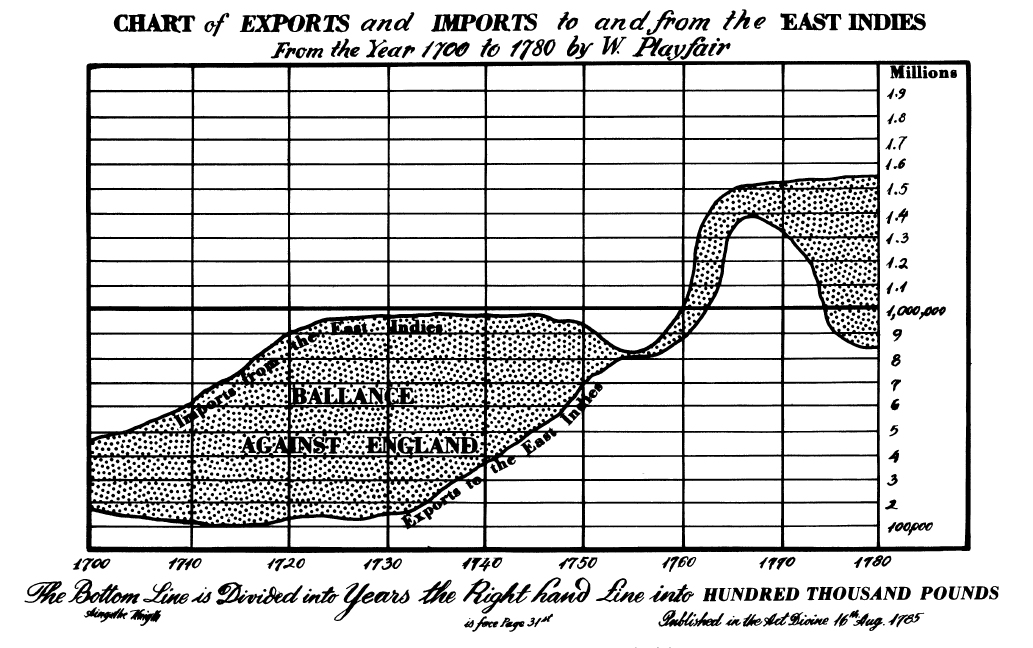
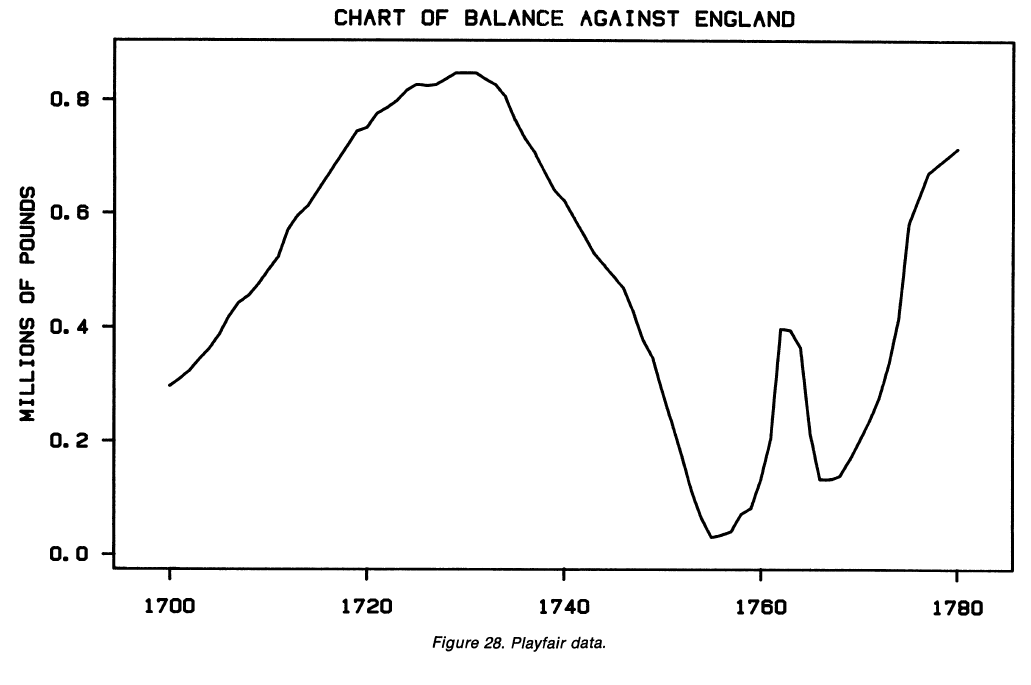
- p.8 and p.119: If you care about differences, plot them directly. Don’t force the brain to compute them. Say you want to subtract one line from another (vertically). But the human brain will try to compare the closest distance between the lines, not the vertical distance. Note what happens around 1760 in the chart below:

Did you notice the feature that pops out in the next chart, when the lines are subtracted?

- p.9: “[From a letter by Deming:] ‘Graphical methods can retain the information in the data.’ Numerical data analytic procedures—such as means, standard deviations, correlation coefficients, and t-tests—are essentially data reduction techniques. Graphical methods complement such numerical techniques. Graphical methods tend to show data sets as a whole, allowing us to summarize the general behavior and to study detail.”
- p.19: In the same sentence as the (now-classic) books by Tukey, Tufte, and Bertin, he also mentions Karsten’s Charts and Graphs from 1925. I’ve never heard of it—I ought to look up a copy.
- p.20: Yessss, there will be no discussion of Chernoff faces and other plots that “almost never showed anyone anything about data that could not be seen more easily by other means.” Similarly, could we also experimentally compare the usability and insightfulness of numerical statistical methods? (or does anyone already do this?) Obviously people study statistical properties of stats methods, and human-factors properties of stats software—but what about human-factors properties of stats methods?
- p.25-27: Nice remake example. Original plot tries to show a woman’s childcare activities throughout the day on a single timeline, with many different symbols and shadings, requiring a wordy legend. Instead, just plot it as 4 adjacent timelines—much simpler to read and no need to memorize symbols.
- p.32, 35, 42, 46: don’t let annotations hide or crowd out the data itself.
- p.55: take great care to ensure plot image quality will be OK under reproduction (e.g. photocopies). Maybe this is less of a problem today, with so many people reading things on the screen—but even so, I’ve had plots look beautiful on my laptop but illegible on the projector in class. Test out your graphs in advance!
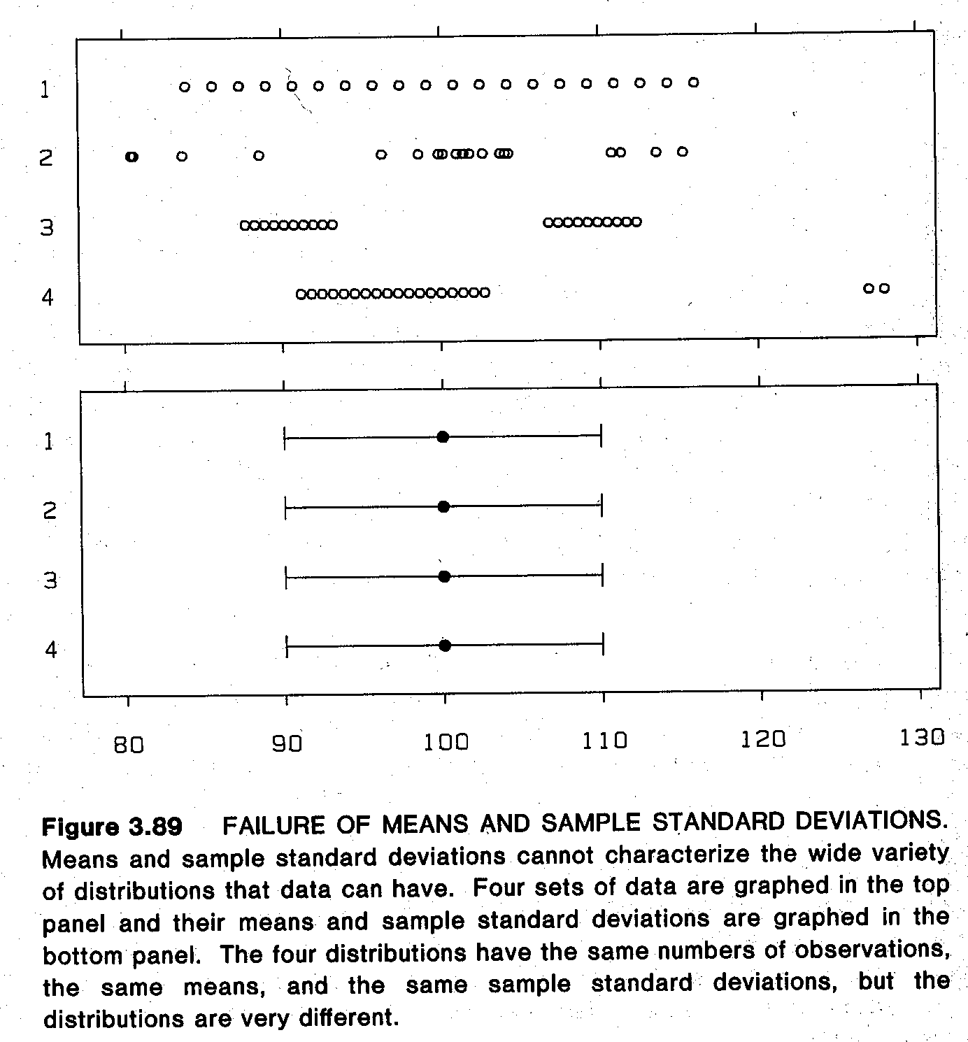
- p.63: Be sure you specify the meaning of your error bars. There are (at least) 3 commonly-used types that you must disambiguate: +/- one standard deviation (of the data); +/- one standard error (of the statistic); or a confidence interval. (Personally I’d advise to never plot SDs or SEs, only CIs. See also good advice by Weissgerber et al.)
- p.69: Set scales so the data fill the plot, if possible, to avoid wasted space. (Elsewhere, Cleveland advises choosing the aspect ratio by “banking to 45 degrees”—setting aspect ratio so that most lines in the chart, or the most prominent line, average around 45 degrees rather than very steep or very shallow.)
- p.76: Don’t worry about including zero on a scatterplot unless zero is really meaningful there. (For bars, you usually must include zero because bars encode data by their length, not their position, and usually they start at zero. So a bar that doesn’t show zero is like a pictogram that’s been cut off: nonsensical. But some bars, like in a waterfall chart, don’t start at 0, and that’s OK. Just think “show the whole bar,” or don’t use bars at all.)
- p.86-87: Don’t use scale breaks unless really necessary (they can be very misleading). If you must use them, don’t connect lines across the break, since the slope will be meaningless. Don’t use a “partial break” (little lines slashing the axis), but rather a “full break” (two entirely separate plots side-by-side). See examples in Cleveland (1984), “Graphical Methods for Data Presentation: Full Scale Breaks, Dot Charts, and Multibased Logging.”
- p.93-95: Try multiple graphs as you work, and you may even need to show/report multiple graphs of the same thing. Example: a time series of both the raw or logged data, and the percent change in the data, can give different (both useful) views of the same dataset.
- p.108: If working with log base 2 scale, but for large numbers, consider dividing by (say) a million so that readers can see the more-familiar, smaller log 2 values on the tick labels.
- p.120: A pattern that looks “null” or uninteresting on the raw data might look much more interesting in a residual plot.
- p.121: When comparing two sets of readings (X vs Y) and neither is naturally the baseline/predictor variable, try a Bland-Altman plot aka Tukey sum-difference graph. Plot the difference (y-x) against the sum or mean (y+x). Gives you a way “to study more effectively the deviations of the points from the line y=x.”
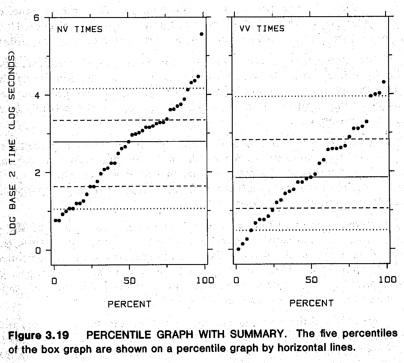
- p.127-8: His “percentile graphs” seem to be just empirical CDFs, but transposed so that the percents are on the x-axis and data-values on the y-axis. See also p.134-5 for “percentile graphs with summaries,” which seem to be transposed ECDFs overlaid with lines at te percentiles used for boxplots. I actually like this addendum to ECDFs: makes it much easier to quickly see big effects (differences in medians and quartiles between groups) while still providing extra detail beyond boxplots.

- p.162: In terms of overlap (also for jittering), open circles work best because their intersection doesn’t look like another circle. This isn’t true of squares and triangles.
- p.173: To help choose a bandwidth for lowess smoothing, plot the residuals and run a new lowess on those. It should look flat if the original bandwidth was not oversmoothing.
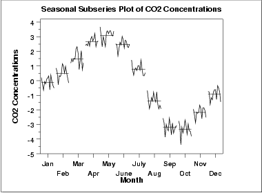
- p.185-7: Nice time-series decomposition into broad trend, seasonal trend, and residual noise. Also “seasonal subseries graph” sort of like faceted seasonality… In this example, it’s monthly data, so they plot all the January data across all years in one facet; then all February data in the next facet; etc.
- p.189-190: Nifty little dataset about the size and price of Hershey bars over time. Also a great example of the value of transforming your data: the two version of the plot (weight vs time, and cost/ounce over time) help to answer two different, interesting questions.
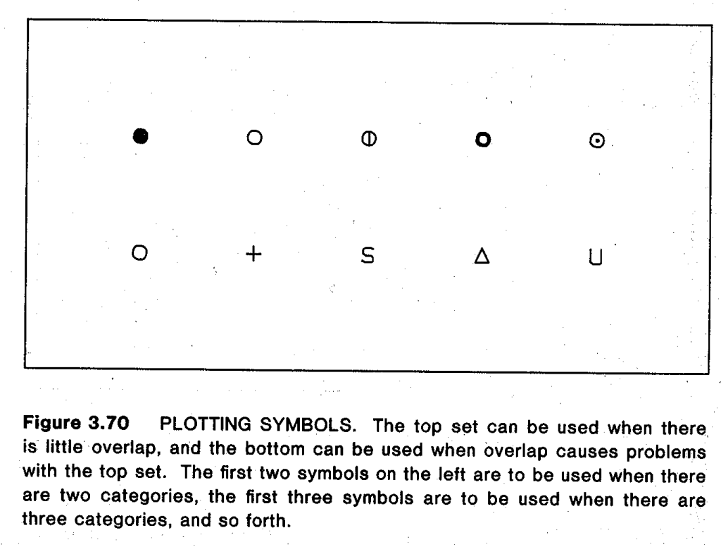
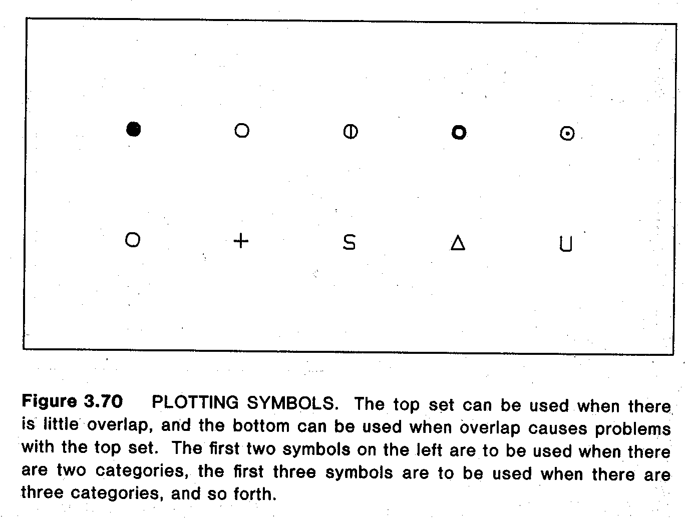
- p.192-6: Nice comparisons of plotting symbols for scatterplots. Letters (initials of the categories, e.g. B = Biology, P = Physics) are more memorable, but can be hard to visually discriminate. Traditional symbols (circle, triangle, square) are a bit easier to discriminate but not great. Circles with different fill levels are much better, unless there’s a lot of overlap. Finally, for scatterplots with lots of overlap, Cleveland suggests a grab-bag of symbols (circle, plus, S, triangle, U) that discriminate easily even when they overlap. On p.196 there’s a summary which is basically the symbol equivalent of ColorBrewer.
- p.203-5: If you want a scatterplot with data from different categorical groups, but can’t “superpose” it all on one plot because it’s just a messy jumble, try to “juxtapose” (basically facet by group)—but also add consistent reference lines across plots. For example, fit a regression separately to each subgroup, but also plot all groups’ regression lines on every subplot, so that you can compare any given group with all the other trends.
(Sometimes I prefer Rafe Donahue’s suggestion to show all the data on every subplot, but show one group at a time in a dark color and grey out the other groups. Then you can see all the data at once for context, but highlight one group at a time for detail. This seems like a compromise for the tension between perception and detection that Cleveland describes on p.268-9. But perhaps Cleveland didn’t try this because his printing only seems to allow strict black-and-white: no grayscale images here.) - p.209: For comparing quantitative data on a map, he prefers “framed rectangle graphs” (they look like thermometers overlaid in each area) over the usual choropleths. I think these are clunky, but I guess I agree they do allow better quantitative comparisons than with shades of color or hatch density. (But this particular example is not a great one—what is the spatial trend here? If none, why bother to show a map?)
- p.213: It’s almost funny to see him promote brushing and linking as “a view of the future” with “high-interaction methods” that can be done live at a computer screen—yet also kind of sad that we haven’t seemed to progress much beyond what he already described here 30 years ago. At least, not many well-adopted alternatives that I can think of. I mean, yes, people are doing plenty of great work today with interactive graphics for communication… and there are more novel exploratory tools for the technical data analyst such as GGobi… But in widespread analysis tools (say Tableau), brushing and linking still seem to be the main options.
- p.222: Nice one-dimensional alternative to Anscombe’s Quartet.

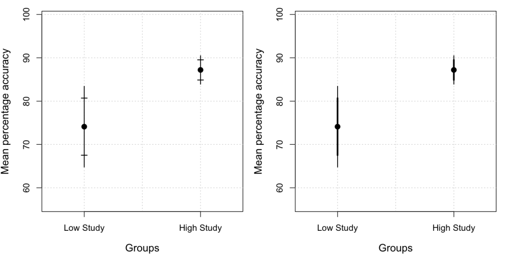
- p.223-5: Good rant against the use of 1-standard-error for error bars instead of plotting actual confidence intervals.
A standard error of a statistic has value only insofar as it conveys information about confidence intervals. The standard error by itself conveys little. It is confidence intervals that convey the sample-to-sample variation of a statistic. … How did it happen that the solidly entrenched convention in science and technology is to show one standard error on graphs? It seems likely … a result of the convention for numerical communication. … Another difficulty, of course, is that confidence intervals are not always based on standard errors.
So there you have it. Report SEs numerically in the text or tables if you want, so readers can perform other calculations—but when plotting, show the actual CIs and not SEs!
- p.226: “Two-tiered error bars”—instead of the usual CI error bars, use a long line for the 95% CI, but put the perpendicular ticks at the 50% CI endpoints instead of the 95% CI endpoints. “The inner interval of 50% gives a middle range for the sample-to-sample variation of the statistic that is analogous to the box of a box graph.” It’d be nice to add this as a geom to
ggplot2, if it’s not there already.
And while searching for a screenshot, I found this great idea by Thom Baguley:I like to use two-tier plots to convey 95% CIs for individual means (outer tier) and inferential (difference-adjusted) 95% CIs (inner tier). The inner tier approximates to a 95% CI for the difference – so that the means can be considered different by conventional criteria if the inner tier error bars don’t overlap
- p.229: Maybe a good summary of the book’s worldview: “graphical perception … arises … from meshing two disciplines: statistical graphics and visual perception.”
- p.231 and p.264: Nice to see that the concept of “pre-attentive processing” was already known and used this early. Easier perception leads to easier cognition.
- p.238: “Distance” (and its effects in experiment, shown on p.252) confused me at first, but seems to be saying that any quantitative comparisons (whether comparing lengths, or angles, or what) are easier if you’re comparing things near each other on the page. So if you’re plotting many things at once, consider whether some of them are more naturally compared, and put those close together if you can. (Say you have grouped bars: each group of bars reflects one categorical variable, and the bars within each group are a different nested variable. Choosing which variable to use across vs within groups will affect which bars are close to each other and hence which comparisons are easier / more accurate.)
- p.241-4: Nifty but technical discussion of Weber’s Law and Stevens’ Law from human visual perception: how people detect differences in attributes (e.g. line segment lengths), and how people perceive magnitudes compared to their real values (e.g. line lengths, vs circle areas, vs cube volumes). Basically justifies why framed-rectangle graphs of p.209 beat simple bars: extra context from the frames helps compare two similar long bars by instead comparing two short gaps. And justifies why length is better for encoding quantitative data than area or volume: because humans consistently perceive area and volume with much more distortion than they do length. Also see p.245 citing experiments that show people see the same angle differently when it’s centered vertically than when it’s centered horizontally.
- p.249: Great experiment! Ask subjects to compare positions B, C, D with position A. Then do same for lengths, angles, volumes, areas, etc. This is the basis for Cleveland’s empirical evidence of his famous ranking (on p.254). I actually ran a mini version of this experiment in class with my students (try it yourself in the Lecture 3 slides), and they seemed to find it convincing 🙂
- p.254: Ah, here’s the famous ranking of “elementary graphical-perception tasks.” Some of it comes from that experiment above, but other parts are heuristic—Cleveland says he didn’t have enough empirical evidence to rank them firmly at this time. But I don’t think the ranking has really changed since then. Has anyone overturned parts of it, or added major new elements to it?
- p.262-3: You never really need to plot divided (stacked) bars; you can usually replace them with superposed lines for each group, plus a line for the total (maybe in a separate facet if the scale differs a lot). This’ll replace the less-accurate non-aligned length judgments by better position judgments.
- p.271-3: His concept of “Detection” is also not fully clear to me. Before I thought it was just the idea that you can’t evaluate anything that isn’t shown adequately (like if heavy gridlines cover up data points). But here also includes informative ranking of the data: e.g. if you sort by a useful value, you can automatically “detect” the large and small values, while if you sort alphabetically, your brain has to do conscious computation to search for large and small values (and can’t see them as groups at once).
- p.276-8: Again, if the vertical distance between curves matters, plot it directly. (1) Don’t make the reader do the computation mentally, and (2) we actually don’t compute vertical distances well—we tend to estimate the minimum distance instead, which turns out to be very different on this example from Playfair. And certainly don’t plot stacked curves if accurate comparisons matter: in stacked curves, the reader must mentally compute differences just to read one curve at a time (even if not trying to compare them)!
- p.286: You don’t see shading density to encode data very often these days, but it’s still good to know why you may want to avoid it: At high densities, a small difference in shading-density is perceived as a big difference. (The tighter the cross-hatching grids get, the more we perceive a small difference as a big one.)
- p.294: Cleveland closes on a call for principles rather than one-off experiments, including a cute historical anecdote:
Much of the experimental work in graphical perception has been aimed at finding out how two graphical methods compare, rather than attempting to develop basic principles. Without the basic principles, or paradigm, we have no predictive mechanism and every graphical issue must be resolved by an experiment. This is the curse of a purely empirical approach. For example, in the 1920s a battle raged on the pages of the Journal of the American Statistical Association about the relative merits of pie charts and divided bar charts. There was a pie chart camp and a divided bar chart camp; both camps ran experiments comparing the two charts using human subjects, both camps measured accuracy, and both camps claimed victory. The paradigm introduced in this chapter shows that a tie is not surprising and shows that both camps lose because other graphics perform far better than either divided bar charts or pie charts.
Thanks for this review of these two seminal books.
The Karsten book (your p.19 note) is available online here:
http://babel.hathitrust.org/cgi/pt?id=uc1.$b86771;view=1up;seq=1
Thanks! I look forward to checking out the Karsten book.