
My last post introduced the recent Tapestry conference and described the three keynote talks.
Below are my notes on the six “Short Stories” presentations and a few miscellaneous points.
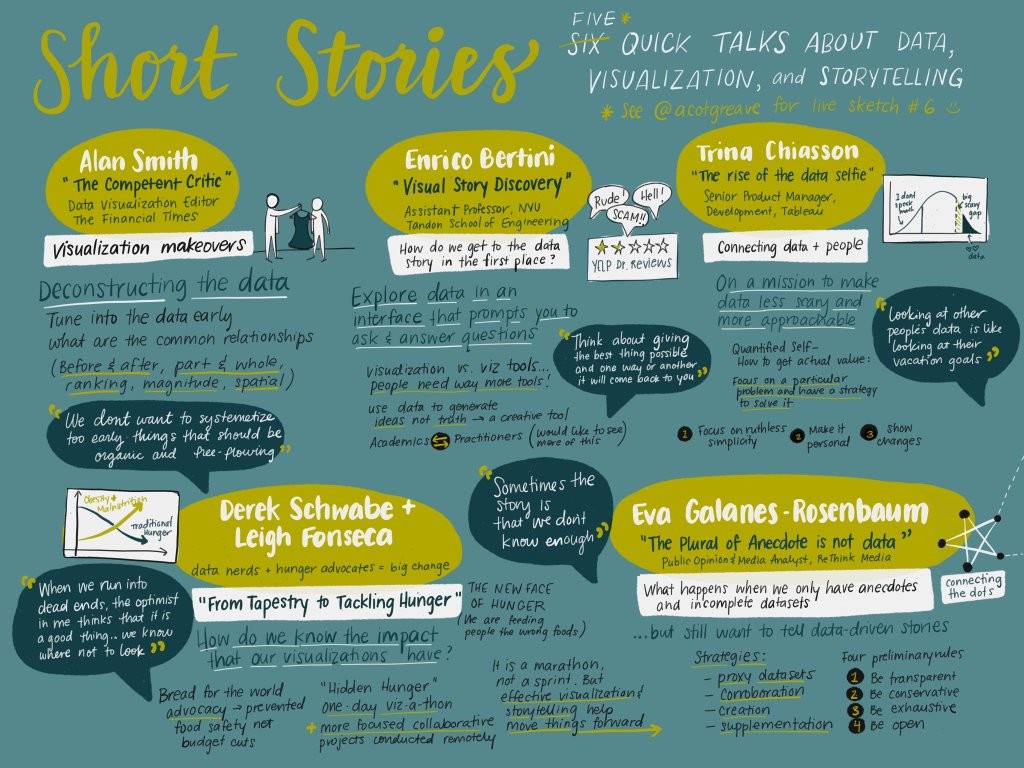
Short Stories
Catherine Madden
Catherine Madden spoke about the role of drawing in visual storytelling. She distinguished drawing as a noun (the outcome) from drawing as a verb (the process), asking us to focus more on the latter. It’s a less intimidating perspective for beginners, vs. focusing on having a polished outcome/product. Sketching on paper also keeps you focused and gets the creativity flowing in ways that you miss while working on a computer, where you’re expending brainpower on trying to resist the pervasive “digital distractions.”
So, imagine you’re taking on a project to visualize some new topic or dataset. Drawing lets you clarify your ideas (to yourself too, not just to others). Use mind maps as a warmup: what do you know about the topic you’re going to visualize, and what do you still need to learn? Then sketch out a ton of possible chart or graphic forms that could help answer your question—don’t critique them yet, just get them out there and see how many different ways you could represent the data. Finally, add depth to the most interesting ones; mash them up with each other; consider what else could be added if you include extra visual attributes, data columns, animation, interaction?
Next, show your ideas to others and get feedback. But don’t over-polish if you want feedback about substance rather than surface. Madden quoted Stanford’s Baba Shiv: “I have observed time after time that if you build a polished prototype others will see flaws. If you build a rough prototype, they will see potential.”
This process of drawing / sketching for brainstorming, refining, and collaboration seems like something worth trying. I hope to practice it this year and perhaps teach it as an activity in my dataviz class.
Finally, Madden is partly known for her excellent live-tweeted sketches of talks (as shown above). She demo’ed her workflow on the nifty Paper app from FiftyThree (or is it vice versa?), sadly only available on Apple devices so far. The app lets you sketch roughly, but “autocorrects” / cleans up ragged shapes for you and lets you copy and paste, duplicate, and rearrange—things that are hard to do on actual paper.
See also her sketches for the Tapestry keynote speakers: Scott Klein, Jessica Hullman, and Nick Sousanis.
Madden has also posted her sketchnotes, slides, and selected tweets.
Alan Smith
Alan Smith of the Financial Times talked about being a “competent critic” and how to educate the rest of the newsroom in visual literacy: giving feedback, editing graphics, or even just deciding when a viz would be useful.
In his welcome lecture to new colleagues, he focuses not just on the before-and-after critiques, but also on the details of incremental improvements that transform original data or mediocre tables/charts into much more accessible versions. The process is just as important to see as the final versions.
The actual advice given is what you might expect: Use good titles and labels and annotations. If appropriate, show deviations rather than raw data. Highlight outliers, and explain whether they’re “good” or “bad.” Consider turning hard-to-read paired bars into slope charts—not only can you see the change from initial to final, but also you can rank within both years.
Basically, learn to recognize the common types of relationships that news stories tend to show (e.g. change over time, ranking, spatial hotspots, etc.) and how those relationships can be shown more effectively. Often, the text of the story already shows what the reporter expects the visual story to be (e.g. “surge” indicates steep rise over time), so how do you clarify and enhance that with a visual?
In the paired bars redesign example, the original graphic had a major typo. The graph’s creator admitted that nobody had ever mentioned spotting it. In Smith’s view, most likely “nobody had bothered to take the time to read it closely.”
Besides merely being readable, graphics should supplement and work with the story copy—not just fill extra space by showing the same info redundantly to the body text. Self-contained, expanded graphs can become central, not ancillary, to the story. Self-contained graphs “share well” on social media too, grabbing readers’ attention (much as a headline might) and linking them to the full story.
Enrico Bertini
Enrico Bertini works on information visualization at NYU. More than building and publishing stories directly, his group builds tools to help analysts discover new data stories. He presented a lovely example of a custom tool called RevEx, designed at his lab, for filtering Yelp reviews of doctors. You can filter down by geography, type of medical practice, total number of reviews, average number of stars, etc… and see summaries of the text reviews from this filtered subcategory. This tool was used by ProPublica internally to explore this Yelp dataset and write stories on it; The Economist did something similar with data from RateMyProfessors.
I like the idea of such custom tools that streamline analyses of a particular data type, at least when done well. Of course specialized data formats have always had specialized tools, like the MNE software I used for a small neuroscience project earlier in grad school—but that kind of thing usually requires high programming skill and intense subject-matter expertise. Bertini’s talking about far more accessible, user-friendly tools for familiar topics. We need more tools for non-technical analysts to explore and visualize data when writing a story, even if the published story itself doesn’t end up being presented visually.
There’s also the danger of data fishing: seeking and seeking until you find spurious “signal” in a huge dataset like this. Bertini defended the use of such tools as an exploratory “creativity tool” to find ideas, not necessarily a formal analysis tool to establish the truth.
[In that spirit, I’d like to explore what’s out there for more-statistical data mining. If we’re trying to do regression or classification, and we’ve split our data into training and test samples, it’s often OK to do a lot of exploration on the training data. Instead of purely automated model-selection algorithms (greedy stepwise regression, classification trees, etc.), sometimes we might want to do “human-in-the-loop” model selection. Let the computer calculate the optimal model on this dataset, but give the human flexibility to edit it on the fly and see (in real time) how proposed changes would affect the outcome, the residual plots, etc. You can do this incrementally with tools like R, but it’s slow and awkward; I can imagine a well-designed graphical tool would be much nicer (especially if it keeps track of your modeling process, in the spirit of reproducible research). If something like this doesn’t already exist, I’m tempted to build a prototype myself.]
Leigh Fonseca and Derek Schwabe
Leigh Fonseca and Derek Schwabe described their collaboration on advocacy visualizations for Bread For The World. Fonseca’s private dataviz practice was going well, and she had just decided to spend some time on pro bono work, when she met Schwabe at last year’s Tapestry and decided to work with his group.
They talked about challenges and rewards of advocacy work: “Advocacy is where data becomes actionable in pushing for change through policy makers.” Having strong, vivid visualizations can be a huge help for advocates who only have a few minutes to convince legislators / policy-makers about the importance of their cause and the impact of their proposed solution. (I wish the speakers had had time to describe this impact explicitly. What exactly happens when a Bread For The World volunteer gets a meeting with a member of Congress or their staff? What kind of things do the legislators find convincing and actionable?)
Fonseca and Schwabe also talked about the challenges of hosting a vizathon with volunteers, especially spread out over different time zones (San Francisco and DC, in their case)… and of keeping vizathon volunteers motivated to continue on with the project longer-term. I know that DataKind and Statistics Without Borders have had similar concerns—I hope these various do-good-with-data organizations are sharing best-practices advice with each other.
One of their joint projects is this “hunger report” about missing data on women and children. To fight hunger effectively, you have to measure it, but plenty of needed data is never collected or published. Instead of giving up at the lack of data, their team turned this fact itself into a visualization—and another worthy cause for which to advocate.
Trina Chiasson
Trina Chiasson spoke about “data selfies.” The term was apparently inspired by a conversation with Molly Flatt, author of the well-titled “Are you secretly afraid of data?”
As Chiasson pointed out, “Looking at someone else’s data is like looking at someone else’s vacation photos.” It’s often boring unless you can spot yourself in that photo or dataset. This led her into two perspectives on bridging the gap between knowing it’s possible to learn from data vs. knowing how to learn from data.
First, she studied people in the Quantified Self community—those who geek out over collecting personal data from Fitbits and the like. It turns out that many of them rarely find any actual insights or even know how to get started (beyond trite things like “The Fitbit data shows that you’re often asleep at night”). There’s an implicit promise that the Quantified Self approach will help you get healthier and more productive… but without simple, clearly defined goals, few users get much benefit.
The Quant Self people who succeed in learning something are those with a concrete goal and a hypothesis to test, concerning what to improve and how. Don’t measure and change everything at once—just try to impact one metric at a time. For example, one guy wanted to improve his flexibility, and he had a few new kinds of stretches to try. He attempted each new stretch for a few weeks, then changed to another one, until he found one that did indeed improve the concrete measure of flexibility he’d chosen.
Second, Chiasson talked about how some kinds of data are easier to engage with than others. For example, the Netflix Prize winning entry was never implemented, partly because the goal—improved accuracy in predicting things like “You’d probably rate this movie 3.2 stars”—was not really engaging to users. Netflix found it easier to draw in and retain viewers by guessing which super-specific sub-genres you seem to enjoy: “Oh wow, Netflix, thanks for suggesting more of my beloved nostalgic underdog police zombie rom-coms!” It’s easier to relate to a category than with a number.
In data visualization, the equivalent would be things like the New York Times’ “The Jobless Rate for People Like You”. Even the title already makes it clear what you can do: find yourself in the data. The first thing you do when playing around with it is find your own age/race/sex/education subgroups.
[Seems like there should be a common term for graphics like this, where it’s expected that you’ll focus on one subgroup but see it in the context of all the others. I tried coining a term, “idiopleth,” but it really doesn’t roll off the tongue. I’ve seen them called “you-are-here” plots, which is much better although hard to Google. Note that this name is distinct from “you-do-it” graphics, another useful concept.]
So, think about “data selfies” in your projects: Help readers focus clearly on one subject, and show personal or relatable data, perhaps also showing changes/differences compared to other groups.
Finally, Chiasson comes from a user experience design background. This was apparent when she demo’ed Vizable, a tablet app that allows for very user-friendly simple analysis (filtering, sorting, aggregation, etc.) using touch-screen gestures like swiping and dragging. As with Bertini’s talk, I couldn’t help wondering what the equivalent would look like in a more advanced-statistical-modeling setting.
Eva Galanes-Rosenbaum
Eva Galanes-Rosenbaum talked about when the plural of anecdote might, after all, be data.
When your job is to tell data stories relevant to media issues, often there’s not much more out there than anecdotes. How can you stay methodologically legit without “good” data? Galanes-Rosenbaum offered four suggestions:
Use proxy data: If there’s no true record of temperatures back in (pre-)history, scientists use tree rings and ice cores as proxies. Likewise, if there’s no official data on drone strikes by the US military, you might use on-the-ground news reports of drone strikes as the next best thing, perhaps a (lower? upper?) bound.
Corroborate: You may be able to overlay a few smaller, problematic datasets to see overlaps or gaps in knowledge. If three polls have different question wording and sample schemes, but the estimates pretty much agree, that’s stronger evidence than just using one.
Create: Scrape or collect your own dataset. Nowadays that might include crowdsourcing it with an app, as the Sikh Coalition did with FlyRights to begin understanding how often Sikhs are “unfairly screened by the TSA.”
Supplement: With enough anecdotes, they can be their own form of data—at least to show that a problem exists or isn’t going away, even if you can’t estimate its full impact.
As you use any of these methods, be transparent (don’t hide your data’s weaknesses); conservative (frame the story as asking a question, not making strong claims); exhaustive (search hard for the best available data); and open (accept what it may or may not tell you). Finally, the act of talking openly about the lack of useful important data can catalyze change and lead to better reporting (as in Fonseca and Schwabe’s talk).
I asked Galanes-Rosenbaum what she does when statistical data exist, but the margins of error are too wide to trust it much. How do you communicate that to non-experts? She advised avoiding terms like “statistically significant” and giving people more intuitive, but still accurate, language to describe the situation. Perhaps “Because the dataset is so small, we don’t have the full picture yet”—or “This is the apparent trend that we expect to see, but we want to be conservative until more data confirm it.”
Miscellaneous
Did I mention the conference was held at the Stanley Hotel, where Stephen King wrote and set The Shining? It was creepy for those you’d read or watched the story, but my ignorance was bliss.
On the airport shuttle I met Larry Elardo, also headed to the Stanley Hotel but not for Tapestry—he was a finalist in the sculpture competition to create a centerpiece for their hedge maze. Turns out his work looks amazing and his submission was a winner. The hedge maze is still a little short right now, but I bet it’ll look great (with Larry’s sculpture) in a few years:

In a pre-conference hike with Sisi Wei and Adam Pearce, we found the local library and I snagged a new card for my collection.
The conference’s great catering (including an open bar) contributed to the flow of ideas between sessions. And the drink names were awesome: how can you resist a Pear-anormal Activity?
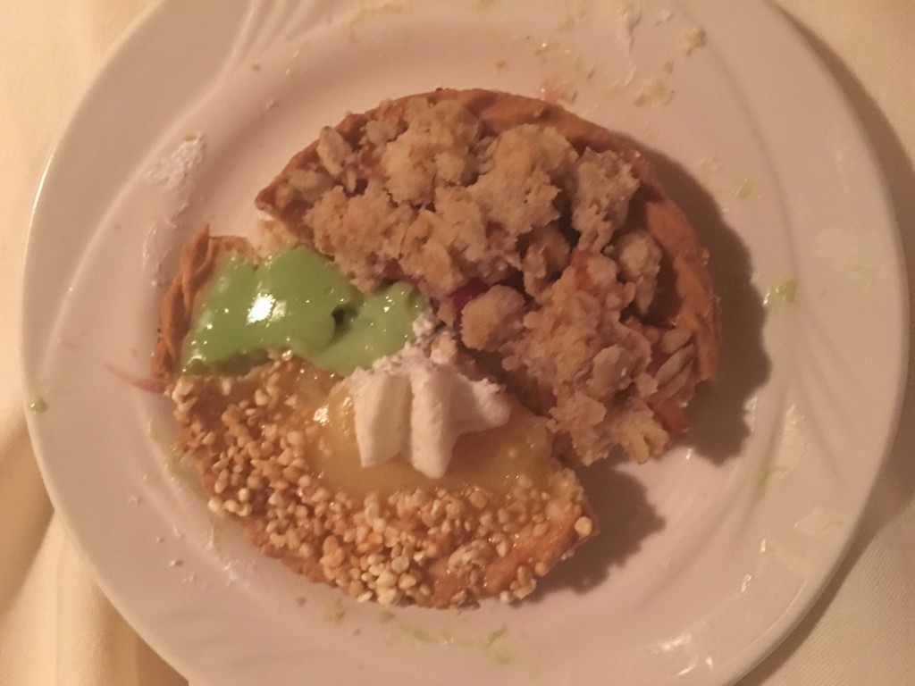
I even made a literal pie chart from the pastries there. Well, someone had to do it. There was strong preference for the apple crumble and banana pies over the key lime:
A chat with Pilar de Haro, Alex Corey, and Angele Beausoleil about post-election migration to Canada led me to check the data myself.
Although I was proudly waving my Statistics flag, I was amused to hear Garfield Fisher introduce himself as a “recovering statistician.” It was also a pleasure to meet Carmen McKell and several of her Houghton College students, gathering inspiration to bring back to Houghton’s new Center for Data Science Analytics.
Elsewhen, some of us discussed how best to start learning dataviz. Creating your own and sketching, like in Catherine Madden’s talk? Or critiquing and redesigning existing work, like in Alan Smith’s? Personally I’ve learned mostly by critique-and-redesign. I can’t imagine even having ideas of what to sketch without such practice first, even though I’ve seen graphs all my life. But maybe others see it differently.
In the demo/poster session, Bridget Cogley’s poster took a look at data visualization from a linguist’s point of view. Her blog post makes explicit the really nifty connections to the linguistics of sign language.
I learned about a ton of useful command-line tools for data analysis, many aimed at data journalists. Thanks to Timo Grossenbacher, Matt Kiefer, and Roberto Rocha for these suggestions:
- csvkit (and its Python counterpart Agate) are quick tools for summarizing, filtering, aggregating, and even plotting data in a CSV file at the command line.
- csvdedupe identifies (likely) duplicate records in a CSV file, again from the command line.
- Probable People (in Python) parses (Western) names into components like prefix, first name, and last name.
- Rddj.info is a curated list of resources for learning & using R in data journalism.
Naomi Robbins, author of the great Creating More Effective Graphs, is working on a new book: Creating Effective Graphs with Microsoft R Open, draft available on GitHub. Sounds like most of it will work with base R, but it’s helpful to have Microsoft as a sponsor. It was fun to hear about Robbins’ writing process, collaborating with her daughter who was learning R for the sake of this book.
Erik Jacobsen pointed me to Scott Murray’s syllabi for Information Visualization and for Visual Communication. Murray’s book is the best introduction to D3 I’ve found, by far, so I’m really glad to see some of his other pedagogical resources.
Finally, other people’s perspectives on Tapestry:
- Quite a few people were live-tweeting with the #tapestryconf tag.
- Tara Richerson’s recap blog post and Laura Tyler’s recap post are both shorter and more insightful than my braindumps.
- Same goes for Robin Kwong’s notes from Tapestry and the NICAR conference.
- Watch past Tapestry speakers on the TapestryConference YouTube channel.
I hope it’s not too long before they postThey’ve already posted this year’s lineup too.