
William Cleveland gave a great interview in a recent Policyviz podcast. (Cleveland is a statistician and a major figure in data visualization research; I’ve reviewed his classic book The Elements of Graphic Data before.) He discussed the history of the term “data science,” his visual perception research, statistical computing advances, etc.
But Cleveland also described his work on brushing and on trellis graphics.
- Brushing is an interactive technique for highlighting data points across linked plots. Plot Y vs X1 and Y vs X2; select some points on the first plot; and they are automatically highlighted on the second plot. You can condition on-the-fly on X1 to better understand the multivariate structure between X1, X2, and Y.
- Trellis displays are essentially Cleveland’s version of small multiples, or of faceting in the Grammar of Graphics sense. Again, you condition on one variable and see how it affects the plots of other variables. See for example slides 10 and 15 here.
I found it fascinating that the static trellis technique evolved from interactive brushing, not vice versa!
Cleveland and colleagues noticed that although brushing let you find interesting patterns, it was too difficult to remember and compare them. You only saw one “view” of the linked plots at a time. Trellises would instead allow you to see many slices at once, making simultaneous comparisons easier.
For example, here’s a brushing view of data on housing: rent, size, year it was built, and whether or not it’s in a “good neighborhood” (figures from Interactive Graphics for Data Analysis: Principles and Examples). The user has selected a subset of years and chosen “good” neighborhoods, and now these points are highlighted in the scatterplot of size vs rent.
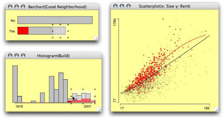
That’s great for finding patterns in one subset at a time, but not ideal for comparing the patterns in different subsets. If you select a different subset of years, you’ll have to memorize the old subset’s scatterplot in order to decide whether it differs much from the new subset’s scatterplot; or switch back and forth between views.
Now look at the trellis display: the rows show whether or not the neighborhood is “good,” the columns show subsets of year, and each scatterplot shows size vs rent within that data subset. All these subsets’ scatterplots are visible at once.
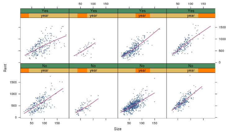
If there were different size-vs-rent patterns across year and neighborhood subsets, we’d be able to spot such an effect easily. I admit I don’t see any such effect—but that’s an interesting finding in its own right, and easier to confirm here than with brushing’s one-view-at-a-time.
So the shinier, fancier, interactive graphic is not uniformly better than a careful redesign of the old static one. Good to remember.