In memoriam: Leland Wilkinson

I am saddened to hear that Lee Wilkinson passed away a few days ago. Wilkinson created the hugely influential concept of a “Grammar of Graphics” and wrote it up in a thorough, thought-provoking book. Through his writings and his own entrepreneurial spirit (he started SYSTAT and sold it to SPSS, then worked with Tableau and H20.ai among others), the Grammar of Graphics became a hugely influential idea1, adopted in many powerful data visualization software packages—Tableau, R’s ggplot2, Python’s plotnine, Javascript’s D3.js and Vega, the SPSS Graphics Production Language (GPL) and Visualization Designer, IBM VizJSON…

Leland Wilkinson

Wilkinson was supposed to speak at a Data Visualization New York meetup tomorrow; instead, it has become a memorial tribute session. The event is online and open to all. Meanwhile, I have seen heartfelt tributes to Wilkinson from a who’s who of the data visualization world: Hadley Wickham (developer of ggplot2), Nathan Yau (creator of FlowingData), Jessica Hullman (prolific dataviz researcher), Jon Schwabish (creator of PolicyViz), Jeff Heer (developer of D3.js and Vega)… Everyone reiterates that he was not only an influential scholar, but also a generous, kind, decent human being.

Apart from his visualization work, I loved Wilkinson’s voice in a report written mostly by him on behalf of the American Psychological Association’s 1999 Task Force on Statistical Inference. Here’s the note I wrote myself when I first ran across this report, and I still stand by it:

This is a really great, short, but fairly complete overview of major components in a statistical study...
i.e., the things you want your junior statistician colleague to know without being told...
i.e., the things we ought to teach AND MEASURE ON our stats students.

Two of my favorite quotes from that report:

“Statistical power does not corrupt.”

and

The main point of this example is that the type of “atheoretical” search for patterns that we are sometimes warned against in graduate school can save us from the humiliation of having to retract conclusions we might ultimately make on the basis of contaminated data. We are warned against fishing expeditions for understandable reasons, but blind application of models without screening our data is a far graver error.

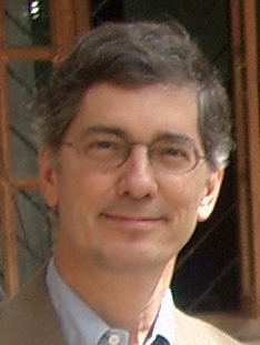
I had the incredible good fortune of meeting Wilkinson myself at a conference, though regrettably just once. This was SDSS 2019 in Seattle—the last conference I attended in person before the pandemic. One groggy morning, I stepped away from my conference breakfast table to get a second cup of coffee. I came back to find that Wilkinson had just sat down, thinking the table was empty. We ended up having a genuinely delightful conversation. I asked how he had managed to combine so many fascinating strands of work in his career, and he told me it had been a roundabout path: if I remember correctly, he had dropped his math major in his first week of college and switched to English; then later dropped out of divinity school; then just barely finished Psychology graduate school because he couldn’t stop tinkering with computers instead; then became a statistical software entrepreneur… He also reminisced fondly about attending conferences as a young researcher, where he got to hear giants in the field get drunk at the open bar and tell their life story 😛 Wilkinson was a witty and warm conversation partner. After breakfast he invited me to keep in touch, and I deeply regret that I never followed up. Rest in peace, Leland Wilkinson.

“Concise Statistical Year-Book of Poland, 1939”

Eighty years ago this week, my grandmother and grandfather were each enthusiastic seven-year-olds, excited for September 1st — their first day of school! At the time, they lived hundreds of kilometers apart and had yet to meet. She had spent her childhood in France but was thrilled to be back in ancestral Poland, in the north-eastern city of Wilejka, where she would finally be able to study in Polish. He was a voracious reader in PoznaÅ„, the westernmost large city in Poland at the time. Still, both had laid out their best clothes and filled a satchel with notebooks and pens.

Of course, it was not to be. My grandfather’s mother woke him in the middle of the night and brought him quietly down to the cellar, in the dark, past windows blacked out with curtains and blankets, as German forces began shelling the city. In the morning his apartment still stood, but he saw the broken walls and ruined rooms of the building next door. Meanwhile, my grandmother’s long-awaited Polish school was cancelled as well, eventually replaced by a Russian school as Soviet forces occupied her city.

Somehow, they survived World War II and eventually met as teachers, committed to the critical importance of education in rebuilding their broken country. My grandfather went on to become a professor of history and a leading figure at the University of Zielona Góra, in the city where they finally settled (and where I was born). A few years ago, when he passed away, I found some of the old statistical yearbooks he must have used as research resources.

Worn cover of my grandfather's copy of the 1939 Concise Statistical Year-Book of Poland

The yearbook from 1939 is particularly touching. As a physical artifact, it has clearly been through a lot: worn from use, spine broken, pages torn, stamped and underlined and scribbled all over.

Title page of my grandfather's copy of the 1939 Concise Statistical Year-Book of Poland, with stamps and inked-out scribbles

But it’s the “Foreword to the 10th Edition,” written in April 1939, that really moves me with its premature optimism:

The current edition of the Year-Book closes the first ten years of its existence. Today I can emphatically assert the great utility of this publication … It remains only necessary to express a hope that the Concise Year-Book, completing currently the first decade of its existence and beginning in the near future its second decade… will continually and increasingly fulfill its mission as set out in 1930…

Once again, it was not to be. The statistical service could not continue its planned work, once the war began in September. The Polish government-in-exile in London did manage to publish a Concise Statistical Year-Book for 1939-1941, summarizing what was known about conditions in the German- and Soviet-occupied territories. But the regular annual compilation and publication of Polish statistical yearbooks did not resume until after the war, in 1947 — and even then it was interrupted again during 1951-1955 as the Soviets in charge did not want to risk revealing any state secrets.

First page of foreword to my grandfather's copy of the 1939 Concise Statistical Year-Book of Poland
Second page of foreword to my grandfather's copy of the 1939 Concise Statistical Year-Book of Poland

The Polish Wikipedia has a good article on these statistical yearbooks, but unfortunately it’s not yet translated into English. However, you can skim through a scanned PDF of the whole 1939 yearbook. For instance, the lovingly hand-drawn population density map reminds us that there were precursors to the (also beautiful) census dot maps based on 2010 US Census data.

Population density dot map from the 1939 Concise Statistical Year-Book of Poland

Now, on this 80th anniversary of the war, my own son is eager to start school, while I am preparing to bring the 1939 yearbook to my fall course on surveys and censuses. I am grateful that our life today is so much better than my grandparents’ was, even if it’s hard to be optimistic about the state of the world when you hear the news lately. All we can do is roll up our sleeves and get back to work, trying to leave the place better than we found it.

Another Pole, the poet Wisława Szymborska, said it well:

The End and the Beginning
After every war
someone has to clean up.
Things won’t
straighten themselves up, after all.

Someone has to push the rubble
to the side of the road,
so the corpse-filled wagons
can pass.

Someone has to get mired
in scum and ashes,
sofa springs,
splintered glass,
and bloody rags.

Someone has to drag in a girder
to prop up a wall,
Someone has to glaze a window,
rehang a door.

Photogenic it’s not,
and takes years.
All the cameras have left
for another war.

We’ll need the bridges back,
and new railway stations.
Sleeves will go ragged
from rolling them up.

Someone, broom in hand,
still recalls the way it was.
Someone else listens
and nods with unsevered head.
But already there are those nearby
starting to mill about
who will find it dull.

From out of the bushes
sometimes someone still unearths
rusted-out arguments
and carries them to the garbage pile.

Those who knew
what was going on here
must make way for
those who know little.
And less than little.
And finally as little as nothing.

In the grass that has overgrown
causes and effects,
someone must be stretched out
blade of grass in his mouth
gazing at the clouds.

When static graphs beat interactives

William Cleveland gave a great interview in a recent Policyviz podcast. (Cleveland is a statistician and a major figure in data visualization research; I’ve reviewed his classic book The Elements of Graphic Data before.) He discussed the history of the term “data science,” his visual perception research, statistical computing advances, etc.

But Cleveland also described his work on brushing and on trellis graphics.

  • Brushing is an interactive technique for highlighting data points across linked plots. Plot Y vs X1 and Y vs X2; select some points on the first plot; and they are automatically highlighted on the second plot. You can condition on-the-fly on X1 to better understand the multivariate structure between X1, X2, and Y.
  • Trellis displays are essentially Cleveland’s version of small multiples, or of faceting in the Grammar of Graphics sense. Again, you condition on one variable and see how it affects the plots of other variables. See for example slides 10 and 15 here.

I found it fascinating that the static trellis technique evolved from interactive brushing, not vice versa!

Cleveland and colleagues noticed that although brushing let you find interesting patterns, it was too difficult to remember and compare them. You only saw one “view” of the linked plots at a time. Trellises would instead allow you to see many slices at once, making simultaneous comparisons easier.

For example, here’s a brushing view of data on housing: rent, size, year it was built, and whether or not it’s in a “good neighborhood” (figures from Interactive Graphics for Data Analysis: Principles and Examples). The user has selected a subset of years and chosen “good” neighborhoods, and now these points are highlighted in the scatterplot of size vs rent.

Brushing

That’s great for finding patterns in one subset at a time, but not ideal for comparing the patterns in different subsets. If you select a different subset of years, you’ll have to memorize the old subset’s scatterplot in order to decide whether it differs much from the new subset’s scatterplot; or switch back and forth between views.

Now look at the trellis display: the rows show whether or not the neighborhood is “good,” the columns show subsets of year, and each scatterplot shows size vs rent within that data subset. All these subsets’ scatterplots are visible at once.

Trellis

If there were different size-vs-rent patterns across year and neighborhood subsets, we’d be able to spot such an effect easily. I admit I don’t see any such effect—but that’s an interesting finding in its own right, and easier to confirm here than with brushing’s one-view-at-a-time.

So the shinier, fancier, interactive graphic is not uniformly better than a careful redesign of the old static one. Good to remember.

Tapestry 2016 conference: overview and keynote speakers

Overview

Encouraged by Robert Kosara’s call for applications, I attended the Tapestry 2016 conference two weeks ago. As advertised, it was a great chance to meet others from all over the data visualization world. I was one of relatively few academics there, so it was refreshing to chat with journalists, industry analysts, consultants, and so on. (Journalists were especially plentiful since Tapestry is the day before NICAR, the Computer-Assisted Reporting Conference.) Thanks to the presentations, posters & demos, and informal chats throughout the day, I came away with new ideas for improving my dataviz course and my own visualization projects.

I also presented a poster and handout on the course design for my Fall 2015 dataviz class. It was good to get feedback from other people who’ve taught similar courses, especially on the rubrics and assessment side of things.

The conference is organized and sponsored by the folks at Tableau Software. Although I’m an entrenched R user myself, I do appreciate Tableau’s usefulness in bringing the analytic approach of the grammar of graphics to people who aren’t dedicated programmers. To help my students and collaborators, I’ve been meaning to learn to use Tableau better myself. Folks there told me I should join the Pittsburgh Tableau User Group and read Dan Murray’s Tableau Your Data!.

Below are my notes on the three keynote speakers: Scott Klein on the history of data journalism, Jessica Hullman on research into story patterns, and Nick Sousanis on comics and visual thinking vs. traditional text-based scholarship.
My next post will continue with notes on the “short stories” presentations and some miscellaneous thoughts.

Continue reading “Tapestry 2016 conference: overview and keynote speakers”

Are you really moving to Canada?

It’s another presidential election year in the USA, and you know what that means: Everyone’s claiming they’ll move to Canada if the wrong candidate wins. But does anyone really follow through?

Anecdotal evidence: Last week, a Canadian told me she knows at least a dozen of her friends back home are former US citizens who moved, allegedly, in the wake of disappointing election results. So perhaps there’s something to this claim/threat/promise?

Statistical evidence: Take a look for yourself.

MovingToCanada

As a first pass, I don’t see evidence of consistent, large spikes in migration right after elections. The dotted vertical lines denote the years after an election year, i.e. the years where I’d expect spikes if this really happened a lot. For example: there was a US presidential election at the end of 1980, and the victor took office in 1981. So if tons of disappointed Americans moved to Canada afterwards, we’d expect a dramatically higher migration count during 1981 than 1980 or 1982. The 1981 count is a bit higher than its neighbors, but the 1985 is not, and so on. Election-year effects alone don’t seem to drive migration more than other factors.

What about political leanings? Maybe Democrats are likely to move to Canada after a Republican wins, but not vice versa? (In the plot, blue and red shading indicate Democratic and Republican administrations, respectively.) Migration fell during the Republican administrations of the ’80s, but rose during the ’00s. So, again, the victor’s political party doesn’t explain the whole story either.

I’m not an economist, political scientist, or demographer, so I won’t try to interpret this chart any further. All I can say is that the annual counts vary by a factor of 2 (5,000 in the mid-’90s, compared to 10,000 around 1980 or 2010)… So the factors behind this long-term effect seems to be much more important than any possible short-term election-year effects.

Extensions: Someone better informed than myself could compare this trend to politically-motivated migration between other countries. For example, my Canadian informant told me about the Quebec independence referendum, which lost 49.5% to 50.5%, and how many disappointed Québécois apparently moved to France afterwards.

Data notes: I plotted data on permanent immigrants (temporary migration might be another story?) from the UN’s Population Division, “International Migration Flows to and from Selected Countries: The 2015 Revision.” Of course it’s a nontrivial question to define who counts as an immigrant. The documentation for Canada says:

International migration data are derived from administrative sources recording foreigners who were granted permission to reside permanently in Canada. … The number of immigrants is subject to administrative corrections made by Citizenship and Immigration Canada.

Tapestry 2016 materials: LOs and Rubrics for teaching Statistical Graphics and Visualization

Here are the poster and handout I’ll be presenting tomorrow at the 2016 Tapestry Conference.

Poster "Statistical Graphics and Visualization: Course Learning Objectives and Rubrics"

My poster covers the Learning Objectives that I used to design my dataviz course last fall, along with the grading approach and rubric categories that I used for assessment. The Learning Objectives were a bit unusual for a Statistics department course, emphasizing some topics we teach too rarely (like graphic design). The “specs grading” approach1 seemed to be a success, both for student motivation and for the quality of their final projects.

The handout is a two-sided single page summary of my detailed rubrics for each assignment. By keeping the rubrics broad (and software-agnostic), it should be straightforward to (1) reuse the same basic assignments in future years with different prompts and (2) port these rubrics to dataviz courses in other departments.

I had no luck finding rubrics for these learning objectives when I was designing the course, so I had to write them myself.2 I’m sharing them here in the hopes that other instructors will be able to reuse them—and improve on them!

Any feedback is highly appreciated.


Footnotes:

PolicyViz episode on teaching data visualization

When I was still in DC, I knew Jon Schwabish’s work designing information and data graphics for the Congressional Budget Office. Now I’ve run across his podcast and blog, PolicyViz. There’s a lot of good material there.

I particularly liked a recent podcast episode that was a panel discussion about teaching dataviz. Schwabish and four other experienced instructors talked about course design, assignments and assessment, how to teach implementation tools, etc.

I recommend listening to the whole thing. Below are just notes-to-self on the episode, for my own future reference.

Continue reading “PolicyViz episode on teaching data visualization”

The Elements of Graphing Data, William S. Cleveland

Bill Cleveland is one of the founding figures in statistical graphics and data visualization. His two books, The Elements of Graphing Data and Visualizing Data, are classics in the field, still well-worth reading today.

Visualizing is about the use of graphics as a data analysis tool: how to check model fit by plotting residuals and so on. Elements, on the other hand, is about the graphics themselves and how we read them. Cleveland (co)-authored some of the seminal papers on human visual perception, including the often-cited Cleveland & McGill (1984), “Graphical Perception: Theory, Experimentation, and Application to the Development of Graphical Methods.” Plenty of authors doled out common-sense advice about graphics before then, and some even ran controlled experiments (say, comparing bars to pies). But Cleveland and colleagues were so influential because they set up a broader framework that is still experimentally-testable, but that encompasses the older experiments (say, encoding data by position vs length vs angle vs other things—so that bars and pies are special cases). This is just one approach to evaluating graphics, and it has limitations, but it’s better than many competing criteria, and much better than “because I said so” *coughtuftecough* 🙂

In Elements, Cleveland summarizes his experimental research articles and expands on them, adding many helpful examples and summarizing the underlying principles. What cognitive tasks do graph readers perform? How do they relate to what we know about the strengths and weaknesses of the human visual system, from eye to brain? How do we apply this research-based knowledge, so that we encode data in the most effective way? How can we use guides (labels, axes, scales, etc.) to support graph comprehension instead of getting in the way? It’s a lovely mix of theory, experimental evidence, and practical advice including concrete examples.

Now, I’ll admit that (at least in the 1st edition of Elements) the graphics certainly aren’t beautiful: blocky all-caps fonts, black-and-white (not even grayscale), etc. Some data examples seem dated now (Cold War / nuclear winter predictions). The principles aren’t all coherent. Each new graph variant is given a name, leading to a “plot zoo” that the Grammar of Graphics folks would hate. Many examples, written for an audience of practicing scientists, may be too technical for lay readers (for whom I strongly recommend Naomi Robbins’ Creating More Effective Graphs, a friendlier re-packaging of Cleveland).

Nonetheless, I still found Elements a worthwhile read, and it made a big impact on the data visualization course I taught. Although the book is 30 years old, I still found many new-to-me insights, along with historical context for many aspects of R’s base graphics.

[Edit: I’ll post my notes on Visualizing Data separately.]

Below are my notes-to-self, with things-to-follow-up in bold:

Continue reading The Elements of Graphing Data, William S. Cleveland”

Teaching data visualization: approaches and syllabi

While I’m still working on my reflection of the dataviz course I just taught, there were some useful dataviz-teaching talks at the recent IEEE VIS conference.

Jen Christiansen and Robert Kosara have great summaries of the panel on “Vis, The Next Generation: Teaching Across the Researcher-Practitioner Gap.”

Even better, slides are available for some of the talks: Marti Hearst, Tamara Munzner, and Eytan Adar. Lots of inspiration for the next time I teach.

Hearst_ClassDiscussions

Finally, here are links to the syllabi or websites of various past dataviz courses. Browsing these helps me think about what to cover and how to teach it.

Update: More syllabi shared through the Isostat mailing list:

Not quite data visualization, but related:

Comment below or tweet @civilstat with any others I’ve missed, and I’ll add them to the list.
(Update: Thanks to John Stasko for links to many I missed, including his own excellent course site & resource page.)