Reader Morghulis

TL;DR: Memento mori. After reading too much Seneca, I’m meditating on death like a statistician, by counting how many of GRRM’s readers did not even survive to see the HBO show (much less the end of the book series). Rough answer: around 40,000.
No disrespect meant to Martin, his readers, or their families—it’s just a thought exercise that intrigued me, and I figured it may interest other people.
Also, we’ve blogged about GoT and statistics before.

In the Spring a young man’s fancy lightly turns to actuarial tables.

That’s right: Spring is the time of year when the next bloody season of Game of Thrones airs. This means the internet is awash with death counts from the show and survival predictions for the characters still alive.

All the deaths in 'A Song of Ice and Fire'

Others, more pessimistically, wonder about the health of George R. R. Martin, author of the A Song of Ice and Fire (ASOIAF) book series (on which Game of Thrones is based). Some worried readers compare Martin to Robert Jordan, who passed away after writing the 11th Wheel of Time book, leaving 3 more books to be finished posthumously. Martin’s trilogy has become 5 books so far and is supposed to end at 7, unless it’s 8… so who really knows how long it’ll take.

(Understandably, Martin responds emphatically to these concerns. And after all, Martin and Jordan are completely different aging white American men who love beards and hats and are known for writing phone-book-sized fantasy novels that started out as intended trilogies but got out of hand. So, basically no similarities whatsoever.)

But besides the author and his characters, there’s another set of deaths to consider. The books will get finished eventually. But how many readers will have passed away waiting for that ending? Let’s take a look.

Caveat: the inputs are uncertain, the process is handwavy, and the outputs are certainly wrong. This is all purely for fun (depressing as it may be).

Dilbert_AvgMultiplyData

Continue reading “Reader Morghulis”

Small Area Estimation 101: old materials posted

I never got around to polishing my Small Area Estimation (SAE) “101” tutorial materials that I promised a while ago. So here they are, though still unedited and not as clean / self-explanatory as I’d like.

The slides introduce a few variants of the simplest area-level (Fay-Herriot) model, analyzing the same dataset in a few different ways. The slides also explain some basic concepts behind Bayesian inference and MCMC, since the target audience wasn’t expected to be familiar with these topics.

  • Part 1: the basic Frequentist area-level model; how to estimate it; model checking (pdf)
  • Part 2: overview of Bayes and MCMC; model checking; how to estimate the basic Bayesian area-level model (pdf)
  • All slides, data, and code (ZIP)

The code for all the Frequentist analyses is in SAS. There’s R code too, but only for a WinBUGS example of a Bayesian analysis (also repeated in SAS). One day I’ll redo the whole thing in R, but it’s not at the top of the list right now.

Frequentist examples:

  • “ByHand” where we compute the Prasad-Rao estimator of the model error variance (just for illustrative purposes since all the steps are explicit and simpler to follow; but not something I’d usually recommend in practice)
  • “ProcMixed” where we use mixed modeling to estimate the model error variance at the same time as everything else (a better way to go in practice; but the details get swept up under the hood)

Bayesian examples:

  • “ProcMCMC” and “ProcMCMC_alt” where we use SAS to fit essentially the same model parameterized in a few different ways, some of whose chains converge better than others
  • “R_WinBUGS” where we do the same but using R to call WinBUGS instead of using SAS

The example data comes from Mukhopadhyay and McDowell, “Small Area Estimation for Survey Data Analysis using SAS Software” [pdf].

If you get the code to run, I’d appreciate hearing that it still works 🙂

My SAE resources page still includes a broader set of tutorials/textbooks/examples.

Very gentle resource for speeding up R code

Nathan Uyttendaele has written a great beginner’s guide to speeding up your R code. Abstract:

Most calculations performed by the average R user are unremarkable in the sense that nowadays, any computer can crush the related code in a matter of seconds. But more and more often, heavy calculations are also performed using R, something especially true in some fields such as statistics. The user then faces total execution times of his codes that are hard to work with: hours, days, even weeks. In this paper, how to reduce the total execution time of various codes will be shown and typical bottlenecks will be discussed. As a last resort, how to run your code on a cluster of computers (most workplaces have one) in order to make use of a larger processing power than the one available on an average computer will also be discussed through two examples.

Unlike many similar guides I’ve seen, this really is aimed at a computing novice. You don’t need to be a master of the command line or a Linux expert (Windows and Mac are addressed too). You are walked through installation of helpful non-R software. There’s even a nice summary of how hardware (hard drives vs RAM vs CPU) all interact to affect your code’s speed. The whole thing is 60 pages, but it’s a quick read, and even just skimming it will probably benefit you.

Favorite parts:

  • “The strategy of opening R several times and of breaking down the calculations across these different R instances in order to use more than one core at the same time will also be explored (this strategy is very effective!)” I’d never realized this is possible. He gives some nice advice on how to do it with a small number of R instances (sort of “by hand,” but semi-automated).
  • I knew about rm(myLargeObject), but not about needing to run gc() afterwards.
  • I haven’t used Rprof before, but now I will.
  • There’s helpful advice on how to get started combining C code with R under Windows—including what to install and how to set up the computer.
  • The doSMP package sounds great — too bad it’s been removed 🙁 but I should practice using the parallel and snow packages.
  • P.63 has a helpful list of questions to ask when you’re ready to learn using your local cluster.

One thing Uyttendaele could have mentioned, but didn’t, is the use of databases and SQL. These can be used to store really big datasets and pass small pieces of them into R efficiently, instead of loading the whole dataset into RAM at once. Anthony Damico recommends the column-store database system MonetDB and has a nice introduction to using MonetDB with survey data in R.

Reproducible research, training wheels, and knitr

Last week I gave a short talk at CMU’s statistical computing seminar, Stat Bytes. I summarized why reproducible research (RR) and literate programming are worthwhile, not just for serious research but also for homework reports or statistical blog posts. I demonstrated how to get started with a range of RR document formats in R: from the “training wheels” R Notebook in RStudio, through the more flexible but still simple R Markdown format, to R Sweave for \LaTeX articles and Beamer slides.

If you’ve wanted to get on the RR bandwagon, but found Sweave too overwhelming, these other tools are a great way to start—and useful in their own right, not just for training.

My materials are here:

  • Overview and links (html output, Rmd source)
  • R Notebook example (html output, R source)
  • R Markdown example (html output, Rmd source)
  • R Sweave / Beamer example (pdf output, Rnw source)

Extra details below.

Reproducible research story time

First, story time! I was once asked to step in and take over the statistical analysis for an article, after the primary statistician became unavailable. It sounded like a pretty straightforward analysis of survey data, with clear scientific questions, and they told me they had the previous statistician’s R code, so I thought it sounded reasonable. Hah…

Continue reading “Reproducible research, training wheels, and knitr”

After 1st semester of Statistics PhD program

Have you ever wondered whether the first semester of a PhD is really all that busy? My complete lack of posts last fall should prove it 🙂

Some thoughts on the Fall term, now that Spring is well under way [edit: added a few more points]:

  • RMarkdown and knitr are amazing. When I next teach a course using R, my students will be turning in homeworks using these tools: The output immediately shows whether the code runs and what its results are. This is much better than students copying and pasting possibly-broken code and unconnected output into a text file or (gasp) Word document.
  • I’m glad my cohort socializes outside the office, taking each other out for birthday lunches or going to see a Pirates game. Some of the older PhD students are so focused on their thesis work that they don’t take time for a social break, and I’d like to avoid getting stuck in that rut.
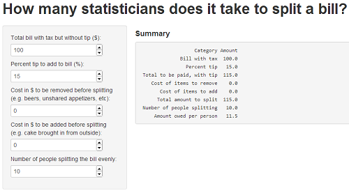
    However! Our lunches always lead us back to the age old question: How many statisticians does it take to split a bill? Answer: too long. I threw together a Shiny app, DinneR, to help us answer this question 🙂

DinneR

  • The first-year PhD courses in Statistics and in Machine Learning have rather different approaches.
    • Statistics professor: Just assume we can compute this estimator. In class we’ll prove that the estimates are reasonably good (e.g. we’ll bound the probability that an estimate is far from the true value).
    • Machine Learning professor: Just trust me that this algorithm gets useful estimates. In class we’ll prove that we can compute it in a reasonable amount of time (e.g. we’ll bound the number of steps until the algorithm converges).
    • Somewhere between these ideas, I ran into the sensible concept of optimizing only until your solution is within statistical error. For example, say you only have enough data to publish an estimate with a confidence interval of +\- 0.1 units. If your optimization algorithm is computer-intensive, then running it until it converges to +\- 0.00001 units is just a waste of time. For instance, see Bottou & Bousquet’s “The Tradeoffs of Large Scale Learning.”
  • My ML professor, midway through a classification-focused semester, finally discussing regression for 10 minutes: “…And that’s all you need to know about regression.”
    My Regression professor, at end of semester, finally discussing classification for 20 minutes: “…And that’s all you need to know about classification.” 🙂
  • In any class that covers proofs or other long detailed arguments, handouts+chalkboards are seriously better than slideshows. With a chalkboard, you can show the whole proof at once—so if students get lost halfway through, they can still see the claim we’re proving and all the steps we’ve made so far. But when you cram a proof onto slides, either you oversimplify to get it onto one slide; or you split it across slides, so that we lose the continuity (and may even forget what we’re trying to prove).
  • Good homeworks and quick feedback are critical. One of my classes had weekly homeworks, each directly tied to the material we just covered, each problem expanding on a good question or illustrating an interesting principle from class. Homeworks were graded within a week, every single time.
    In another class, we had just a few homeworks, very loosely tied to the lecture contents and usually at a very different level (way too easy or too hard relative to what the lecture covered). Although this class had the same number of students and TAs as the other one, we never got our homeworks back in less than 2 weeks—and one of them took a full 2 months to return!
  • TAing is a mixed bag. I enjoy holding office hours and being there during lab sessions to help students understand something they were missing. I do not so much enjoy grading homeworks and labs by those students who don’t ask questions, don’t come to office hours, and clearly don’t read the comments I leave on their assignments since I see them make the same mistakes over and over. I especially don’t like finding instances of cheating. Urgh.
  • I was a bit worried about coming back to grad school as an “older” student (the youngest guy in our 1st-year PhD cohort is almost a decade younger than me!). But it’s been great, actually:
    • My schedule seems much saner than some of my classmates’. Quite a few seem to stay in the office until late most nights, then may sleep through a morning class. For me, after years of waking at 6:30 to spend an hour on the crowded metro to work… it’s been luxurious to sleep in until 7:30 or 8, walk to school in half an hour in the fresh air, have a focused workday of reasonable length, and come home for dinner with my wife, actually relaxing in the evening instead of studying until 3am. Yes, there’s the occasional late night, but occasional is the key word there.
    • The income’s lower than my old job, of course, but Pittsburgh is much cheaper than DC, especially for housing. Besides: my previous school loans are all paid off, I have a fair chunk of retirement savings already earning interest, and my wife and I are used to budgeting. (YNAB is an excellent tool for this—I will blog about it at some point. If you’re interested, here’s a slight discount referral code, or you can wait for the big sale they seem to have every 3-4 months.)
      [My point is: despite the drop in income, we’re still more financially secure (thanks to savings and paid-off loans) than if I’d gone straight into the PhD from my MSc.]
    • As Cosma Shalizi points out: “Note to graduate students: It is important that you internalize that you are, in fact, a badass…” With age and experience, I’m far more able to speak confidently when it’s called for (e.g. giving a talk), and far less intimidated about tackling new topics, talking to professors, writing papers, speaking at conferences, etc.
  • On the other hand, despite longer experience as a statistician than my classmates, I appreciate and admire that they are much better at many things. I’m really impressed by my various classmates’ command of topics like real analysis and measure theory, scientific computing, or practical knowledge about fields like physics or economics.
  • Pittsburgh is a great town. Affordable housing, decent bus system, beautiful scenic views from the inclines, friendly people, livable walkable neighborhoods, tons of good food, extensive and well-run library system… It has a lot of what I liked about Portland, without as much of the “Portlandia” over-the-top hipsters. There are also beautiful old buildings, like the Carnegie Natural History Museum (with its sweet dinosaur exhibit) and UPitt’s Cathedral of Learning. The weather right now is pretty snowy/icy, but I don’t mind—I’m honestly impressed by how well Pittsburgh just goes ahead and deals with winter weather, in comparison to DC’s city-wide shutdown every time a snowflake is sighted.

Edit: Here’s another good post on the first semester of a PhD program, from several mathematics students. I agree with most of the responses, especially the ones that conflict each other 🙂

Next up: the 2nd, 3rd, 4th, 5th, 6th, 7th, 8th, 9th, and 10th semesters of my Statistics PhD program.

audiolyzR: Data sonification with R

Update (5/15/2014): I just realized audiolyzR is publicly available on CRAN. See also co-creator Jesse Garrison’s audiolyzR page.

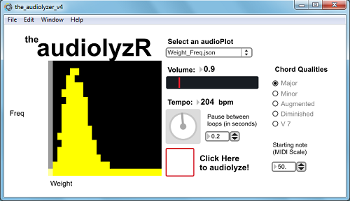
In his talk “Give Your Data A Listen” at last summer’s useR! 2012 conference, Eric Stone presented joint work with Jesse Garrison on audiolyzR, an R package for “data sonification.” I thought this was a nifty and well-executed idea. Since I haven’t seen Eric and Jesse post any demos online yet, I’d like to share a summary and video clip here, so that I can point to them whenever I describe audiolyzR to other folks.

audiolyzR

In August I invited Eric to my workplace to speak, and he gave us a great talk including demos of features added since the useR session. Here’s the post-event summary:

Eric Stone, a PhD student at Temple University, presented his co-authored work with Jesse Garisson on “data sonification”: using sound (other than speech) to visualize a dataset.
Eric demonstrated audiolizations of scatterplots and histograms using the statistical software R and the audio toolkit Max/MSP, as well as his ongoing research on time-series line plots. The software shows a visual display of the data and then plays an audio version, with the x-axis mapped to time and the y-axis to pitch. For instance, a positively-correlated scatterplot sounds like rising scales or arpeggios. Other variables are represented by timbre, volume, etc. to distinguish them. The analyst can also tweak the tempo and other settings while listening to the data repeatedly to help outliers stand out more clearly. A few training examples helped the audience to learn how to listen to these audiolizations and identify these outliers.
Eric believes that, even if the audiolization itself is no clearer than a visual plot, activating multiple cortices in the brain makes the analyst more attuned to the data. As a musician since childhood, he succeeded in making the results sound pleasant so that they do not wear out the listener.
The software will soon be released as an R package and linked to RExcel to expand its reach to Excel users. Future work includes: 1) supporting more data structures and more layers of data in the same audiolization; 2) testing the software with visually impaired users as a tool for accessibility; and 3) developing ways to embed the audiolizations into a website.

Eric suggested that he can imagine someone using this as part of an information dashboard or for reviewing a zillion different data views in a row, while multi-tasking: Just set it to loop through each slice of the data while you work on something else. Your ears will alert you when you hit a data slice that’s unusual and worth investigating further.

Eric has kindly sent me a version of the package, and below I demonstrate a few examples using NHANES data:

I’ve asked Eric if there’s a public release coming anytime soon, but it may be a while:

I am nearly ready to release it, but it’s one of those situations where my advisor will come up with “just one more thing” to add, so, you know, it might be a while.. Anyway, if people are interested I can provide them with the software and everything. Just let me know if anyone is.

If you want to get in touch with Eric, his contact info is in the useR talk abstract linked at the top.

On a very-loosely-related note, consider also John Cook’s post on measuring evidence in decibels. Someday I’d like to re-read this after I’ve had my morning coffee and think about if there’s any useful way to turn this metaphor into literal sonic hypothesis testing.

DC R Meetup: “Analyze US Government Survey Data with R”

I really enjoyed tonight’s DC R Meetup, presented by the prolific Anthony Damico. [Edit: adding link to the full video of Anthony’s talk; review is below.]

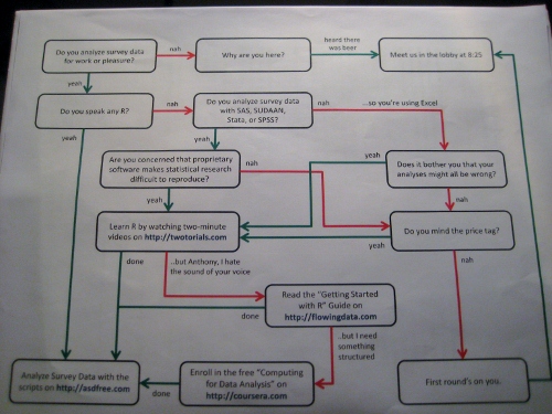
DamicoFlowchart (small)

I’ve met Anthony before to discuss whether the Census Bureau could either…

  • publish R-readable input statements for flat file public datasets (instead of only the SAS input statements we publish now); or…
  • cite his R package sascii, which automatically processes a SAS input file and reads data directly into R (no actual SAS installation required!). Folks agree sascii is an excellent tool and we’re working on the approvals to mention it on the relevant download pages.

Meanwhile, Anthony’s not just waiting around. He’s put together an awesome blog, asdfree.com (“Analyze Survey Data for Free”), where he posts complete R instructions for finding, downloading, importing, and analyzing each of several publicly-available US government survey datasets. These include, in his words, “obsessively commented” R scripts that make it easy to follow his logic and understand the analysis examples. Of course, “My syntax does not excuse you from reading the technical documentation,” but the blog posts point you to the key features of the tech docs. For each dataset on the blog, he also makes sure to replicate a set of official estimates from that survey, so you can be confident that R is producing the same results that it should. Continue reading “DC R Meetup: “Analyze US Government Survey Data with R””

Animated map of 2012 US election campaigning, with R and ffmpeg

[vimeo 52312754]

(Video link here, in case the embedded player doesn’t work for you.)

Idea: see if I can mimic the idea behind Ben Schmidt’s lovely video of ocean shipping routes, and apply it to another dataset. But which?
“Hmm… what’s another interesting dataset about some competitors traveling around a mostly-fixed area at the same time?… Hey friends, stop  giving me election news, I need to think of an idea… Oh.” Continue reading “Animated map of 2012 US election campaigning, with R and ffmpeg”

Javascript and D3 for R users, part 2: running off the R server instead of Python

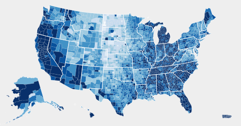
Thank you all for the positive responses to Basics of JavaScript and D3 for R Users! Quick update: last time we had to dabble in a tiny bit of Python to start a local server, in order to actually run JavaScript and D3 examples on our home computer… However, commenter Shankar had the great idea of using the R server instead. He provided some example code, but reported that it didn’t work with all the examples.

Here’s my alternative code, which works with all the D3 examples I’ve tried so far. Unlike Shankar’s approach with lower-level functions, I found it simpler to use Jeffrey Horner’s excellent Rook package.

# Load the Rook library
library(Rook)

# Where is your d3 directory located?
myD3dir <- 'C:/Downloads'

# Start the server
s <- Rhttpd$new()
s$start(quiet=TRUE)

# To view a different D3 example,
# change the directory and .html file names below
# and rerun s$add() and s$browse()
s$add(
app=Builder$new(
Static$new(
# List all the subdirectories that contain
# any files it will need to access (.js, .css, .html, etc)
urls = c('/d3','/d3/examples','/d3/examples/choropleth'),
root = myD3dir
),
Redirect$new('/d3/examples/choropleth/choropleth.html')
),
name='d3'
)
s$browse(2)
# browse(1) would load the default RookTest app instead

# When you're done,
# clean up by stopping and removing the server
s$stop()
s$remove(all=TRUE)
rm(s)

If I understand the Rook documentation correctly, you just can’t browse directories using R’s local server. So you’ll have to type in the exact directory and HTML file for each example separately. But otherwise, this should be a simple way to play with D3 for anyone who’d rather stick within R instead of installing Python.

Basics of JavaScript and D3 for R Users

Hadley Wickham, creator of the ggplot2 R package, has been learning JavaScript and its D3 library for the next iteration of ggplot2 (tentatively titled r2d3?)… so I suspect it’s only a matter of time before he pulls the rest of the R community along.

Below are a few things that weren’t obvious when I first tried reading JavaScript code and the D3 library in particular. (Please comment if you notice any errors.) Then there’s also a quick walkthrough for getting D3 examples running locally on your computer, and finally a list of other tutorials & resources. In a future post, we’ll explore one of the D3 examples and practice tweaking it.

Perhaps these short notes will help other R users get started more quickly than I did. Even if you’re a ways away from writing complex JavaScript from scratch, it can still be useful to take one of the plentiful D3 examples and modify it for your own purposes. Continue reading “Basics of JavaScript and D3 for R Users”