
I’ve updated the interactive poverty map from last month, providing better labels, legends, and a clickable link to the data source. It also actually compares confidence intervals correctly now. I may have switched the orange and purple colors too. (I also reordered the code so that things are defined in the right order; I think that was why sometimes you’d need to reload the map before the interactivity would work.)
Please click the screenshot to try the interactive version (seems to work better in Firefox than Internet Explorer):
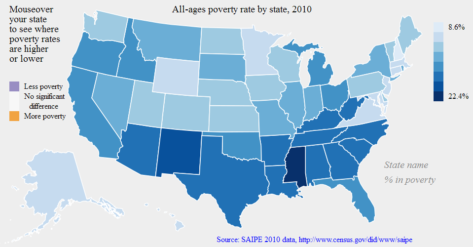
Next steps: redo the default color scheme so it shows the states relative to the national average poverty rate; figure out why there are issues in the IE browser; clean up the code and share it on Github.
[Edit: the IE issues seem to be caused by D3’s use of the SVG format for its graphics; older versions of IE do not support SVG graphics. I may try to re-do this map in another Javascript library such as Raphaël, which can apparently detect old versions of IE and use another graphics format when needed.]
For lack of a better term I’m still using “idiopleth”: idio as in idiosyncratic (i.e. what’s special about this area?) and pleth as in plethora (or choropleth, the standard map for a multitude of areas). Hence, together, idiopleth: one map containing a multitude of idiosyncratic views. Please leave a comment if you know of a better term for this concept already.