
The Census Bureau is beta-testing a new API for developers. As I understand it, within hours of the API going live, Jan Vink incorporated it into an updated version of the interactive maps I’ve discussed before.
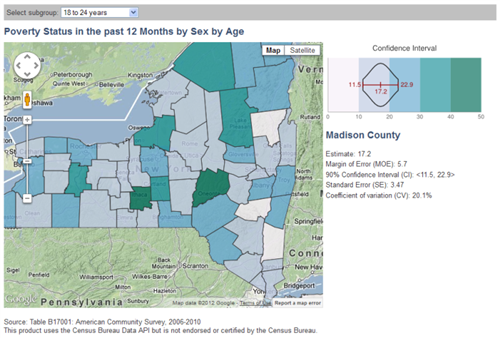
I think the placement of the legend on the side makes it easier to read than the previous version, where it was below. It’s a great development for the map — and a good showcase for the Census Bureau’s API, which I hope will become ready for public use in the near future.
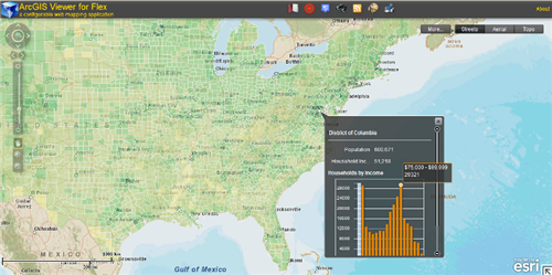
I’d love to see this and related approaches become available in several environments or frameworks for online/interactive mapping tools. One possibility is to make widgets for the ArcGIS Viewer for Flex platform, which works with ESRI’s ArcGIS products.
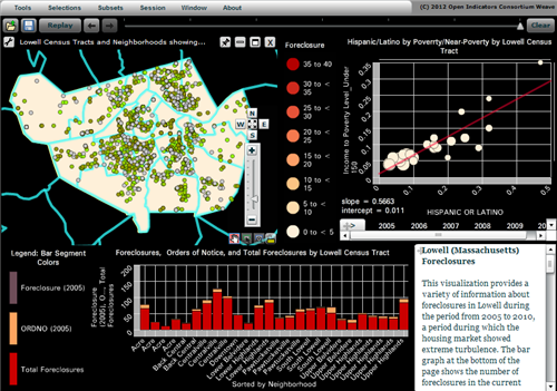
Another great environment I’m just learning about is Weave. This week the Census Bureau is hosting Dr. Georges Grinstein, of the University of Massachusetts at Lowell, who is building a powerful open-source platform for integrating and visualizing data. This is being developed alongside a consortium of local governments and nonprofits who are using Weave for information dashboards, data dissemination, etc.
It seems to be a mix of Actionscript, Javascript, and C++, so extending Weave’s core functionality sounds a bit daunting, but I was very glad to see that advanced users can call R scripts inside of a visualization. This will let you analyze and plot data in ways that the Weave team did not explicitly foresee.
In short, there’s plenty of exciting work being done in this arena!
The brushing and linking on the Weave project is really great. And they seem to to have given thought to how to stream very large vector files. This is a really difficult problem, in general, much more difficult than streaming images. It is still really slow, though, and I didn’t see how to interface with R.
One thing I notice in many of these examples, and that remains a challenge for interactive graphics… is the lopsided tradeoff between analysis and presentation. After using interactive graphics to do some neat exploratory analysis, it is not always easy to then get your analysis out of whichever program you are using in order to present it to someone.
Grinstein said the streaming has been a big focus for them. Their targets are no more than 20 seconds to download the data / load a visualization, and no more than 1 second delay on interactions. I think they’ve developed a binary format for the files in-house, and they keep finding ways to speed it all up as the datasets get larger.
Whoops, I linked to an example whose authors apparently chose to disable R scripting. Try this one instead:
http://demo.oicweave.org:8080/weave.html?defaults=obesity.xml
On the menu, go to Tools -> Add R Script Editor. (I haven’t tried it myself yet except to see that it’s there, so I don’t know how easy it is to use.)
In terms of the presentation, I agree, it’s tricky to cross from exploratory analysis to a debrief for decision-makers or final product for the general public. At least the Weave folks are planning to keep a record of the analysis history so you can see how you got to where you are, and to make it easy to save your final graphics in very-high-resolution images for printing hardcopies. But these features might still be in development.