After 5th semester of statistics PhD program

Better late than never—here are my hazy memories of last semester. It was one of the tougher ones: an intense teaching experience, attempts to ratchet up research, and parenting a baby that’s still too young to entertain itself but old enough to get into trouble.

Previous posts: the 1st, 2nd, 3rd, and 4th semesters of my Statistics PhD program.

Classes

I’m past all the required coursework, so I only audited Topics in High Dimensional Statistics, taught by Alessandro Rinaldo as a pair of half-semester courses (36-788 and 36-789). “High-dimensional” here loosely means problems where you have more variables (p) than observations (n). For instance, in genetic or neuroscience datasets, you might have thousands of measurements each from only tens of patients. The theory here is different than in traditional statistics because you usually assume that p grows with n, so that getting more observations won’t reduce the problem to a traditional one.

This course focused on some of the theoretical tools (like concentration inequalities) and results (like minimax bounds) that are especially useful for studying properties of high-dimensional methods. Ale did a great job covering useful techniques and connecting the material from lecture to lecture.

In the final part of the course, students presented recent minimax-theory papers. It was useful to see my fellow students work through how these techniques are used in practice, as well as to get practice giving “chalk talks” without projected slides. I gave a talk too, preparing jointly with my classmate Lingxue Zhu (who is very knowledgeable, sharp, and always great to work with!) Ale’s feedback on my talk was that it was “very linear”—I hope that was a good thing? Easy to follow?

Also, as in every other stats class I’ve had here, we brought up the curse of dimensionality—meaning that, in high-dimensional data, very few points are likely to be near the joint mean. I saw a great practical example of this in a story about the US Air Force’s troubles designing fighter planes for the “average” pilot.

Teaching

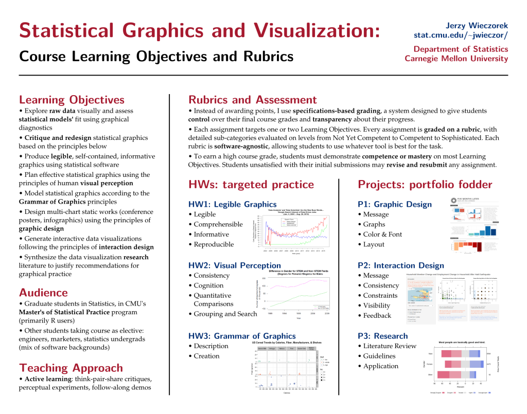
I taught a data visualization course! Check out my course materials here. There’ll be a separate post reflecting on the whole experience. But the summer before, it was fun (and helpful) to binge-read all those dataviz books I’ve always meant to read.

I’ve been able to repurpose my lecture materials for a few short talks too. I was invited to present a one-lecture intro to data viz for Seth Wiener‘s linguistics students here at CMU, as well as for a seminar on Data Dashboard Design run by Matthew Ritter at my alma mater (Olin College). I also gave an intro to the Grammar of Graphics (the broader concept behind ggplot2) for our Pittsburgh useR Group.

Research

I’m officially working with Jing Lei, still looking at sparse PCA but also some other possible thesis topics. Jing is a great instructor, researcher, and collaborator working on many fascinating problems. (I also appreciate that he, too, has a young child and is understanding about the challenges of parenting.)

But I’m afraid I made very slow research progress this fall. A lot of my time went towards teaching the dataviz course, and plenty went to parenthood (see below), both of which will be reduced in the spring semester. I also wish I had some grad-student collaborators. I’m not part of a larger research group right now, so meetings are just between my advisor and me. Meetings with Jing are very productive, but in between it’d also be nice to hash out tough ideas together with a fellow student, without taking up an advisor’s time or stumbling around on my own.

Though it’s not quite the same, I started attending the Statistical Machine Learning Reading Group regularly. Following these talks is another good way to stretch my math muscles and keep up with recent literature.

Life

As a nice break from statistics, we got to see our friends Bryan Wright and Yuko Eguchi both defend their PhD dissertations in musicology. A defense in the humanities seems to be much more of a conversation involving the whole committee, vs. the lecture given by Statistics folks defending PhDs.

Besides home and school, I’ve been a well-intentioned but ineffective volunteer, trying to manage a few pro bono statistical projects. It turns out that virtual collaboration, managing a far-flung team of people who’ve never met face-to-face, is a serious challenge. I’ve tried reading up on advice but haven’t found any great tips—so please leave a comment if you know any good resources.

So far, I’ve learned that choosing the right volunteer team is important. Apparent enthusiasm (I’m eager to have a new project! or even eager for this particular project!) doesn’t seem to predict commitment or followup as well as apparent professionalism (whether or not I’m eager, I will stay organized and get s**t done).

Meanwhile, the baby is no longer in the “potted-plant stage” (when you can put him down and expect he’ll still be there a second later), but not yet in day care, while my wife is returning to part-time work. After this semester, we finally got off the wait-lists and into day care, but meanwhile it was much harder to juggle home and school commitments this semester.

However, he’s an amazing little guy, and it’s fun finally taking him to outings and playdates at the park and zoo and museums (where he stares at the floor instead of exhibits… except for the model railroad, which he really loved!) We also finally made it out to Kennywood, a gorgeous local amusement park, for their holiday light show.

Here’s to more exploration of Pittsburgh as the little guy keeps growing!

Next up

The 6th, 7th, 8th, 9th, and 10th semesters of my Statistics PhD program.

Tapestry 2016 conference: overview and keynote speakers

Overview

Encouraged by Robert Kosara’s call for applications, I attended the Tapestry 2016 conference two weeks ago. As advertised, it was a great chance to meet others from all over the data visualization world. I was one of relatively few academics there, so it was refreshing to chat with journalists, industry analysts, consultants, and so on. (Journalists were especially plentiful since Tapestry is the day before NICAR, the Computer-Assisted Reporting Conference.) Thanks to the presentations, posters & demos, and informal chats throughout the day, I came away with new ideas for improving my dataviz course and my own visualization projects.

I also presented a poster and handout on the course design for my Fall 2015 dataviz class. It was good to get feedback from other people who’ve taught similar courses, especially on the rubrics and assessment side of things.

The conference is organized and sponsored by the folks at Tableau Software. Although I’m an entrenched R user myself, I do appreciate Tableau’s usefulness in bringing the analytic approach of the grammar of graphics to people who aren’t dedicated programmers. To help my students and collaborators, I’ve been meaning to learn to use Tableau better myself. Folks there told me I should join the Pittsburgh Tableau User Group and read Dan Murray’s Tableau Your Data!.

Below are my notes on the three keynote speakers: Scott Klein on the history of data journalism, Jessica Hullman on research into story patterns, and Nick Sousanis on comics and visual thinking vs. traditional text-based scholarship.
My next post will continue with notes on the “short stories” presentations and some miscellaneous thoughts.

Continue reading “Tapestry 2016 conference: overview and keynote speakers”

Are you really moving to Canada?

It’s another presidential election year in the USA, and you know what that means: Everyone’s claiming they’ll move to Canada if the wrong candidate wins. But does anyone really follow through?

Anecdotal evidence: Last week, a Canadian told me she knows at least a dozen of her friends back home are former US citizens who moved, allegedly, in the wake of disappointing election results. So perhaps there’s something to this claim/threat/promise?

Statistical evidence: Take a look for yourself.

MovingToCanada

As a first pass, I don’t see evidence of consistent, large spikes in migration right after elections. The dotted vertical lines denote the years after an election year, i.e. the years where I’d expect spikes if this really happened a lot. For example: there was a US presidential election at the end of 1980, and the victor took office in 1981. So if tons of disappointed Americans moved to Canada afterwards, we’d expect a dramatically higher migration count during 1981 than 1980 or 1982. The 1981 count is a bit higher than its neighbors, but the 1985 is not, and so on. Election-year effects alone don’t seem to drive migration more than other factors.

What about political leanings? Maybe Democrats are likely to move to Canada after a Republican wins, but not vice versa? (In the plot, blue and red shading indicate Democratic and Republican administrations, respectively.) Migration fell during the Republican administrations of the ’80s, but rose during the ’00s. So, again, the victor’s political party doesn’t explain the whole story either.

I’m not an economist, political scientist, or demographer, so I won’t try to interpret this chart any further. All I can say is that the annual counts vary by a factor of 2 (5,000 in the mid-’90s, compared to 10,000 around 1980 or 2010)… So the factors behind this long-term effect seems to be much more important than any possible short-term election-year effects.

Extensions: Someone better informed than myself could compare this trend to politically-motivated migration between other countries. For example, my Canadian informant told me about the Quebec independence referendum, which lost 49.5% to 50.5%, and how many disappointed Québécois apparently moved to France afterwards.

Data notes: I plotted data on permanent immigrants (temporary migration might be another story?) from the UN’s Population Division, “International Migration Flows to and from Selected Countries: The 2015 Revision.” Of course it’s a nontrivial question to define who counts as an immigrant. The documentation for Canada says:

International migration data are derived from administrative sources recording foreigners who were granted permission to reside permanently in Canada. … The number of immigrants is subject to administrative corrections made by Citizenship and Immigration Canada.

Lunch with ASA president Jessica Utts

The president of the American Statistical Association, Jessica Utts, is speaking tonight at the Pittsburgh ASA Chapter meeting. She stopped by CMU first and had lunch with us grad students here.

LOGO FINALBRAND_Tagline under

First of all, I recommend reading Utts’ Comment on statistical computing, published 30 years ago. She mentioned a science-fiction story idea about a distant future (3 decades later, i.e. today!) in which statisticians are forgotten because everyone blindly trusts the black-box algorithm into which we feed our data. Of course, at some point in the story, it fails dramatically and a retired statistician has to save the day.
Utts gave good advice on avoiding that dystopian future, although some folks are having fun trying to implement it today—see for example The Automatic Statistician.
In some ways, I think that this worry (of being replaced by a computer) should be bigger in Machine Learning than in Statistics. Or, perhaps, ML has turned this threat into a goal. ML has a bigger culture of Kaggle-like contests: someone else provides data, splits it into training & test sets, asks a specific question (prediction or classification), and chooses a specific evaluation metric (percent correctly classified, MSE, etc.) David Donoho’s “50 years of Data Science” paper calls this the Common Task Framework (CTF). Optimizing predictions within this framework is exactly the thing that an Automatic Statistician could, indeed, automate. But the most interesting parts are the setup and interpretation of a CTF—understanding context, refining questions, designing data-collection processes, selecting evaluation metrics, interpreting results… All those fall outside the narrow task that Kaggle/CTF contestants are given. To me, such setup and interpretation are closer to the real heart of statistics and of using data to learn about the world. It’s usually nonsensical to even imagine automating them.

Besides statistical computing, Utts has worked on revamping statistics education more broadly. You should read her rejoinder to George Cobb’s article on rethinking the undergrad stats curriculum.

Utts is also the Chief Reader for grading the AP Statistics exams. AP Stats may need to change too, just as the undergraduate stats curriculum is changing… but it’s a much slower process, partly because high school AP Stats teachers aren’t actually trained in statistics the way that college and university professors are. There are also issues with computer access: even as colleges keep moving towards computer-intensive methods, in practice it remains difficult for AP Stats to assess fairly anything that can’t be done on a calculator.

Next, Utts told us that the recent ASA statement on p-values was inspired as a response to the psychology journal, BASP, that banned them. I think it’s interesting that the statement is only on p-values, even though BASP actually banned all statistical inference. Apparently it was difficult enough to get consensus on what to say about p-values alone, without agreeing on what to say about alternatives (e.g. publishing intervals, Bayesian inference, etc.) and other related statistical concepts (especially power).

Finally, we had a nice discussion about the benefits of joining the ASA: networking, organizational involvement (it’s good professional experience and looks good on your CV), attending conferences, joining chapters and sections, getting the journals… I learned that the ASA website also has lesson plans and teaching ideas, which seems quite useful. National membership is only $18 a year for students, and most local chapters or subject-matter sections are cheap or free.

The ASA has also started a website Stats.org for helping journalists understand, interpret, and report on statistical issues or analyses. If you know a journalist, tell them about this resource. If you’re a statistician willing to write some materials for the site, or to chat with journalists who have questions, go sign up.

Tapestry 2016 materials: LOs and Rubrics for teaching Statistical Graphics and Visualization

Here are the poster and handout I’ll be presenting tomorrow at the 2016 Tapestry Conference.

Poster "Statistical Graphics and Visualization: Course Learning Objectives and Rubrics"

My poster covers the Learning Objectives that I used to design my dataviz course last fall, along with the grading approach and rubric categories that I used for assessment. The Learning Objectives were a bit unusual for a Statistics department course, emphasizing some topics we teach too rarely (like graphic design). The “specs grading” approach1 seemed to be a success, both for student motivation and for the quality of their final projects.

The handout is a two-sided single page summary of my detailed rubrics for each assignment. By keeping the rubrics broad (and software-agnostic), it should be straightforward to (1) reuse the same basic assignments in future years with different prompts and (2) port these rubrics to dataviz courses in other departments.

I had no luck finding rubrics for these learning objectives when I was designing the course, so I had to write them myself.2 I’m sharing them here in the hopes that other instructors will be able to reuse them—and improve on them!

Any feedback is highly appreciated.


Footnotes:

PolicyViz episode on teaching data visualization

When I was still in DC, I knew Jon Schwabish’s work designing information and data graphics for the Congressional Budget Office. Now I’ve run across his podcast and blog, PolicyViz. There’s a lot of good material there.

I particularly liked a recent podcast episode that was a panel discussion about teaching dataviz. Schwabish and four other experienced instructors talked about course design, assignments and assessment, how to teach implementation tools, etc.

I recommend listening to the whole thing. Below are just notes-to-self on the episode, for my own future reference.

Continue reading “PolicyViz episode on teaching data visualization”

A year after BASP banned statistical inference

Last year, as I noted, there was a big fuss about the journal Basic and Applied Social Psychology, whose editors decided to ban all statistical inference.1 No p-values, no confidence intervals, not even Bayesian posteriors; only descriptive statistics allowed.

The latest (Feb 2016) issue of Significance magazine has an interview with David Trafimow, the editor of BASP [see Vol 13, Issue 1, “Interview” section; closed access, unfortunately].

The interview suggests Trafimow still doesn’t understand the downsides of banning statistical inference. However, I do like this quote:

Before the ban, much of the reviewer commentary on submissions pertained to inferential statistical issues. With the ban in place, these issues fall by the wayside. The result has been that reviewers have focused more on basic research issues (such as the worth of the theory, validity of the research design, and so on) and applied research issues (such as the likelihood of the research actually resulting in some sort of practical benefit).

Here’s my optimistic interpretation: You know how sometimes you ask a colleague to review what you wrote, but they ignore major conceptual problems because they fixated on finding typos instead? If inferential statistics are playing the same role as typos—a relatively small detail that distracts from the big picture—then indeed it could be OK to downplay them.2

Finally, if banning inference forces authors to have bulletproof designs (a sample so big and well-structured that you’d trust the results without asking to see p-values or CI widths), that would truly be good for science. If they allowed, nay, required preregistered power calculations, then published the results of any sufficiently-powered experiment, this would even help with the file-drawer problem. But it doesn’t sound like they’re necessarily doing this.


Related posts:

Footnotes:

The Elements of Graphing Data, William S. Cleveland

Bill Cleveland is one of the founding figures in statistical graphics and data visualization. His two books, The Elements of Graphing Data and Visualizing Data, are classics in the field, still well-worth reading today.

Visualizing is about the use of graphics as a data analysis tool: how to check model fit by plotting residuals and so on. Elements, on the other hand, is about the graphics themselves and how we read them. Cleveland (co)-authored some of the seminal papers on human visual perception, including the often-cited Cleveland & McGill (1984), “Graphical Perception: Theory, Experimentation, and Application to the Development of Graphical Methods.” Plenty of authors doled out common-sense advice about graphics before then, and some even ran controlled experiments (say, comparing bars to pies). But Cleveland and colleagues were so influential because they set up a broader framework that is still experimentally-testable, but that encompasses the older experiments (say, encoding data by position vs length vs angle vs other things—so that bars and pies are special cases). This is just one approach to evaluating graphics, and it has limitations, but it’s better than many competing criteria, and much better than “because I said so” *coughtuftecough* 🙂

In Elements, Cleveland summarizes his experimental research articles and expands on them, adding many helpful examples and summarizing the underlying principles. What cognitive tasks do graph readers perform? How do they relate to what we know about the strengths and weaknesses of the human visual system, from eye to brain? How do we apply this research-based knowledge, so that we encode data in the most effective way? How can we use guides (labels, axes, scales, etc.) to support graph comprehension instead of getting in the way? It’s a lovely mix of theory, experimental evidence, and practical advice including concrete examples.

Now, I’ll admit that (at least in the 1st edition of Elements) the graphics certainly aren’t beautiful: blocky all-caps fonts, black-and-white (not even grayscale), etc. Some data examples seem dated now (Cold War / nuclear winter predictions). The principles aren’t all coherent. Each new graph variant is given a name, leading to a “plot zoo” that the Grammar of Graphics folks would hate. Many examples, written for an audience of practicing scientists, may be too technical for lay readers (for whom I strongly recommend Naomi Robbins’ Creating More Effective Graphs, a friendlier re-packaging of Cleveland).

Nonetheless, I still found Elements a worthwhile read, and it made a big impact on the data visualization course I taught. Although the book is 30 years old, I still found many new-to-me insights, along with historical context for many aspects of R’s base graphics.

[Edit: I’ll post my notes on Visualizing Data separately.]

Below are my notes-to-self, with things-to-follow-up in bold:

Continue reading The Elements of Graphing Data, William S. Cleveland”

A cursory overview of Differential Privacy

I went to a talk today about Differential Privacy. Unfortunately the talk was rushed due to a late start, so I didn’t quite catch the basic concept. But later I found this nice review paper by Cynthia Dwork who does a lot of research in this area. Here’s a hand-wavy summary for myself to review next time I’m parsing the technical definition.

I’m used to thinking about privacy or disclosure prevention as they do at the Census Bureau. If you release a sample dataset, such as the ACS (American Community Survey)’s PUMS (public use microdata sample), you want to preserve the included respondents’ confidentiality. You don’t want any data user to be able to identify individuals from this dataset. So you perturb the data to protect confidentiality, and then you release this anonymized sample as a static database. Anyone who downloads it will get the same answer each time they compute summaries on this dataset.

(How can you anonymize the records? You might remove obvious identifying information (name and address); distort some data (add statistical noise to ages and incomes); topcode very high values (round down the highest incomes above some fixed level); and limit the precision of variables (round age to the nearest 5-year range, or give geography only at a large-area level). If you do this right, hopefully (1) potential attackers won’t be able to link the released records to any real individuals, and (2) potential researchers will still get accurate estimates from the data. For example, say you add zero-mean random noise to each person’s age. Then the mean age in this edited sample will still be near the mean age in the original sample, even if no single person’s age is correct.)

So we want to balance privacy (if you include *my* record, it should be impossible for outsiders to tell that it’s *me*) with utility (broader statistical summaries from the original and anonymized datasets should be similar).

In the Differential Privacy setup, the setting and goal are a bit different. You (generally) don’t release a static version of the dataset. Instead, you create an interactive website or something, where people can query the dataset, and the website will always add some random noise before reporting the results. (Say, instead of tweaking each person’s age, we just wait for a user to ask for something. One person requests the mean age, and we add random noise to that mean age before we report it. Another user asks for mean age among left-handed college-educated women, and we add new random noise to this mean before reporting it.)

If you do this right, you can get a Differential Privacy guarantee: Whether or not *I* participate in your database has only a small effect on the risk to *my* privacy (for all possible *I* and *my*). This doesn’t mean no data user can identify you or your sensitive information from the data… only that your risk of identification won’t change much whether or not you’re included in the database. Finally, depending on how you choose the noise mechanism, you can ensure this Differential Privacy retains some level of utility: estimates based on these noisified queries won’t be too far from the noiseless versions.

At first glance, this isn’t quite satisfying. It feels in the spirit of several other statistical ideas, such as confidence intervals: it’s tractable for theoretical statisticians to work with, but it doesn’t really address your actual question/concern.

But in a way, Dwork’s paper suggests that this might be the best we can hope for. It’s possible to use a database to learn sensitive information about a person, even if they are not in that database! Imagine a celebrity admits on the radio that their income is 100 times the national median income. Using this external “auxiliary” information, you can learn the celebrity’s income from any database that’ll give you the national median income—even if the celebrity’s data is not in that database. Of course much subtler examples are possible. In this sense, Dwork argues, you can never make *absolute* guarantees to avoid breaching anyone’s privacy, whether or not they are in your dataset, because you can’t control the auxiliary information out there in the world. But you can make the *relative* guarantee that a person’s inclusion in the dataset won’t *increase* their risk of a privacy breach by much.

Still, I don’t think this’ll really assuage people’s fears when you ask them to include their data in your Differentially Private system:

“Hello, ma’am, would you take our survey about [sensitive topic]?”
“Will you keep my responses private?”
“Well, sure, but only in the sense that this survey will *barely* raise your privacy breach risk, compared to what anyone could already discover about you on the Internet!”
“…”
“Ma’am?”
“Uh, I’m going to go off the grid forever now. Goodbye.” [click]
“Dang, we lost another one.”

Manual backtrack: Three-Toed Sloth.