Scientific American has a short article on trends in undergraduate degrees over the past 20 years, illustrated with a great infographic by Nathan Yau. As a big fan of STEM (science, tech, engineering and math) education, I was pleased to see data on changing patterns among STEM degree earners.
However, there seemed to be a missed opportunity. The article mentioned that “More women are entering college, which in turn is changing the relative popularity of disciplines.” If the data were broken down by gender, readers could better see this fact for themselves.
I thought I could exploit the current graphic’s slight redundancy: the bar heights below and above the gray horizontal lines are exactly the same. Why not repurpose this format to show data on degrees earned by men vs. by women (below vs. above the horizontal line), in the same amount of space?
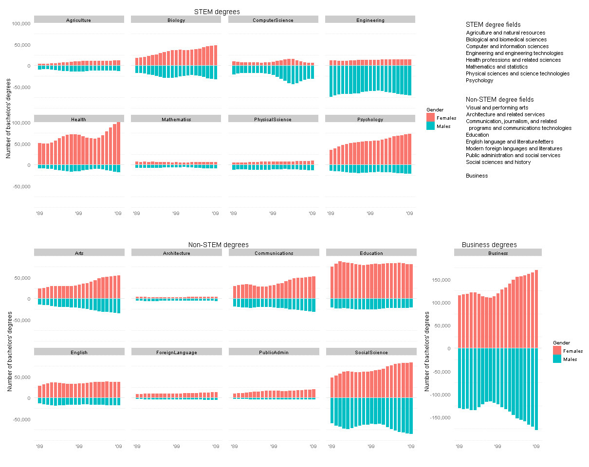
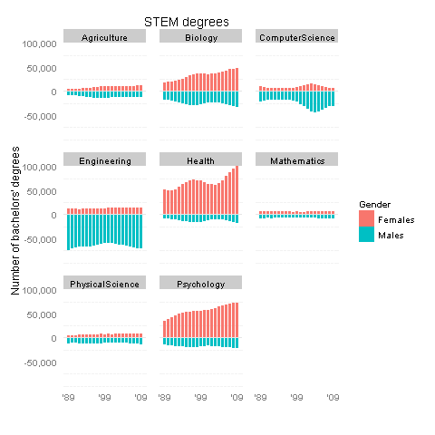
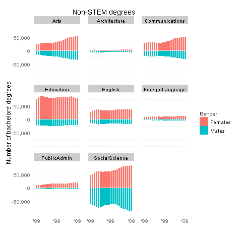
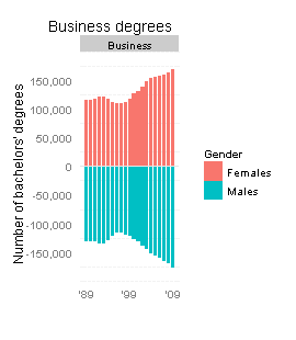
I could not find the gender breakdown for the exact same set of degrees, but a similar dataset is in the Digest of Education Statistics, tables 308 to 330. Here are my revised plots, made using R with the ggplot2 package.
Click this thumbnail to see all the data in one plot (it’s too big for the WordPress column width):

Or see the STEM and non-STEM plots separately below.
So, what’s the verdict? These new graphs do support SciAm’s conclusions: women are largely driving the increases in psychology and biology degrees (as well as “health professions and related sciences”), and to a lesser degree in the arts and communications. On the other hand, increases in business and social science degrees appear to be driven equally by males and females. The mid-’00s spike in computer science was mostly guys, it seems.
I’d also like to think that my alma mater, Olin College, contributed to the tiny increase in female engineers in the early ’00s 🙂
Technical notes:
Some of these degree categories are hard to classify as STEM vs. non-STEM. In particular, Architecture and SocialScience include some sub-fields of each type… Really, I lumped them under non-STEM only because it balanced the number of items in each group.
Many thanks to a helpful Learning R tutorial on back-to-back bar charts.


Nicely done! Thanks for mining the data and pushing the graphic further.
Thank you! And thanks as well for the original piece, both for its own sake and for inspiring this idea.