In which we propose a unifying theme, name, and some new prototypes for visualizations that allow “localization of comparisons,” aka “How do I relate to others?”
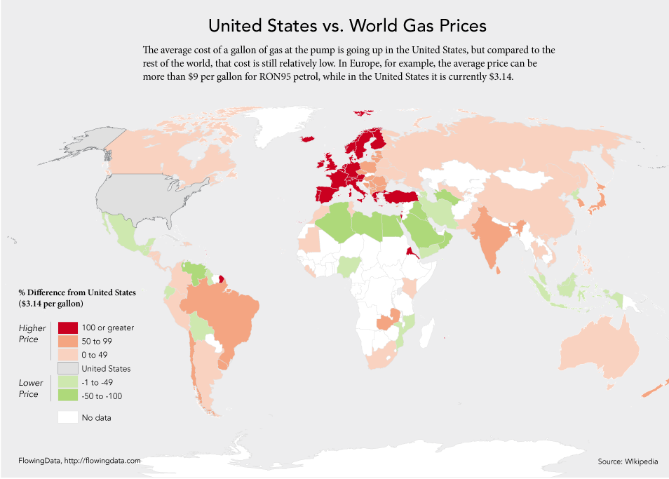
When Nathan Yau visited the Bureau a few months ago, he compared two world maps of gasoline prices by country. The first one was your typical choropleth: various color shades correspond to different gas prices. Fair enough, but (say) an American viewing the map is most likely interested in how US gas prices compare to the rest of the world. So instead, present a map with America in a neutral color (grey) and recolor the other countries relative to the US, to show whether their prices are higher or lower than here (for instance, red for pricier and green for cheaper gas).
I liked this idea but wanted to take it further: Instead of a one-off map just for Americans, why not make an interactive map that recolors automatically when you select a new country?
As a statistician, I’m also interested in how to communicate uncertainty: is your local area’s estimate statistically significantly different from your neighbors’ estimates?
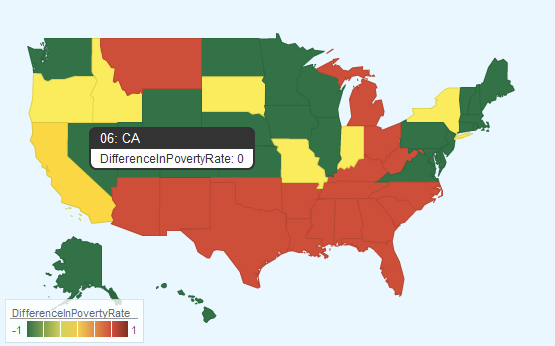
I’ve developed several interactive maps that combine these ideas: clicking on an area re-colors the map to show which other areas are higher, lower, or not significantly different relative to the chosen area. Below is my first draft, using Google Charts to map poverty rates. Click a state to see the map change relative to that state: green have lower poverty rates than the selection, red are higher, and yellow are not significantly different.
(This is US state-level poverty data from the Small Area Income and Poverty Estimates (SAIPE) program.)
(I’m still working on getting WordPress to run the script inside a post; for now, please click the screenshot to be taken to an interactive version!)
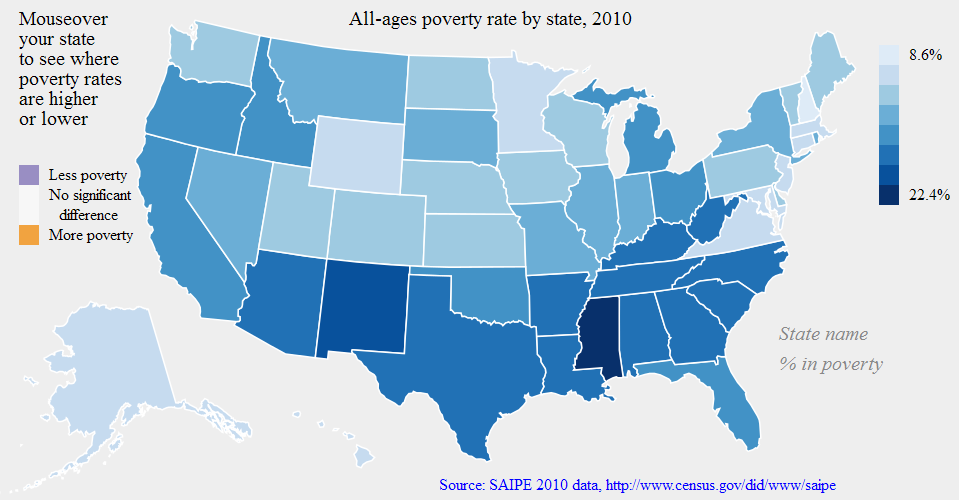
The Google Geomap was a great easy way to get started, but it’s a bit clunky and I can’t tweak everything I want to edit. So I tried a second approach using d3, an open source Javascript library. I began with their choropleth example and modified it to add interactivity on mouseover.
Without mouseover, darker blues have higher poverty rates. On mouseover, the purple states have significantly more less poverty, orange significantly less more, and grey are not significantly different.
(Technically I haven’t implemented the significance check yet — it just checks for a difference of at least 1% in poverty rates. This is to be fixed in the next version!)
(Again, please click the screenshot to be taken to an interactive version!)
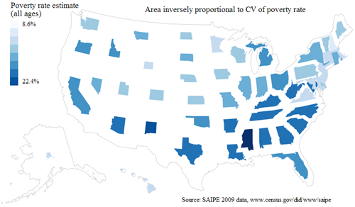
Finally, in a recent paper by Cornell’s Francis et al. I read a side comment that “To date, to our knowledge no one has explored the use of cartograms for this purpose.” I thought it was worth a try, again using d3 but this time building off of the cartogram example.
I decided to rescale all states to have the same surface area, then scale them up or down relative to our degree of certainty about the poverty rate. For a bigger state we are more confident about the poverty rate estimate than for a smaller state. Color (indicating the poverty rate point estimate) is independent of area. (An alternate approach would have been to rescale states relative to their original size; I might implement this too just to see.)
In retrospect, I think this is difficult to read: the areas sizes are hard to compare since each shape is so different. But it’s nice to know it’s possible, and perhaps it could be refined to be more useful.
(This one is not interactive, but clicking the screenshot will show a larger version.)
As a statistician I must warn you that the maps currently do not account for covariances, multiple comparisons, etc. I am just checking for overlap of independent confidence intervals at the moment, which is less than ideal. It’s also known that the best point estimates (what’s my state’s poverty rate?) are not necessarily the best estimates of relative ranks (which state has the highest poverty rate?). So that’s a separate problem to think about.
Gabriel Florit has a great interactive map of the same SAIPE data; it does not directly account for measures of uncertainty or confidence, but it shows the time trends quite clearly. Florit has also let the viewer play with how the colors are done.
And David Sparks has done related work, trying to show confidence/uncertainty on maps based on smoothed data, rather than drawing areas separately as in a choropleth. I like this approach for looking at general trends; however, choropleths may be more relevant when your map boundaries are the same administrative boundaries where policy decisions are made.
In any case, the above is an exploration of two ideas (viewer-selected baseline, and significance of comparisons) that I have not seen very often separately, much less combined.
The first concept (letting the viewer select a baseline for making comparisons) has been difficult until recently, as paper is not interactive, and providing a separate graphic for each baseline would take up too much space. Note that this idea is not restricted to mapping: a great example is the New York Times visualization of “How Many Households Are Like Yours?”
The second concept (distinguishing significant vs. non-significant differences) is sometimes possible in principle but usually difficult in practice with a single static map. Francis et al. summarize the history and difficulties of trying to convey uncertainty or data quality in maps. They mention a few interactive examples:
- Jan Vink of Cornell made a map of New York counties and it displays confidence intervals on the screenshot in Francis et al.
, although the CIs are not in the version on Cornell’s websiteEdit 3/30/12: Vink has kindly pointed me to the correct interactive map which does include CIs (as well as CVs, MOEs, etc.) - Nicholas Nagle of the University of Tennessee has a nice example of mapping small area poverty estimates for Tennessee counties which includes confidence bounds on the time series for each county, but this does not make it obvious on the map which counties are significantly different at each time period.
- Nancy Torrieri at the Census Bureau is working with David Wong at George Mason University on mapping American Community Survey data. They overlay a usual choropleth with textures (crosshatch, dots, etc) to classify by estimates measures of uncertainty or to distinguish significant differences. I find the two legends a bit hard to read simultaneously, but these are closest to what I am trying to do.
Finally, what would you name such a map? I haven’t found a name (catchy or otherwise) in the literature so far. My current suggestion is idiopleth, as an idiosyncratic (“idio”=”proper or peculiar to one” i.e. localized) variant of the familiar choropleth (“choro”=”place”, “pleth”=”multitude”).
I’ve also considered Protagorean maps, after the Greek philosopher Protagoras, who said “Man is the measure of all things” (baseline: the map is drawn relative to the observer’s vantage point); and “Many things prevent knowledge including the obscurity of the subject and the brevity of human life” (uncertainty: we won’t show differences that we are not confident about).
Please let me know if you have other suggestions!
PS: I meant to link to the d3 license as well. I still need to figure out other standard license options and see if there’s anything else I’d like to add.


The interactive version of the map mentioned in the Francis et al paper is at:
http://pad.human.cornell.edu/papers/annex/uncertaintymap_fullinfo.cfm
I like that Confidence Intervals in the legend, Jan. That’s pretty slick.
Thanks very much for the link, Jan! I really enjoyed your paper and I think this is a great way to show the data quality / measures of uncertainty.
An appropriate reference for the small area poverty maps in Tennessee is
2010 Nagle, Nicholas N., Bruce Ralston and Barbara Buttenfield. “Interactively Mapping Geographic Time Series with Uncertainty: An example from the Small Area Income and Poverty Estimates Program,” Presented at the International Cartographic Association, Symposium of the Census Cartography Working Group. November 19.