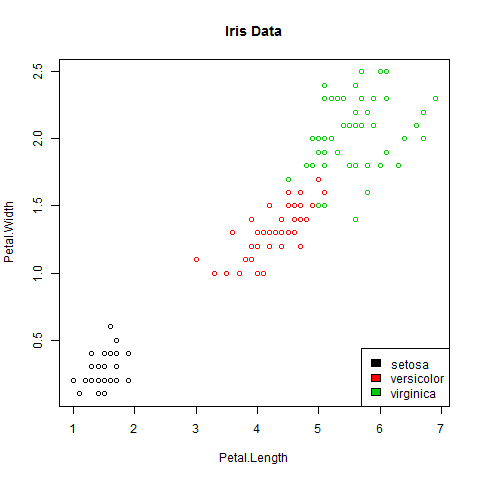
I only visited a few JSM sessions today, as I’ve been focused on preparing for my own talk tomorrow morning. However, I went to several talks in a row which all had a common problem that made me cringe: graphics where the fonts (titles, axes, labels) are too small to read.

Dear colleagues: if we’re going to the effort of analyzing our data carefully, and creating a lovely graph in R or otherwise to convey our results in a slideshow, let’s PLEASE save our graphs in a way that the text is legible on the slides! If the audience has to strain to read your graphics, it’s no easier to digest than a slide with dense equations or massive tables of numbers.
For those of us working in R, here are some very quick suggestions that would help me focus on the content of your graphics, not on how hard I’m squinting to read them.
- Instead of clicking “Save as” or “Copy to clipboard” to get your graph into your slides, use functions like
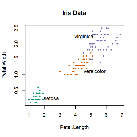
pngorpdfto save it to a file. This gives you more control over the image height and width in pixels or inches, as well as over the point size for text in the image. For example,png("mygraph.png", pointsize=18)should do nicely. (Usepdfinstead if you’re working with Beamer and LaTeX.) Remember to callpng, then the commands for making your plot, then calldev.off()at the end so R knows you’re done plotting. - While we’re at it, consider whether you really need a legend for your scatterplots or line plots. If your lines or your point-clusters are well separated, it’ll be much easier to read the graph if you just put labels next to each line or cluster, rather than forcing readers’ eyes to keep jumping from the main graph to the legend and back.
- Finally, take a few seconds to choose a colorblind-safe palette. Red-green colorblindness is common enough, but unfortunately R’s first color defaults (after black) are red and green… Use the
RColorBrewerpackage’s Dark2 palette, or check out other options on the Color Brewer website.
If any of that’s unclear, here’s a quick example, using the trusty old iris data:

# Set up a colorblind-safe palette with three colors
library(RColorBrewer)
iriscolors = brewer.pal(3, "Dark2")

# Find the means of each cluster
irismeans = aggregate(iris[3:4], by=iris[5], FUN=mean)

# Create the plot with a larger point size
png("LegibleGood.png", pointsize=18)
# Use pch=20 so dots are filled, not hollow
plot(iris[3:4], col=iriscolors[unclass(iris$Species)],
  main="Iris Data", pch=20)
# Label the clusters near their means
# (adjusted manually so labels do not overlap points)
text(irismeans[,2]+c(1,1,-1), irismeans[,3]+c(0,-.2,.2),
  irismeans[,1])
dev.off()
Let me know if there’s anything unclear in the example above, or if you have a better way to do this or any other advice to offer.
For more suggestions on preparing good presentations, see also:
- Cosma Shalizi’s guidance on academic talks
- Clay Johnson’s advice on preparing for a talk
- the American Statistical Association’s guidelines for effective presentations
- Dianne Cook and Rob Hyndman‘s advice for useR conference talks

Important topic! Some additional suggestions:
– use ‘las=1’ to force all axis annotation horizontal (better readable)
– use ‘pch=c(21, 22, 24)’ and ‘bg’ instead of ‘col’ (datapoints are distinguished by shape and color then, while still easily recognizable in a light environment due to the black outline of symbols
– specitying ‘pointsize=18’ increases text nicely relative to the standard axes size; However, if the figure is resized later on in the ppt 18pt != 18pt anymore. I would suggest to specify ‘width’, ‘height’ and ‘res’ for the png beforehand such that it fits the reserved space and does not need to be rescaled later.
So, based on your above example I would suggest:
png("LegibleGood.png", width=4.5, height=5, units="in",

    pointsize=14, res=200)

plot(iris[3:4], bg=iriscolors[unclass(iris$Species)], main="Iris Data",

    pch=c(21,22,24)[unclass(iris$Species)], las=1)

text(irismeans[,2]+c(1.5,1.5,-1.5), irismeans[,3]+c(0,-.3,.3), irismeans[,1])

dev.off()
to achieve a nicely readable png for half a page in ppt with scriptsize 14pt.
To test the appearance beforehand I tend to open a window in R playing with the specifications before writing to png using:
windows(width=4.5, height=5, pointsize=14)
saving time by not saving to often filse to disc and importing back in ppt.
directlabels is very useful for the labeling
I very much agree. And with the little-known
directlabelspackage, you don’t even have to position (or colour) the labels manually. The package works with bothggplot2andlatticegraphics, supports several different graph types, and is extremely easy to use. Take a look at thedirectlabelsWeb site for some usage examples.Thanks for all the great suggestions — I will try them out and update the post with the results!
Great post. Given the amount of people using ggplot these days, myself included, you could make a theme were everything is set so that the output is ideal for a presentation, given that I think most graphs that go into ppt would either sit smack bang in the middle and take up ~75% of the slide or sit to the side with a text box on the other side so take up ~40% of the slide. Could have two themes options. Pop them in your .rprofile and they’d always be available. The possibilities!
Still haven’t gotten to writing a follow-up post, but here’s one more good resource on creating legible R graphics:
http://blog.revolutionanalytics.com/2009/01/10-tips-for-making-your-r-graphics-look-their-best.html