I love Nathan Yau’s tutorial on making choropleths from a SVG file. However, if you don’t have a SVG handy already and instead you want to repurpose a map from another vector format such as PDF or EPS, there are a few extra steps that can be done in the free tool Inkscape. And while I’m at it, how could I turn down the opportunity to replicate Nathan’s Python approach in R instead?
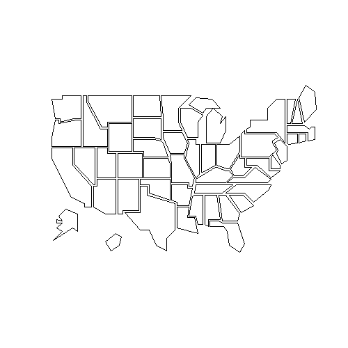
The following was inspired by the 300-page Census Atlas of the United States, full of beautiful maps of 2000 decennial census data. I particularly liked the small multiples of state maps, which were highly generalized (i.e. the fine detail was smoothed out) but still recognizable, and DC was enlarged to be big enough to see.
I have wanted a map like this for my own purposes, when mapping a variable for all 50 states and DC. Unfortunately, I haven’t been able to track down any colleagues who know where to find the original shapefiles for this map. Fortunately, several images from the Census Atlas are available in EPS format near the bottom of this page, under “PostScript Map Files.” With access to such vector graphics, we can get started.
Starting in Inkscape
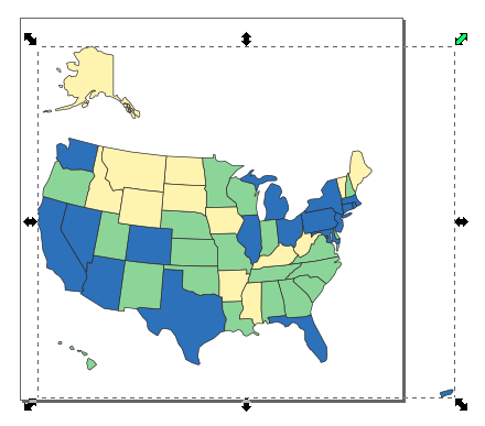
From that website, I downloaded the “Location – Map 2” file. To create a SVG file from this EPS, you’ll need a vector graphics program like Adobe Illustrator… or the open source alternative, Inkscape, which is what I used. It’s straightforward to open map2.eps in Inkscape. With Shift + and Shift – you can zoom in and out of the map. The mini-map I wanted is in the top right corner, but if you try to select anything, it’s initially all grouped together (so if you click and drag, the entire document moves together). Right-click and select Ungroup to break it up into its components, then select just the map in the top right and copy it into a new document. I also wanted the final image to be around 500×500 pixels, so you can set that custom size under File -> Document Properties. Then drag the map into the document and stretch it out using the arrows (while holding down Ctrl so that the aspect ratio doesn’t change).

Great, now we can edit this smaller map to contain just the pieces and info that we need. Let’s Ungroup again so that we can select each state separately. I deleted Puerto Rico (bottom right corner) at this point, since I don’t need to map its data very often. To do this, just click and drag to select it, then hit Delete.
You may as well save this as a SVG file now. Open this SVG file in Notepad or similar, and you’ll see it contains XML, just as Nathan’s tutorial explains. In order to follow his approach, we’re going to want to end up with exactly one “path” for every state (so we can recolor them with our own data) and a final one for the state outlines (so we can change all the line colors at once). So in the next few steps, nothing is going to look different visually on the map; we’re just changing how the map is organized internally.
To get to this point, we want to select all of the lines and merge them into one object. We do this by going to Edit -> Find and, in the Style box, searching for the term “line” … then close the Find popup and hit Ctrl+K to combine all the lines into a single object. This way, when we edit the SVG later, they’re all part of the same path and we only have to change its style in one place.
After this, we also want to group Alaska’s islands together, and Hawaii’s, and the two parts of Michigan and also of Virginia (there’s that little peninsula across the Chesapeake Bay). So again, click and drag to select all of Alaska’s various bits and bobs, and use Ctrl+K to combine them into a single object. Likewise for the other multi-part states.
If you resave the SVG and open it in Notepad again, you should see there are only about 52 different “path” elements instead of the hundreds we had before. But each path’s “id” is something like “path12345” and there’s no way we can tell what state that’s supposed to be.
So now comes the tedious part. (Let me know if you see a simpler way to do this!) We must give each object a meaningful name, so that we know which path corresponds to which state when add data to the map. So… click on each state in turn, use Ctrl+Shift+O to get the Object Properties menu, and give the state an Id and a Label. I recommend using the two-digit state FIPS codes for the Id values — it’s much easier to match data against FIPS codes than against state names (Does your dataset write North Carolina as two words or compress them into one? Did they put Washington DC or District of Columbia? etc.). But you can put in the state names or postal abbreviations for the Label. So just search online for a list of the state FIPS codes, find a labeled map if you need one (which one’s Indiana and which one’s Illinois again?), and chug along with this for a few minutes. Also, create a recognizable Id and Label for the state lines (I just called it State_Lines).
Now, save the results and again open the SVG in Notepad. You should see 52 distinct paths, each with its FIPS code in the id field and a name or abbreviation in the label field. Sweet — we are at the point where Nathan’s tutorial picks up! Feel free to jump over there and finish reading how to recolor this map using Python.
Continuing in R
But if you’re a stats nerd like me, you may be more comfortable in R than Python. No worries, I’ve got you covered. However, before you open up R, go back to your SVG in Notepad and remove the line near the top where it says “inkscape:version=[something]”. I’m not sure why but R’s XML parser removes the “inkscape:” in front of “version” so that you end up with two separate definitions of the version attribute, which your browser will not like. There must be a cleaner way to fix this, but for now I’ve found that removing the inkscape:version line will work.
Okay! Open up R, and install and load the “XML” library. We’re going to use the function xmlTreeParse() to open the SVG file and read in its XML content. Next we want to find the “id” for each path (so we know what state it is) and replace its “style” with a new one with the right color, depending on our dataset. There may be a much better way to access these, but this worked for me: If you saved the parsed XML using atlasXML <- xmlTreeParse("AtlasMap.svg") then the id for the i’th path will be stored in atlasXML$doc$children$svg$children$g$children[i]$path$attributes["id"] or something similar, and likewise but replacing “id” with “style” for the style. Now we can iterate through all the paths, check their id’s, replace their styles, and finally save the result.
We’ll also want to do a good job of choosing the fill colors: I recommend using the RColorBrewer package to choose the color palette, and selecting the cut points between color classes by using the classIntervals() function with the style="jenks" option, from the classInt package. Read more about the Jenks natural breaks optimization method on Wikipedia.
In the following code example I use the SAIPE state-level poverty rate dataset from my useR! 2012 talk.
# Load XML libray, set path, and parse the SVG file
library(XML)
setwd("C:/Users/Jerzy/Documents/Stats/CensusAtlas")
atlasXML = xmlTreeParse("CensusAtlasStateMap.svg")

# Load in our dataset, with state poverty rates
# from the SAIPE program
povdata = read.csv("StatePovData.csv")
names(povdata) = c("postcode", "fips", "povrate",
	"cilo", "cihi")

# How many color groups do we want?
nrcolors = 5

# Set the style tag to fill in,
# leaving just fill color to be added at end
styleprefix =
	"fill-opacity:1;fill-rule:nonzero;stroke:none;fill:"

# Choose color palette; but reverse the order
library(RColorBrewer)
mycolors = brewer.pal(nrcolors,"BrBG")[nrcolors:1]

# Divide povrates into groups using the Jenks approach
library(classInt)
povdata$color = mycolors[cut(povdata$povrate,
	classIntervals(povdata$povrate, nrcolors, "jenks")$brks,
	labels=FALSE, include.lowest=TRUE)]

# Iterate through the XML and redefine styles based on id
npaths = length(atlasXML$doc$children$svg$children$g$children)
for(i in 1:npaths){
	id = atlasXML$doc$children$svg$children$g$children[i]$path$attributes["id"]
	if(id != "State_Lines"){
	whichrow = which(povdata$fips==as.numeric(id))
	atlasXML$doc$children$svg$children$g$children[i]$path$attributes["style"] =
		paste0(styleprefix,povdata$color[whichrow])
	}
}

# Save results
saveXML(atlasXML$doc$children$svg,
	"CensusAtlasStateMapTweaked.svg")

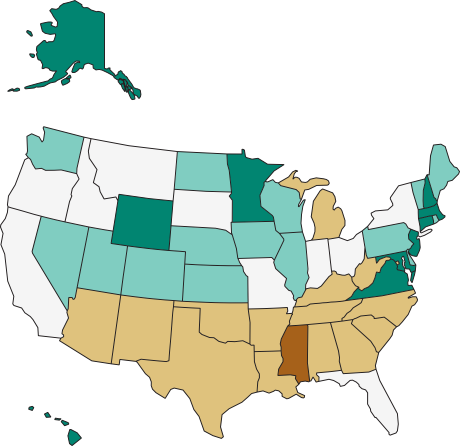
After all this work, ironically WordPress won’t let me embed SVG images 🙂 so I went back to Inkscape and exported a PNG bitmap image from this final SVG. Either way, you can see that we’ve been able to recolor the map. For example, Mississippi has the distinctively higher poverty rate than anyone else (darkest brown). It’d be great to add a legend… but that’s for another time!
Other issues
There must be cleaner ways to process the XML in R, right? And is there a way to convert this SVG into a shapefile or some format that R’s maps package can read? No disrespect meant, but R’s standard state map is leaves off Alaska and Hawaii and DC, and is too detailed; there is also the state.vbm map, but it does not look as nice and clean as this one from the Census Atlas. Perhaps we can find a way to add a version of this to R’s maps package eventually.

Anyway, this post feels both too long and not detailed enough, so let me know if any questions remain. Also, it’d be fun to try this on a set of imagined political boundaries. So if anyone knows where to find a nice vector map of the boundaries of, say, Middle Earth or Earthsea or Panem…


Great post! If you have some time, a step-by-step post for creating a nice map using shapefiles would also be very appreciated.
All the best, Rick
Thanks, Rick. Do you mean creating a shapefile in the first place, or loading existing shapefiles into R to make a map, or something else?
I meant loading in existing shapefiles. There are a few posts on creating maps, but I haven’t found any step-by-step tutorial on how to make a really nice map from shapefiles and data, including using appropriate colors (e.g. color brewer). So, if you have the time, it would be greatly appreciated. In any case, really like your blog!
All the best,
Rick
Good point. I’ll try to create a general post on this topic, though it might take a week or two to get to it.
Meanwhile, although this older post is not step-by-step detailed, it might be of some use:
http://civilstat.com/?p=429
What a information of un-ambiguity and preserveness of valuable familiarity regarding unexpected feelings.
I’m not sure if this is Markov-generated spam or just poor translation, but what a lovely sentiment!