Continuing the summary of last week’s symposium on statistics and data visualization (see part 1 and part 3)… Here I describe Dianne Cook’s discussion of visual inference, and Rob Kass’ talk on statistics in cognitive neuroscience.
[Edit: I’ve added a few more related links throughout the post.]
“It’s impressive that statisticians have got good visual skills…”
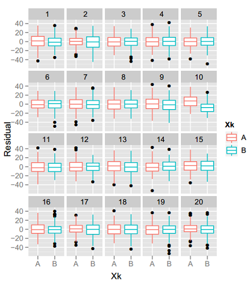
Iowa State’s Di Cook, colleague Heike Hofmann, and their students are well respected for their work on innovative statistical graphics packages (including XGobi and GGobi; Yihui Xie‘s cranvas; Hadley Wickham‘s ggplot2…) This week Dr Cook talked about a difference aspect: using a lineup of graphics for “visual inference.” In a parallel with the usual meaning of statistical inference, Cook and her collaborators create a kind of sampling distribution of graphs under the null hypothesis that there’s nothing interesting going on… then show a reader the real data graph and several of these null graphs. If readers can easily & consistently pick out the real data graph as the one showing the strongest trend or most separation between groups, then you can reject the null hypothesis and agree that there’s something going on in the data.
For example, take a look at the figure above, from this paper. One of those 20 boxplot pairs shows the real data, and the rest are plots of random data assuming no difference between the groups. The real-data plot jumps out at me, so it seems fair to say the trend is real. Can you see it too?
On the other hand, if the real-data plot is indistinguishable from the others, you fail to reject the null hypothesis: this data doesn’t show a trend any stronger than what you’d see from random noise. That’s how I feel about the example below, from this paper: the spatial clusters of cancer cases in the real data don’t seem any more prominent than the fake clusters in the null plots. (See also the related discussion about model checking between Andrew Gelman and Andreas Buja, on Buja’s website under “Inference for EDA and Diagnostics.”)
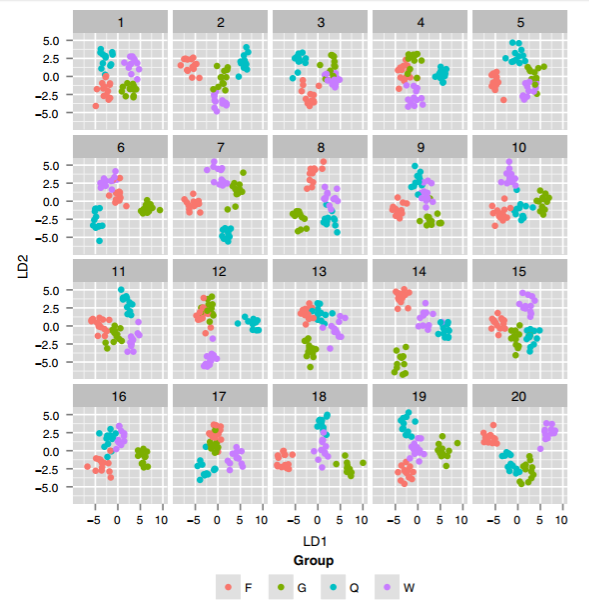
Another example in her talk involved the use of Linear Discriminant Analysis (LDA) on high-dimensional data to find the 2D projection that best separated groups in the data. The real-data plot showed nice separation, but many of the fake-data plots showed even better separation! This was a great reminder not to trust a single final plot that looks “clean”—your fancy statistical technique might just be overfitting. (I’m not explaining this point very well… I’ll add a link to LDA examples if I can find one.)
[Update: Here’s an example from a more recent paper. They ran LDA on a 40-dimensional dataset, trying to find the 2-dimensional projection that’s best at separating four groups of wasps. Then, they ran the same LDA for 19 “null” versions of the same dataset with group labels swapped at random. To my eyes, almost all of the null plots look like great “real” separation… which suggests that the real-data plot, with similarly-good separation, may be overfitting.]
Of course, to do this kind of evaluation rigorously, you need more than one test subject’s response to the graph lineup. Cook’s team has been using Amazon’s Mechanical Turk to test many lineups on many subjects, seeing what kind of features people are best at picking out of the lineup and under what conditions the real data is easily distinguished from the null plots. There are also cases where the real data is obvious because of artifacts (regular spacing between measurements of the real data, irregular gaps in the null plots) that are not really related to the question of interest, so it can be a challenge to design the best null plots for your situation. Earlier this summer I also enjoyed Heike Hoffman’s JSM talk about related work on testing graphics via Mechanical Turk. If you are considering similar research, Hoffman and Cook clearly have valuable experience to share.
They’re no longer collecting data but you can try out the examples on their student Mahbubul Majumder’s website. Or if you’d like to try out this approach with your own data, while using yourself as a blind subject, use the R package nullabor. It will plot your data in a lineup, rather than plotting the real data first, so you can be your own unbiased observer.
Finally, Cook is also in good company with Mark Hansen as someone who became frustrated with mathematical statistics for a while and went to New York to do art instead. We need to strengthen those bridges between the art and statistics communities!
“Most of you already know this, but the brain is located in the head…”
CMU’s Rob Kass spoke about statistical modeling in cognitive neuroscience and neurophysiology. There are many aspects of brain science, but Kass’s approach focuses on “discovering how neural activity produces behavior.” His talk stressed the usefulness of adapting and extending old statistical tools to new areas of science.
For example, neuroscientists figured out that a stimulus (like the intensity of light hitting the eye) is encoded by the neuron’s firing rate (it fires more often as the light gets brighter). Hooking up a single neuron to a clicking, Geiger-counter-like noisemaker, you can find the neuron’s receptive area just by listening — no fancy statistical analysis required. However, as soon as you want to encode the data, it gets trickier: your measurements are 1s and 0s (fire or no-fire) within discrete-time chunks, but you’d like a smooth continuous-time model. So you fit a Poisson model, and perhaps include the time since last firing. Okay… But now what about measuring multiple neurons at once? How do you detect what these 100 neurons are responding to, and how are they interacting? You can look for neuron spikes that show synchrony, except that the anaesthesia (needed when you attach neuron detectors) induces its own erratic synchrony in the neuron firing patterns even with no stimulus…
As the experiments dig deeper into the brain, there is more and more statistical modeling required. Kass’ work includes using more modern time-series methods and hierarchical models to account for noise and control false discovery rates. (That requires approaches like the ones in Carl Morris’ morning keynote.) As he says, there was a 40 year gap between sophisticated statistical developments and the start of their use in his field. Today there is simply no way to make progress without solid statistical thinking, which in Kass’ view consists of: (1) using statistical models to describe variation and decompose it into knowledge & uncertainty; and (2) analysing the data-modeling procedures themselves to see how well the ideas are working. To paraphrase, you need to understand what your tools are separating into signal vs noise; and how well your tools do this work. With this background, a statistician’s biggest impact often comes not from data analysis as much as from understanding how to design a better experiment. If we want to hope to learn anything, what’s the right experiment to do?
In his diagram of the 15 or so fields that inform cognitive neuroscience, statistics was the central hub that ties them all together. For more of his views on statistical thinking, I highly recommend the thought-provoking article by Kass and his colleague Emery Brown, “What Is Statistics?” (American Statistician, 2009); see also the great comments & rejoinder. (Brown is both a statistician and an anesthesiologist, so I imagine that people at cocktail parties can’t help joking he must be doubly effective at putting people to sleep…)


One thought on “Carl Morris Symposium on Large-Scale Data Inference (2/3)”
Comments are closed.