When I reviewed The Grammar of Graphics, Harlan Harris pointed me to Kosslyn’s book Graph Design for the Eye and Mind. I’ve since read it and can recommend it highly, although the two books have quite different goals. Unlike Wilkinson’s book, which provides a framework encompassing all the graphics that are possible, Kosslyn’s book summarizes perceptual research on what makes graphics actually readable.
In other words, this is something of the graphics equivalent to Strunk and White’s The Elements of Style, except that Kosslyn’s grounded in actual psychology research rather than personal preferences. This is a good book to keep at your desk for quickly checking whether your most recent graphic follows his advice.
Kosslyn is targeting the communicator-of-results, not the pure statistician (churning out graphs for experts’ data exploration) or the data artist (playing with data-inspired, more-pretty-than-meaningful visual effects). In contrast to Tukey’s remark that a good statistical graphic “forces us to notice what we never expected to see,” Kosslyn’s focus is clear communication of what the analyst has already notices.
For present purposes I would say that a good graph forces the reader to see the information the designer wanted to convey. This is the difference between graphics for data analysis and graphics for communication.
Kosslyn also respects aesthetics but does not focus on them:
Making a display attractive is the task of the designer […] But these properties should not obscure the message of the graph, and that’s where this book comes in.
So Kosslyn presents his 8 “psychological principles of effective graphics” (for details, see Chopeta Lyons’ review or pages 4-12 of Kosslyn’s Clear and to the Point). Then he illustrates the principles with clear examples and back them up with research citations, for each of several common graph types as well as for labels, axes, etc. in general. I particularly like all the paired “Don’t” and “Do” examples, showing both what to avoid and how to fix it. Most of the book is fairly easy reading and solid advice. Although much of it is common sense, it’s useful as a quick checkup of the graphs you’re creating, especially as it’s so well laid-out.
Bonus: Unlike many other recent data visualization books, Kosslyn does not completely disavow pie charts. Rather, he gives solid advice on the situations where they are appropriate, and on how to use them well in those cases.
If you want to dig even deeper, Colin Ware’s Information Visualization is a very detailed but readable reference on the psychological and neural research that underpins Kosslyn’s advice.
The rest of this post is a list of notes-to-self about details I want to remember or references to keep handy… Bolded notes are things I plan to read about further.
- p. 11: I’d never noticed that we see red colors as “closer” than blue. So if you have lines of both colors crossing, you should avoid drawing blue over red or it’ll be distracting. Likewise, the background should use bluer (“cooler”) colors and the foreground should be the redder (“warmer”) ones.
- p. 15: avoid the Stroop effect. This is when, say, your graph represents blue and orange crab species using the wrong colors, or the SMALL group using large letters. Although there may be a place for this kind of cognitive interference in Victoria Secret’s business model, it’s not helpful for making clear graphics.

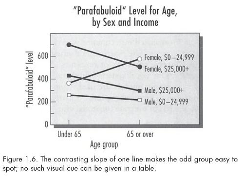
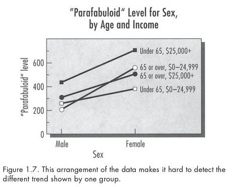
- p. 18-19: the horizontal axis should be for the variable with the “most important part of the data.” See Kosslyn’s Figure 1.6 and 1.7 below. Figure 1.6 clearly shows that one of the sex-by-income groups reacts to age differently than the other three groups do. Figure 1.7 uses sex as the x-axis variable, making it much harder to see this same effect in the data.
As a statistician exploring the data, I might make several plots using different groupings… but for communicating my results to an audience, I would choose the one plot that shows the findings most clearly.
[Edit: Thanks to Andrew Gelman’s comments on this bullet, and let me clarify: I don’t mean to imply you should always restrict yourself to one plot! And of course small multiples could be much clearer. But if you try switching the x-axis and grouping variables several ways, and one arrangement makes the story stand out while the others are confusing, then show that best arrangement rather than a randomly-chosen one. However, if several are interesting, show them all!]
- p. 30: Use a graph rather than a table only if the point is to compare amounts. Our visual system does this very efficiently from graphics and very slowly with tables. However, if the point is to give specific absolute values, the table will be much more precise than a graph.
- p. 35: Remember that not everyone is an expert graph reader, and some audiences may need more time or explanation! Expert graph readers have built up “graph schemata” in their minds, and so will be quick to grasp certain common patterns from certain common graph types. But the lay audience might not already have a meaning associated in memory with, say, parallel lines (the grouping variable has an additive effect on the x-variable) vs. converging lines (there is interaction between the variables). However, even expert readers may need more time when the data don’t follow a simple identifiable pattern. Follow up by reading Pinker 1990.
- p. 40: add this to your list of concerns about pie charts: angles symmetrical around the horizontal axis (< or >) look larger than the exact same angle around the vertical axis (v or ^).
- p. 52: lines chart vs. grouped bar chart: use the lines if the slope is most important (“group A’s productivity grew faster than group B’s”), but use grouped bars if the relative height at each x is what matters (“group A was over twice as productive as group B in each of these years”).
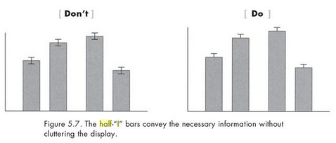
- p. 132, 146: here’s where I really disagree with Kosslyn. He suggests using “half-I” error bars instead of the full ones, both on bar charts and line charts. I’d argue that if your audience is statistically-inexperienced and has difficulty reading error bars, then you should probably leave them off and make a point of only plotting data for which the comparisons are statistically significant. On the other hand, if it’s important to your message that some values are not-significantly-different while others are, I feel this is much easier to convey with the full error bar than the “half-I” version.
See Kosslyn’s advice below — but I disagree:
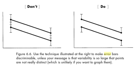
- p. 153-4: again, error bars are tricky and there are problems with our standard visual representation. This time I agree with Kosslyn: the widest error bars (i.e. the data points which are least precisely known) should not stand out more than the thinner ones. I’d love to find a cleaner solution that’s still simple enough for non-experts to use. See comments on Andrew Gelman’s post about error bars, particularly Displaying Uncertainty With Shading (Jackson 2008). There’s a good visual display of several ideas in Potter et al. 2010 but none of them seem to deal with Kosslyn’s concern here.
- p. 155: Mosteller et al. (1985) found that when people fit lines by eye, the results are close to the “major-axis line” (minimizing squared distances perpendicular to the line), not the usual regression line (which minimizes squared vertical distances from the line).
- p. 166-7: If you break color down by hue, saturation, and intensity, then it’s okay to use hue for showing categories, but it’s better to co-vary saturation and intensity if you want to show quantitative information. (Color is WAY more complicated than I’d realized.)
- p. 176: It’s hard to do 3D graphs well, and probably best not to try. Kosslyn advises against using a wireframe to show the results of an experiment with multiple variables to set. I did find this kind of wireframe to be useful for exploring data when I worked in the ITS lab, but I’ll admit it was difficult to explain quickly when I gave talks on the research.
- p. 178: Why do people use those awful 3D pie charts etc.? Read Tractinsky and Meyer 1999 who found that although study participants would choose a clean 2D chart to aid decision-making, they preferred 3D when the aim was to impress others, demonstrate their mastery with graphing technology, compensate for bad results, or obscure unfavorable data.
- p. 225-6: although Kosslyn’s right that your graph shouldn’t make a difference pop out if it’s not statistically significant, I disagree that a statistically-significant trend should be made “visually obvious.” A the trend or difference that’s significant statistically may not be practically significant. If an effect is precisely-measured (statistically-significant) but still too small to be of any use in practical decision-making, there’s no need to highlight it.
- p. 236-8: choropleths (maps where areas are filled with color or shading) are hard to read if you want to make precise comparisons. Dunn 1988 found readers to be more accurate with filled-rectangle charts instead.
Also, contiguous cartograms (where the areas are distorted so the size represents a quantity) are even harder to read, not only for judging the quantity but also for recognizing the areas themselves. I think non-contiguous cartograms help with the 2nd but not the 1st concern. See also Dorling and Demers cartograms. - p. 242: See Tversky, Morrison, and Betrancourt (2002) who argue that animation is rarely used in a helpful way:
Tversky et al. conclude that animations not only should be slow enough to track, but also should tend to be more schematic than realistic, and should be annotated with symbols (e.g., arrows) that will direct the viewer’s attention to crucial changes and relations in the display.
- p. 243: There’s a vast literature on what goes on in your brain’s neurons and your mind’s depictions as you read and understand a graphic. One finding is that the eyes scan the form of the graph before they actually read the legends for content. Another breakdown is between the processes that read the data, vs. read between the data (integrate and interpret), vs. read beyond the data (extrapolate). See Friel, Curcio, and Bright (2001).
- p. 244: Much like we saw with Sarah Nusser’s talk on spatial ability, people have a range of graph-reading experience as well as working memory capacities. Adaptive software could present graphics differently for different audiences, say, giving a more complex visual for high-experience readers but a better-annotated and decomposed visual for others.
- p. 245: “If we have good computer simulations of how people read graphs, we need not actually conduct the experiments–we can just run the model, which will tell us how best to use graphics in any specific situation.” That’s a nice goal but seems WAY overoptimistic!
- p. 251: The discussion of variances is a bit muddled; and he seems to advise plotting error bars based on plus-or-minus one standard error, without mentioning the usual 95% confidence interval at all. If statistics is new to you, I doubt this section will help much.
- p. 253: He says to be careful making comparisons, because one could compare to many different baselines and end up with very different messages. (Your candidate’s standing in the polls might be lower than a competitor’s, but higher than last month’s, or than the other’s all-time average, etc…) However, I’d argue that making comparison is what statistics is for! The way to avoid lying with statistics isn’t to choose “the right comparison” — it’s to make and present all of the comparisons. Or at least, make all the comparisons yourself, and present a representative selection to your audience.
- p. 256: Kosslyn’s appendix 2 is a checklist of questions to ask about graphics software before you choose one. My go-to tool R fails on several of these counts 🙂 It’s very powerful and flexible, but admittedly not the easiest to learn or the quickest to use for very simple graphs.


