Census-related links from June

A few links to share since I’ve been away:

Article on “An American Tradition: The U.S. Census Bureau Continues to Innovate in Data Visualization” (free access after watching an ad): A colleague summarizes some of the many mapping and datavis resources provided by the Census Bureau.

Two interactive web apps by data users (these use Census Bureau data but the datavises are someone else’s products):

  • Web app “Point Context”: a data user calls the Census Bureau’s API to find the distributions of age, race, income, and education for residents of the “average” neighborhood containing an arbitrary set of latitude-longitude coordinates.
  • Interactive map of “Is the United States spending less on public education?”: A Census data user practices with D3 and tries out the lessons from datavis classes — show comparisons, allow color-blind-safe color palettes, “catchy” headlines and informative annotations help guide readers, etc. I particularly like the arrow indicating where the selected state falls on the colorbar.

Several tools for making maps from Excel or spreadsheet-like tools:

  • Esri, the makers of ArcGIS software, have created a Microsoft Office add-on that lets you create maps of your data in Excel. A live demo looked promising, especially if your organization is already an Esri client… but otherwise ArcGIS is not cheap!
  • If you do have ArcGIS Online access, you can try using Esri’s “Story Maps” templates. Their published examples include this simple one based on Census Bureau data.
  • JMP, a SAS product, also has mapping tools that should be fairly simple for people used to spreadsheets. But again, SAS’s products tend to be expensive too.

Transitions

Apologies for the lack of posts recently. I’m very excited about upcoming changes that are keeping me busy:

Let me suggest a few other blogs to follow while this one is momentarily on the back burner.

By my Census Bureau colleagues:

By members of the Carnegie Mellon statistics department:

Visual Revelations, Howard Wainer

I’m starting to recognize several clusters of data visualization books. These include:

(Of course this list calls out for a flowchart or something to visualize it!)

Howard Wainer’s Visual Revelations falls in this last category. And it’s no surprise Wainer’s book emulates Tufte’s, given how often the author refers back to Tufte’s work (including comments like “As Edward Tufte told me once…”). And The Visual Display of Quantitative Information is still probably the best introduction to the genre. But Visual Revelations is different enough to be a worthwhile read too if you enjoy such books, as I do.

Most of all, I appreciated that Wainer presents many bad graph examples found “in the wild” and follows them with improvements of his own. Not all are successful, but even so I find this approach very helpful for learning to critique and improve my own graphics. (Tufte’s classic book critiques plenty, but spends less time on before-and-after redesigns. On the other hand, Kosslyn’s book is full of redesigns, but his “before” graphs are largely made up by him to illustrate a specific point, rather than real graphics created by someone else.)

Of course, Wainer covers the classics like John Snow’s cholera map and Minard’s plot of Napoleon’s march on Russia (well-trodden by now, but perhaps less so in 1997?). But I was pleased to find some fascinating new-to-me graphics. In particular, the Mann Gulch Fire section (p. 65-68) gave me shivers: it’s not a flashy graphic, but it tells a terrifying story and tells it well.
[Edit: I should point out that Snow’s and Minard’s plots are so well-known today largely thanks to Wainer’s own efforts. I also meant to mention that Wainer is the man who helped bring into print an English translation of Jacques Bertin’s seminal Semiology of Graphics and a replica volume of William Playfair’s Commercial and Political Atlas and Statistical Breviary. He has done amazing work at unearthing and popularizing many lost gems of historical data visualization!
See also Alberto Cairo’s review of a more recent Wainer book.]

Finally, Wainer’s tone overall is also much lighter and more humorous than Tufte’s. His first section gives detailed advice on how to make a bad graph, for example. I enjoyed Wainer’s jokes, though some might prefer more gravitas.

Continue reading Visual Revelations, Howard Wainer”

Upcoming DataKind datadive with the World Bank in DC

DataKind (formerly Data Without Borders) is teaming up with the World Bank to host a datadive on monitoring poverty and corruption.

If you’ve never been to one of their datadives, here’s my writeup of last year’s DC event (which I thoroughly enjoyed), and DataKind’s writeup of our project results. These datadives are a great way for statisticians and other data scientists to put our skills to good use, and to connect with other good folks in the field.

The World Bank events will take place in Washington DC on two days: preliminary prep work on 2/23 (Open Data Day), and the main datadive on 3/15 to 3/17. Please consider attending if you’re around! If not, keep an eye out for future DataKind events or other related data science volunteer opportunities.

Small Area Estimation resources

Small Area Estimation is a field of statistics that seeks to improve the precision of your estimates when standard methods are not enough.

Say your organization has taken a large national survey of people’s income, and you are happy with the precision of the national estimate: The estimated national average income has a tight confidence interval around it. But then you try to use this data to estimate regional (state, county, province, etc.) average incomes, and some of the estimates are not as precise as you’d like: their standard errors are too high and the confidence intervals are too wide to be useful.

Unlike usual survey-sampling methods that treat each region’s data independently, a Small Area Estimation model makes some assumptions that let areas “borrow strength” from each other. This can lead to more precise and more stable estimates for the various regions (if the assumptions are reasonable).

Also note that it is sometimes called Small Domain Estimation because the “areas” do not have to be geographic: they can be other sub-domains of the data, such as finely cross-classified demographic categories of race by age by sex.

If you are interested in learning about the statistical techniques involved in Small Area Estimation, it can be difficult to get started. This field does not have as many textbooks yet as many other statistical topics do, and there are a few competing philosophies whose proponents do not cross-pollinate so much. (For example, the U.S. Census Bureau and the World Bank both use model-based small area estimation but in quite different ways.)

Recently I gave a couple of short tutorials on getting started with SAE, and I’m polishing those slides into something stand-alone I can post. [Edit: I still haven’t polished them, but I’ve posted my old slides and code.] Meanwhile, below is a list of resources I recommend if you would like to be more knowledgeable about this field. Continue reading “Small Area Estimation resources”

Evil Queen of Numbers

Would there be any demand for a statistics class taught by M from the James Bond films?

M: You don’t like me, Bond. You don’t like my methods. You think I’m an accountant, a bean counter, more interested in my numbers than your instincts.
JB: The thought had occurred to me.
[…]
M: I’ve no compunction about sending you to your death, but I won’t do it on a whim.

Continue reading “Evil Queen of Numbers”

Hypothesis tests will not answer your question

Assume your hypothesis test concerns whether a certain effect or parameter is 0. With interval estimation, you can distinguish several options:

  1. The effect is precisely-measured and the interval includes 0, so we can ignore it.
  2. The effect is precisely-measured but the interval doesn’t include 0, but it’s close enough to be negligible for practical purposes, so we can ignore it.
  3. The effect is precisely-measured to be far from 0, so we can keep it as is.
  4. The effect is poorly-measured but we’re confident it’s not 0, so we can keep it but should still get more data to raise precision.
  5. The effect is poorly-measured and might be 0, so we definitely need more data before deciding what to do.

…as illustrated below:

NHST

Imagine you’re a scientist, making inferences about how the world works; or an engineer, building a tool that relies on knowing the size of these effects. You would like to distinguish between (1&2) vs. (3) vs. (4&5). Journal readers would like you to publish results for cases (1&2) or (3), and should want you to collect more data before publishing in cases (4&5).

Instead, hypothesis testing conflates (1&5) vs. (2&3&4). That doesn’t help you much!

In particular, when you conflate (1&5) it makes for bad science, as people in practice tend to interpret “not statistically significant” as “the effect must be spurious.” Instead they should interpret it as “either the effect is spurious, or it might be practically significant but not measured well enough to know.” And even if you were aware of this, and if you did collect more data to get out of situations (1&5), a hypothesis test still wouldn’t help you distinguish (2) vs. (3) vs. (4).

Finally, this is an issue whether your hypothesis tests are Frequentist or Bayesian. As John Kruschke’s excellent book on Doing Bayesian Data Analysis points out, if you do a Bayesian model comparison of one model with a spiked prior at \theta=0 and another with some diffuse prior for \theta, “all that this model comparison tells us is which of two unbelievable models is less unbelievable. [And] that is not all we want to know, because usually we also want to know what [parameter] values are credible” (p.427).

This is in addition to all the other problems with hypothesis tests. See my notes from reading Michael Oakes’ Statistical Inference for several more.

Sure, traditional hypothesis testing does have its uses, but they are rather limited. I find that interval estimation does a better job of supporting careful thought about your analysis.

audiolyzR: Data sonification with R

Update (5/15/2014): I just realized audiolyzR is publicly available on CRAN. See also co-creator Jesse Garrison’s audiolyzR page.

In his talk “Give Your Data A Listen” at last summer’s useR! 2012 conference, Eric Stone presented joint work with Jesse Garrison on audiolyzR, an R package for “data sonification.” I thought this was a nifty and well-executed idea. Since I haven’t seen Eric and Jesse post any demos online yet, I’d like to share a summary and video clip here, so that I can point to them whenever I describe audiolyzR to other folks.

audiolyzR

In August I invited Eric to my workplace to speak, and he gave us a great talk including demos of features added since the useR session. Here’s the post-event summary:

Eric Stone, a PhD student at Temple University, presented his co-authored work with Jesse Garisson on “data sonification”: using sound (other than speech) to visualize a dataset.
Eric demonstrated audiolizations of scatterplots and histograms using the statistical software R and the audio toolkit Max/MSP, as well as his ongoing research on time-series line plots. The software shows a visual display of the data and then plays an audio version, with the x-axis mapped to time and the y-axis to pitch. For instance, a positively-correlated scatterplot sounds like rising scales or arpeggios. Other variables are represented by timbre, volume, etc. to distinguish them. The analyst can also tweak the tempo and other settings while listening to the data repeatedly to help outliers stand out more clearly. A few training examples helped the audience to learn how to listen to these audiolizations and identify these outliers.
Eric believes that, even if the audiolization itself is no clearer than a visual plot, activating multiple cortices in the brain makes the analyst more attuned to the data. As a musician since childhood, he succeeded in making the results sound pleasant so that they do not wear out the listener.
The software will soon be released as an R package and linked to RExcel to expand its reach to Excel users. Future work includes: 1) supporting more data structures and more layers of data in the same audiolization; 2) testing the software with visually impaired users as a tool for accessibility; and 3) developing ways to embed the audiolizations into a website.

Eric suggested that he can imagine someone using this as part of an information dashboard or for reviewing a zillion different data views in a row, while multi-tasking: Just set it to loop through each slice of the data while you work on something else. Your ears will alert you when you hit a data slice that’s unusual and worth investigating further.

Eric has kindly sent me a version of the package, and below I demonstrate a few examples using NHANES data:

I’ve asked Eric if there’s a public release coming anytime soon, but it may be a while:

I am nearly ready to release it, but it’s one of those situations where my advisor will come up with “just one more thing” to add, so, you know, it might be a while.. Anyway, if people are interested I can provide them with the software and everything. Just let me know if anyone is.

If you want to get in touch with Eric, his contact info is in the useR talk abstract linked at the top.

On a very-loosely-related note, consider also John Cook’s post on measuring evidence in decibels. Someday I’d like to re-read this after I’ve had my morning coffee and think about if there’s any useful way to turn this metaphor into literal sonic hypothesis testing.

DC R Meetup: “Analyze US Government Survey Data with R”

I really enjoyed tonight’s DC R Meetup, presented by the prolific Anthony Damico. [Edit: adding link to the full video of Anthony’s talk; review is below.]

DamicoFlowchart (small)

I’ve met Anthony before to discuss whether the Census Bureau could either…

  • publish R-readable input statements for flat file public datasets (instead of only the SAS input statements we publish now); or…
  • cite his R package sascii, which automatically processes a SAS input file and reads data directly into R (no actual SAS installation required!). Folks agree sascii is an excellent tool and we’re working on the approvals to mention it on the relevant download pages.

Meanwhile, Anthony’s not just waiting around. He’s put together an awesome blog, asdfree.com (“Analyze Survey Data for Free”), where he posts complete R instructions for finding, downloading, importing, and analyzing each of several publicly-available US government survey datasets. These include, in his words, “obsessively commented” R scripts that make it easy to follow his logic and understand the analysis examples. Of course, “My syntax does not excuse you from reading the technical documentation,” but the blog posts point you to the key features of the tech docs. For each dataset on the blog, he also makes sure to replicate a set of official estimates from that survey, so you can be confident that R is producing the same results that it should. Continue reading “DC R Meetup: “Analyze US Government Survey Data with R””

More names for statistics, and do they matter?

Partly continuing on from my previous post

So I think we’d all agree that applied mathematics is a venerable field of its own. But are you tired of hearing statistics distinguished from “data science“? Trying to figure out the boundaries between data science, statistics, and machine learning? What skills are needed by the people in this field (these fields?), do they also need domain expertise, and are there too many posers?

Or are you now confused about what is statistics in the first place? (Excellent article by Brown and Kass, with excellent discussion and rejoinder — deserving of its own blog post soon!)

Or perhaps you are psyched for the growth of even more of these similar-sounding fields? I’ve recently started hearing people proclaim themselves experts in info-metrics and uncertainty quantification. [Edit: here’s yet another one: cognitive informatics.]

Is there a benefit to having so many names and traditions for what should, essentially, be the same thing, if it hadn’t been historically rediscovered independently in different fields? Is it just a matter of branding, or do you think all of these really are distinct specialties?

TwoTypesOfPeople

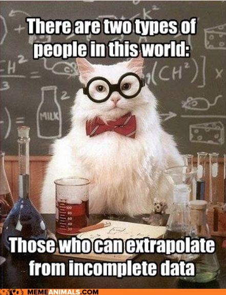
Given the position in my last post, I might argue that you should complete Chemistry Cat’s sentence with “…and those who can quantify their uncertainty about those extrapolations.” And maybe some fields have more sophisticated traditions for tackling the first part, but statisticians are especially focused on the second.

In other words, much of a statistician’s special unique contribution (what we think about more than might an applied mathematician, data scientist, haruspicer, etc.) is our focus on the uncertainty-related properties of our estimators. We are the first to ask: what’s your estimator’s bias and variance? Is it robust to data that doesn’t meet your assumptions? If your data were sampled again from scratch, or if you ran your experiment again, what’s the range of answers you’d expect to see? These questions are front and center in statistical training, whereas in, say, the Stanford machine learning class handouts, they often come in at the end as an afterthought.

So my impression is that other fields are at higher risk of modeling just the mean and stopping there (not also telling you what range of data you may see outside the mean), or overfitting to the training data and stopping there (not telling you how much your mean-predictions rely on what you saw in this particular dataset). On the other hand, perhaps traditional stats models for the mean/average/typical trend are less sophisticated than those in other communities. When statisticians limit our education to the kind of models where it’s easy to derive MSEs and compare them analytically, we miss out on the chance to contribute to the development & improvement of many other interesting approaches.

So: if you call yourself a statistician, don’t hesitate to talk with people who have a different title on their business cards, and see if your special view on the world can contribute to their work. And if you’re one of these others, don’t forget to put on your statistician hat once in a while and think deeply about the variability in the data or in your methods’ performance.

PS — I don’t mean to be adversarial here. Of course a good statistician, a good applied mathematician, a good data scientist, and presumably even a good infometrician(?) ought to have much of the same skillset and worldview. But given that people can be trained in different departments, I’m just hoping to articulate what might be gained or lost by studying Statistics rather than the other fields.
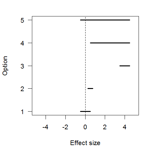