Statistical Rules of Thumb, Gerald van Belle

Gerard van Belle’s Statistical Rules of Thumb has piqued my curiosity at conferences. It turns out my work library has a copy, which has been fun to skim, or should I say, to thumb through.

The book’s examples focus largely on medical and environmental studies, but most of the book does apply to statistics in general.

The book starts off with good “rules of thumb” in the sense of quick calculations, i.e. for the approximate sample size you’d need to get suitably precise estimates in several common situations. But van Belle also suggests more general good advice, such as typical models to start with: when to use Normal vs Exponential vs Poisson etc as your initial model, etc.

Some of my favorite pithy or self-explanatory “rules”:

  • 1.9: “Use p-values to determine sample size, confidence intervals to report results”
  • 3.3: “Do not correlate rates or ratios indiscriminately”
    i.e. if X, Y, and Z are mutually independent, then X/Z and Y/Z will show spurious correlation.
  • 5.8 “Distinguish between variability and uncertainty”
    i.e. “reduce uncertainty but account for variability”
  • 5.13 “Distinguish between confidence, prediction, and tolerance intervals”
  • 6.2 “Blocking is the key to reducing variability”
  • 6.6 “Analysis follows design”
    i.e. the possible analyses will depend on how the randomization was done
  • 6.11 “Plan for missing data”
    i.e. be explicit about how you intend to deal with it
  • 6.12 “Address multiple comparisons before starting the study”

Continue reading Statistical Rules of Thumb, Gerald van Belle”

Too close for bells, I’m switching to tubas

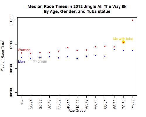
So when I’m not visualizing data or crunching small area estimates, I’ve been training to run DC’s Jingle All The Way 8k.

Most people wear little jingle bells as they run this race.
I decided to carry a tuba instead.

 More photos here. The one above is thanks to a blog I found by googling the race name + tuba. Our team t-shirts said Tuba Awareness, and apparently people were indeed aware! 🙂

My time was super slow (although I placed 1st in the carrying-a-tuba category), but I did run the whole thing, and I had a blast playing carols along the way. I really need to find somewhere in DC to play regularly, though perhaps a bit more sedentary…

Moore method / inquiry-based learning in statistics?

Via Dave Richeson:

For the last 10+ years I’ve taught topology using a modified Moore method, also known as inquiry-based learning (IBL). The students are given the skeleton of a textbook; then they must prove all the theorems and solve all of the problems. They are forbidden from looking at outside sources. The class types up their work as they go. At the end of the semester they have a textbook that they wrote. It is a great way to learn, and at the end of the semester the student are thrilled to hold a bound copy of the textbook that they created.

I love this idea! Wikipedia lists several universities with math courses using the Moore method, but none in probability or mathematical statistics. Google doesn’t suggest much besides this blog post with the same idea, and this article which seems to have good advice but is no longer accessible.

Have you ever seen the Moore approach used for a statistics course? Do you have any success stories or pitfalls to share?

A Theory of Data, Clyde Coombs

Earlier I’ve quoted Leland Wilkinson in The Grammar of Graphics, where he recommends Clyde Coombs’ book A Theory of Data:

…in a landmark book, now out of print and seldom read by statisticians, Coombs (1964) … believed that the prevalent practice of modeling based on cases-by-variables data layouts often prevents researchers from considering more parsimonious structural theories and keeps them from noticing meaningful patterns in their data.

I checked out Coombs’ book through interlibrary loan and haven’t had time to read it thoroughly before the due date. But even from skimming it on the train a few days, I can see why Wilkinson recommends it.

Continue reading A Theory of Data, Clyde Coombs”

Most-cited books on list of lists of data visualization readings

As part of the resources for his online data visualization course, Alberto Cairo has posted several lists of recommended readings:

Some of these links lead to other excellent recommended-readings lists:

I figured I should focus on reading the book suggestions that came up more than once across these lists. Below is the ranking; it’s by author rather than book, since some authors were suggested with multiple books. So many good books!


The list, by number of citations per author: Continue reading “Most-cited books on list of lists of data visualization readings”

Graph Design for the Eye and Mind, Stephen Kosslyn

When I reviewed The Grammar of Graphics, Harlan Harris pointed me to Kosslyn’s book Graph Design for the Eye and Mind. I’ve since read it and can recommend it highly, although the two books have quite different goals. Unlike Wilkinson’s book, which provides a framework encompassing all the graphics that are possible, Kosslyn’s book summarizes perceptual research on what makes graphics actually readable.

In other words, this is something of the graphics equivalent to Strunk and White’s The Elements of Style, except that Kosslyn’s grounded in actual psychology research rather than personal preferences. This is a good book to keep at your desk for quickly checking whether your most recent graphic follows his advice.

Kosslyn is targeting the communicator-of-results, not the pure statistician (churning out graphs for experts’ data exploration) or the data artist (playing with data-inspired, more-pretty-than-meaningful visual effects). In contrast to Tukey’s remark that a good statistical graphic “forces us to notice what we never expected to see,” Kosslyn’s focus is clear communication of what the analyst has already notices.

For present purposes I would say that a good graph forces the reader to see the information the designer wanted to convey. This is the difference between graphics for data analysis and graphics for communication.

Kosslyn also respects aesthetics but does not focus on them:

Making a display attractive is the task of the designer […] But these properties should not obscure the message of the graph, and that’s where this book comes in.

So Kosslyn presents his 8 “psychological principles of effective graphics” (for details, see Chopeta Lyons’ review or pages 4-12 of Kosslyn’s Clear and to the Point). Then he illustrates the principles with clear examples and back them up with research citations, for each of several common graph types as well as for labels, axes, etc. in general. I particularly like all the paired “Don’t” and “Do” examples, showing both what to avoid and how to fix it. Most of the book is fairly easy reading and solid advice. Although much of it is common sense, it’s useful as a quick checkup of the graphs you’re creating, especially as it’s so well laid-out.

Bonus: Unlike many other recent data visualization books, Kosslyn does not completely disavow pie charts. Rather, he gives solid advice on the situations where they are appropriate, and on how to use them well in those cases.

If you want to dig even deeper, Colin Ware’s Information Visualization is a very detailed but readable reference on the psychological and neural research that underpins Kosslyn’s advice.

The rest of this post is a list of notes-to-self about details I want to remember or references to keep handy… Bolded notes are things I plan to read about further. Continue reading Graph Design for the Eye and Mind, Stephen Kosslyn”

Statistics is Applied Science Fiction

I’m enjoying the discussion coming out of Alberto Cairo‘s online data visualization course.

Bryn Williams, in a comment on thinkers & creators who read comics & sci-fi for inspiration:

“…a familiarity with imagined alternative worlds makes philosophy an easier path to tread when posing counterfactuals and thought experiments…”

My response:

And not just philosophy or data visualization — I think statistics could be presented as a kind of “applied science fiction.” When you perform a hypothesis test of whether some parameter is 0, you

  1. assume it *is* 0,
  2. imagine what kinds of data you would probably have seen under that assumption, and then
  3. if the real data you *did* see is unlikely under that assumption, decide that the assumption is probably wrong.

It’s just like in SF where

  1. you imagine a possible alternate reality (say, Joe discovers a talent for dowsing),
  2. you explore the consequences if that possibility were true (Joe becomes rich from oil prospecting), and
  3. in the best cases, readers can draw lessons about our actual reality from this thought experiment (http://xkcd.com/808/).

(XKCD is, of course, a great comic for both SF and datavis. See also this recent SMBC for another amusing exploration of “If this claim were true…”)

Loess and Clark

Apologies for the awful pun in the title, but it seemed to befit an exploration of the history of loess local regression, particularly its name and codebase.

If you’re not familiar with loess, it’s basically a nonparametric algorithm that smooths the data to find the local mean of y at each x value. If you want to end up with a more traditional regression, loess can still be a useful starting point for visually finding trends in the data. Earl Glynn shows a worked example with R code that illustrates the loess fit for different values of the bandwidth.

Today was the first session of a Machine Learning study group with my colleagues. (We’re following along Andrew Ng‘s course notes for Stanford’s CS 229, also available on Coursera.) In the first chapter, Ng mentions loess regression, and two colleagues had interesting historical comments about it. Continue reading “Loess and Clark”

Animated map of 2012 US election campaigning, with R and ffmpeg

[vimeo 52312754]

(Video link here, in case the embedded player doesn’t work for you.)

Idea: see if I can mimic the idea behind Ben Schmidt’s lovely video of ocean shipping routes, and apply it to another dataset. But which?
“Hmm… what’s another interesting dataset about some competitors traveling around a mostly-fixed area at the same time?… Hey friends, stop  giving me election news, I need to think of an idea… Oh.” Continue reading “Animated map of 2012 US election campaigning, with R and ffmpeg”

Javascript and D3 for R users, part 2: running off the R server instead of Python

Thank you all for the positive responses to Basics of JavaScript and D3 for R Users! Quick update: last time we had to dabble in a tiny bit of Python to start a local server, in order to actually run JavaScript and D3 examples on our home computer… However, commenter Shankar had the great idea of using the R server instead. He provided some example code, but reported that it didn’t work with all the examples.

Here’s my alternative code, which works with all the D3 examples I’ve tried so far. Unlike Shankar’s approach with lower-level functions, I found it simpler to use Jeffrey Horner’s excellent Rook package.

# Load the Rook library
library(Rook)

# Where is your d3 directory located?
myD3dir <- 'C:/Downloads'

# Start the server
s <- Rhttpd$new()
s$start(quiet=TRUE)

# To view a different D3 example,
# change the directory and .html file names below
# and rerun s$add() and s$browse()
s$add(
app=Builder$new(
Static$new(
# List all the subdirectories that contain
# any files it will need to access (.js, .css, .html, etc)
urls = c('/d3','/d3/examples','/d3/examples/choropleth'),
root = myD3dir
),
Redirect$new('/d3/examples/choropleth/choropleth.html')
),
name='d3'
)
s$browse(2)
# browse(1) would load the default RookTest app instead

# When you're done,
# clean up by stopping and removing the server
s$stop()
s$remove(all=TRUE)
rm(s)

If I understand the Rook documentation correctly, you just can’t browse directories using R’s local server. So you’ll have to type in the exact directory and HTML file for each example separately. But otherwise, this should be a simple way to play with D3 for anyone who’d rather stick within R instead of installing Python.