Hot Pot recipe, and stages of learning

I use Mark Bittman’s How to Cook Everything all the time, and I can really identify with his “four stages of learning how to teach yourself to cook”:

First, you slavishly follow recipes; this is useful.

In stage two, you synthesize some of the recipes you’ve learned. […] You learn your preferences. You might, if you’re dedicated, consult two, three, four cookbooks before you tackle anything.

The third stage incorporates what you’ve learned with the preferences you’ve developed, what’s become your repertoire, your style, and leads you to search out new things. […] This is the stage at which many people bring cookbooks to bed, looking for links and inspiration; they don’t follow recipes quite as much, but sometimes begin to pull ideas from a variety of sources and simply start cooking.

Stage four is that of the mature cook, a person who consults cookbooks for fun or novelty but for the most part has both a fully developed repertoire and — far, far more importantly — the ability to start cooking with only an idea of what the final dish will look like. There’s a pantry, there’s a refrigerator, and there is a mind capable of combining ingredients from both to Make Dinner.

These phases seem to apply in other areas as well. Consider foreign languages: first, you parrot your phrasebook word-for-word. Next, you learn to plug in new words or conjugations and combine pieces of several phrases. Third, you’ve started to grasp the grammar and the structure of the language; you have enough vocabulary to get by in basic scenarios, though you enjoy learning more. Fourth, you’ve reached fluency and “the ability to start [speaking] with only an idea of what the final [sentence] will look like.”

Anyhow, when you spend most of your time in stage 2 or possibly 3, it’s a pleasure to reach stage 4 sometimes — just coming home and BAM! making something tasty with whatever’s in the fridge + pantry. That happened recently with some shaved beef my fiancée and I found at Trader Joes, combined with memories of a delicious hot pot restaurant in the DC area. I didn’t have any mala spice available (too bad, as it does indeed cause a delicious “neurological confusion”), and I make no claims to authenticity, but it was a seriously tasty recipe-less culinary adventure. Recipe follows, although there are no proportions — everything is “to taste”!

Continue reading “Hot Pot recipe, and stages of learning”

Basics of JavaScript and D3 for R Users

Hadley Wickham, creator of the ggplot2 R package, has been learning JavaScript and its D3 library for the next iteration of ggplot2 (tentatively titled r2d3?)… so I suspect it’s only a matter of time before he pulls the rest of the R community along.

Below are a few things that weren’t obvious when I first tried reading JavaScript code and the D3 library in particular. (Please comment if you notice any errors.) Then there’s also a quick walkthrough for getting D3 examples running locally on your computer, and finally a list of other tutorials & resources. In a future post, we’ll explore one of the D3 examples and practice tweaking it.

Perhaps these short notes will help other R users get started more quickly than I did. Even if you’re a ways away from writing complex JavaScript from scratch, it can still be useful to take one of the plentiful D3 examples and modify it for your own purposes. Continue reading “Basics of JavaScript and D3 for R Users”

Carl Morris Symposium on Large-Scale Data Inference (2/3)

Continuing the summary of last week’s symposium on statistics and data visualization (see part 1 and part 3)… Here I describe Dianne Cook’s discussion of visual inference, and Rob Kass’ talk on statistics in cognitive neuroscience.

[Edit: I’ve added a few more related links throughout the post.]

Continue reading “Carl Morris Symposium on Large-Scale Data Inference (2/3)”

Carl Morris Symposium on Large-Scale Data Inference (1/3)

I enjoyed this week’s Symposium on Large-Scale Data Inference, which honored Harvard’s Carl Morris as the keynote speaker. This was the 2nd such symposium; last year’s honoree was Brad Efron (whose new book I also recommend after seeing it at this event).

This year’s focus was the intersection of statistics and data visualization around the question, “Can we believe what we see?” I was seriously impressed by the variety and quality of the speakers & panelists — many thanks to Social & Scientific Systems for organizing! Look for the lecture videos to be posted online in January.

See below for the first two speakers, Carl Morris and Mark Hansen. The next posts will summarize talks by Di Cook and Rob Kass (part 2), and Chris Volinsky and the final panel discussion (part 3).

Continue reading “Carl Morris Symposium on Large-Scale Data Inference (1/3)”

USGS mapping suggestions

Geology, to put it bluntly, rocks. Where else can you talk about cleavage, bedding attitudes, discharge, and thrust faults with a straight face?

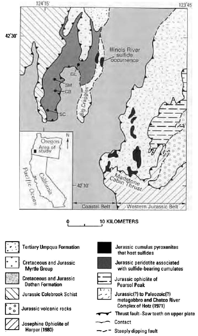
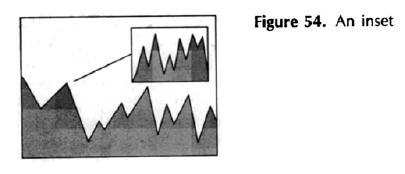
Anyhow, the United States Geological Survey (USGS) has a nice document of Suggestions To Authors of their technical reports and maps. In particular, the chapter on “Preparing maps and other illustrations” seems to be a good reference on maps for those of us without much formal cartography/geography training. For example, there are good tips on index maps (little inset maps showing the context around the bigger map, or pointing out where your study took place). The overall focus is naturally on geological maps, but much of the advice applies to other kinds of maps and visualizations too.

This is the 7th edition from 1991, so perhaps it’s due for an update, but the advice still seems solid. I’d also love to see the 1st edition from 1909 and see how much the guide has changed.

Superheroes? Dataheroes!

Jake Porway of DataKind gave an inspiring talk comparing statisticians and data scientists to superheroes. Hear the story of how “the data scientists, statisticians, analysts were able to bend data to their will” and how these powers are being used for good or for awesome:

(Hat Tip: FlowingData.com)

Jake’s comment that “you have extraordinary powers that ordinary people don’t have” reminds me of Andrew Gelman’s suggestion that “The next book to write, I guess, should be called, not Amazing Numberrunchers or Fabulous Stat-economists, but rather something like Statistics as Your Very Own Iron Man Suit.

Links to the statistics / data science volunteering opportunities Jake mentioned:

I also recommend Statistics Without Borders, with more of an international health focus. And if you’re here in Washington DC, Data Community DC and the related meetups are a great resource too.

Edit: Current students could also see if there is a Statistics in the Community (StatCom) Network branch at their university.

Statistics contests

Are you familiar with Kaggle? It’s a website for hosting online data-analysis contests, like smaller-scale versions of the Netflix Prize contest.
The U.S. Census Bureau is now hosting a Kaggle contest, asking statisticians and data scientists to help predict mail return rates on surveys and census forms (more info at census.gov and kaggle.com). The ability to predict return rates will help the Census Bureau target its outreach efforts and interview followup (phone calls and door-to-door interviews) more efficiently. So you could win a prize and make the government more efficient, all at the same time! 🙂
The contest ends on Nov 1st, so you still have 40 days to compete.

If you prefer making videos to crunching numbers, there’s also a video contest to promote the International Year of Statistics for 2013. Help people see how statistics makes the world better, impacts current events, or gives you a fun career, and you may win a prize and be featured on their website all next year. There are special prizes among non-English-language videos and among entrants under 18 years old.
Submissions are open until Oct 31st, just a day before the Census Challenge.


Compensating for different spatial abilities (feat. cyborgs!)

In July, I saw Iowa State’s  Dr. Sarah Nusser give a presentation about spatial ability among survey field representatives and how different people interact with various geospatial technologies. This talk introduced an area of research quite new to me, and it reminded me how important it is to know your audience before designing products for them. It also touched on directly augmenting our sensory perception — more about that below.

When you hire people to collect survey data in the field (verify addresses, conduct interviews, assess land cover type, etc.), you hope they’ll be able to find their way to the sites where you’re sending them. But new hires might come in with various levels of skill or experience, as well as different mental models for maps and geography. Dr. Nusser’s work [here’s a representative article] frames this as “spatial ability” and, practically speaking, treats it as innate: rather than training adults to improve their spatial ability, she focuses on technology and interfaces that help them work better with the mental model they already have. (I can’t believe that spatial ability really is innate and static… but it’s probably cheaper to design a few user-targeted interfaces once than to train new hires indefinitely.)

How do you tell if someone has high or low spatial ability (high SA vs low SA)? One approach is the Paper Folding Test and related tests produced by the Educational Testing Service.

Where will the holes be when the paper is unfolded?

Continue reading “Compensating for different spatial abilities (feat. cyborgs!)”

The Grammar of Graphics: notes on first reading

Leland Wilkinson’s The Grammar of Graphics is a classic in the data visualization literature. Wilkinson created a framework that coherently ties together many aspects of designing, implementing, reading, and understanding a graphic. It’s a useful approach and has been fairly influential: The popular R package ggplot2 is, more or less, an implementation of Wilkinson’s ideas, and I also see their influence in the software Tableau (about which more another time). Wilkinson himself helped to build these ideas into SPSS’s Graphics Production Language (GPL) and then SPSS Visualization Designer.

So what’s so special here? One of the core ideas is to start with the raw data and think about all the transformations, summaries, etc. that go into graphing it. With a good framework, this can help us see connections between different graphs and create new ones. (The opposite extreme is a “typology” or list of graph types, like you get in Excel: do you want a bar chart, a pie chart, a line chart, or one of these other 10 types? Such a list has no deep structure.) Following Wilkinson’s approach, you’ll realize that a pie chart is basically just a stacked bar chart plotted in polar coordinates, with bar height mapped to pie-slice angle… and that can get you thinking: What if I mapped bar height to radius, not angle? What if I added a variable and moved to spherical coordinates? What if I put a scatterplot in polar coordinates too? These may turn out to be bad ideas, but at least you’re thinking — in a way that is not encouraged by Excel’s list of 10 graph types.

This is NOT the approach that Wilkinson takes.

But, of course, thinking is hard, and so is this book. Reading The Grammar of Graphics requires much more of a dedicated slog than, say, Edward Tufte’s books, which you can just flip through randomly for inspiration and bite-sized nuggets of wisdom. (I admire Tufte too, but I have to admit that Wilkinson’s occasional jabs at Tufte were spot-on and amused me to no end.) It’s a book full of wit and great ideas, but also full of drawn-out sections that require serious focus, and it takes a while to digest it all and put it together in your mind.

So, although I’d highly recommend this book to anyone deeply interested in visualization, I’m still digesting it. What follows is not a review but just notes-to-self from my first read-through: things to follow up on and for my own reference. It might not be particularly thrilling for other readers. Continue reading “The Grammar of Graphics: notes on first reading”