Pun for the money

Today’s post is brought to you by my language nerd side.

First of all, this weekend brings the O’Henry Pun-Off World Championships in Austin, Texas. Read more about the Pun-Off in an excerpt from John Pollack’s book, The Pun Also Rises, which is also the prize of an online pun contest run by the online store Marbles.
(My submission: “Hey baby, you must be a Latin noun, because I could never decline you.”)
More good (bad?) puns from Chemistry Cat and Condescending Literature Pun Dog.

For DC-area residents, today is also the first day to register for summer language classes with the Global Language Network. Whether you want to hone your Spanish, start on Mandarin, or get exposed to something more uncommon (Azerbaijani, Georgian, Yoruba?), I highly recommend the GLN. It’s potentially free — your $150 deposit is returned to you unless you miss more than a quarter of the classes. (Even paying the full price, it’s still a great deal.) I’ve taken a couple of Turkish classes there, then taught Polish for the past year, and it’s been a great experience both as student and teacher.

DC word nerds may also enjoy the Spelling Buzz, held most Fridays at 8pm at Rock & Roll Hotel on H St NE. It’s a spelling bee with drinking: contestants must have a drink in hand at all times, and the MC can make you drink at any point. Pro tip: he usually uses the Sharon Herald spelling bee word lists, so if you study ahead of time you might do reasonably well. At the very least, be sure you’re solid on “diphtheria” and “ophthalmology” before you go.

Finally: If pun contests, language classes, and spelling bees are still not nerdy enough for you, then have you heard of linguistics olympiads? They’re like math olympiads but with these language puzzles that I find amazingly addictive. For example, given a few words in a language you’ve never learned, can you find translations (or pronunciations) of new phrases? Or can you figure out the patterns behind an alternative to Braille?
I wish I’d had the opportunity to do a linguistics olympiad in high school. But luckily there are some excellent problem sets online thanks to the folks behind the International Linguistics Olympiad, North American Computational Linguistics Olympiad, and Princeton and University of Oregon. If you like cryptic crosswords, these might be up your alley too.

JSM: accessible for first-year grad students?

A friend of mine has just finished his first year of a biostatistics program. I’m encouraging him to attend the Joint Statistical Meetings (JSM) conference in San Diego this July/August. He asked:

Some of the talks look really interesting, though as a someone who’s only been through the first year of a master’s program, I wonder if I’d be able to understand much.  When you went as a student, did you find the presentations to be accessible?

I admit a lot of the talks went over my head the first year — and many still do. Some talks are too specialized even for an experienced statistician who just has a different focus… But there are always plenty of accessible talks as well:

  • Talks on teaching statistical literacy or Stats 101 might be useful if you’re ever a TA or consultant
  • Talks on data visualization may focus on communicating results rather than on technical details
  • Overview lectures can introduce you to a new field
  • Some folks are known for generally being accessible speakers (a few off the top of my head: Hadley Wickham, Persi Diaconis, Andrew Gelman, Don Rubin, Dick DeVeaux, David Cox, Hal Varian… and plenty of others)

And it’s worthwhile for a grad student to start getting to know other statisticians and becoming immersed in your field.

  • There’s a nice opening night event for first-time attendees, and the Stat Bowl contest for grad students; in both of those, I made some friends I keep seeing again at later JSMs
  • Even when the talk is too advanced, it’s still fun to see a lecture by the authors of your textbooks, meet the folks who invented a famous estimator, etc.
  • You can get involved in longer-term projects: after attending the Statistics Without Borders sessions, I’ve become co-chair of the SWB website and co-authored a paper that’s now under review
  • It’s fun to browse the books in the general exhibit hall, get free swag, and see if any exhibitors are hiring; there is also a career placement center although I haven’t used it myself

Even if you’re a grad student or young statistician just learning the ropes, I definitely think it’s worth the trip!

API, and online mapping platforms

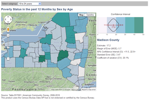
The Census Bureau is beta-testing a new API for developers. As I understand it, within hours of the API going live, Jan Vink incorporated it into an updated version of the interactive maps I’ve discussed before.

I think the placement of the legend on the side makes it easier to read than the previous version, where it was below. It’s a great development for the map — and a good showcase for the Census Bureau’s API, which I hope will become ready for public use in the near future.

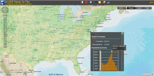
I’d love to see this and related approaches become available in several environments or frameworks for online/interactive mapping tools. One possibility is to make widgets for the ArcGIS Viewer for Flex platform, which works with ESRI’s ArcGIS products.

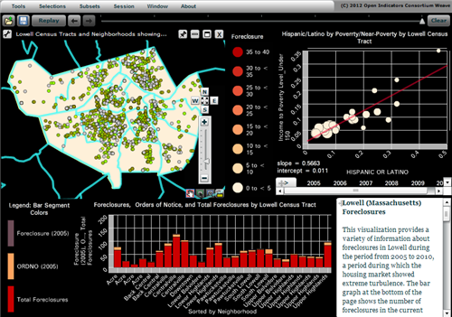
Another great environment I’m just learning about is Weave. This week the Census Bureau is hosting Dr. Georges Grinstein, of the University of Massachusetts at Lowell, who is building a powerful open-source platform for integrating and visualizing data. This is being developed alongside a consortium of local governments and nonprofits who are using Weave for information dashboards, data dissemination, etc.
It seems to be a mix of Actionscript, Javascript, and C++, so extending Weave’s core functionality sounds a bit daunting, but I was very glad to see that advanced users can call R scripts inside of a visualization. This will let you analyze and plot data in ways that the Weave team did not explicitly foresee.

In short, there’s plenty of exciting work being done in this arena!

In defense of the American Community Survey

Disclaimer: All opinions expressed on this blog are my own and are not intended to represent those of the U.S. Census Bureau.
Edit: Please also read the May 11th official statement responding to the proposed cuts, by Census Bureau Director Robert Groves.
(Again, although of course my opinions are informed by my work with the Bureau, my post below is strictly as a private citizen. I have neither the authority nor the intent to be an official spokesperson for the Census Bureau.)

Yesterday the U.S. House of Representatives voted to eliminate the American Community Survey (ACS). The Senate has not passed such a measure yet. I do not want to get political, but in light of these events it seems appropriate to highlight some of the massive benefits that the ACS provides.

For many variables and indicators, the ACS is the only source of nationally-comparable local data. That is, if you want a detailed look at trends and changes over time, across space, or by demographic group, the ACS is your best dataset for many topics. Take a look at the list of data topics on the right-hand side of the ACS homepage: aging, disability, commuting to work, employment, language, poverty…

Businesses use the ACS to analyze markets: Can people afford our product here?  Should we add support for speakers of other languages? Does the aging population here need the same services as the younger population there? Similarly, public health officials use ACS information about population density when deciding where to place a new hospital. Dropping the ACS would increase risks with no corresponding direct benefits to businesses or local governments.

Local authorities can and do commission their own local studies of education levels or commute times; but separate surveys by each area might use incompatible questions. Only the ACS lets them compare such data to their neighbors, to similar localities around the country, and to their own past.

The Census Bureau works long and hard to ensure that each survey is well-designed to collect only the most important data with minimal intrusion. For example, even the flush toilet question (cited deprecatingly by the recent measure’s author) is useful data about infrastructure and sanitation. From the ACS page on “Questions on the form and why we ask”:

Complete plumbing facilities are defined as hot and cold running water, a flush toilet, and a bathtub or shower. These data are essential components used by the U.S. Department of Housing and Urban Development in the development of Fair Market Rents for all areas of the country. Federal agencies use this item to identify areas eligible for public assistance programs and rehabilitation loans. Public health officials use this item to locate areas in danger of ground water contamination and waterborne diseases.

Besides the direct estimates from the ACS itself, the Census Bureau uses ACS data as the backbone of several other programs. For example, the Small Area Income and Poverty Estimates program provides annual data to the Department of Education for use in allocating funds to school districts, based on local counts and rates of children in poverty. Without the ACS we would be limited to using smaller surveys (and thus less accurate information about poverty in each school district) or older data (which can become outdated within a few years, such as during the recent recession). Either way, it would hurt our ability to allocate resources fairly to schoolchildren nationwide.

Similarly, the Census Bureau uses the ACS to produce other timely small-area estimates required by Congressional legislation or requested by other agencies: the number of people with health insurance, people with disabilities, minority language speakers, etc. The legislation requires a data source like the ACS not only so that it can be carried out well, but also so its progress can be monitored.

Whatever our representatives may think about the costs of this survey, I hope they reflect seriously on all its benefits before deciding whether to eliminate the ACS.

Updated d3 idiopleth

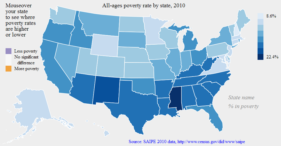
I’ve updated the interactive poverty map from last month, providing better labels, legends, and a clickable link to the data source. It also actually compares confidence intervals correctly now. I may have switched the orange and purple colors too. (I also reordered the code so that things are defined in the right order; I think that was why sometimes you’d need to reload the map before the interactivity would work.)

Please click the screenshot to try the interactive version (seems to work better in Firefox than Internet Explorer):

Next steps: redo the default color scheme so it shows the states relative to the national average poverty rate; figure out why there are issues in the IE browser; clean up the code and share it on Github.
[Edit: the IE issues seem to be caused by D3’s use of the SVG format for its graphics; older versions of IE do not support SVG graphics. I may try to re-do this map in another Javascript library such as Raphaël, which can apparently detect old versions of IE and use another graphics format when needed.]

For lack of a better term I’m still using “idiopleth”: idio as in idiosyncratic (i.e. what’s special about this area?) and pleth as in plethora (or choropleth, the standard map for a multitude of areas). Hence, together, idiopleth: one map containing a multitude of idiosyncratic views. Please leave a comment if you know of a better term for this concept already.

Getting SASsy

Although I am most familiar with R for statistical analysis and programming, I also use a fair amount of SAS at work.

I found it a huge transition at first, but one thing that helped make SAS “click” for me is that it was designed around those (now-ancient) computers that used punch cards. So the DATA step processes one observation at a time, as if you were feeding it punch cards one after another, and never loads the whole dataset into memory at once. I think this is also why many SAS procedures require you to sort your dataset first. It makes some things awkward to do, and often it takes more code than the equivalent in R, but on the other hand it means you can process huge datasets without worrying about whether they will fit into memory. (Well… memory size should be a non-issue for the DATA step, but not for all procedures. We’ve run into serious memory issues on large datasets when using PROC MIXED and PROC MCMC, so using SAS does not guarantee that you never have to fear large data.)

The Little SAS Book (by Delwiche and Slaughter) and Learning SAS by Example (by Cody) are two good resources for learning SAS. If you’re able to take a class directly from the SAS Institute, they tend to be taught well, and you get a book of class notes with a very handy cheat sheet.

Great work in math education (through blogs and Star Wars)

I keep emailing these links to friends, so I might as well put them in an update-able post instead.

I got hooked by this line:

You say “looks like somebody has too much time on their hands” but all I hear is “I’m sad because I don’t know what creativity feels like.”

I love this mentality and followed it down the path to an excellent community of high school math/physics teachers, all blogging about how they try to keep students engaged, motivate the topics they teach, make grades meaningful, etc. Two of my favorites are Shawn Cornally and Dan Meyer:

Shawn Cornally‘s all about formative assessment, standards-based grading, learning through inquiry, etc. Definitely watch his TEDx talk (with Star Wars references, as promised; I love the part about “Tayh D Be”) and check out the formative assessment / feedback / grading tool he’s built.

Dan Meyer takes a love of storytelling (compare the narrative of Star Wars to a typical math problem) and sets up some badass perplexing math questions, using good hooks to get students engaged AND using the real world as an answer key (vs. just “Oh that’s what the back of the book says”).

Also recommended is another TEDx talk by physics teacher / skateboarder Dr Tae.

Here is an overview of some other discussions in this math-teacher blogosphere. That includes some back-and-forth on Khan Academy, which I think is doing great work but I agree with the criticism that his videos can come across as “This is a required class, so let me help you pass the quiz,” instead of “This is an awesome subject, so let me get you hooked on it.” It’s much better than nothing, but there’s room for even more goodness…

Plenty of other great great blogs to share, but that’s a start for now.

Matrix vs Data Frame in R

Today I ran into a double question that might be relevant to other R users:
Why can’t I assign a dataframe row into a matrix row?
And why won’t my function accept this dataframe row as an input argument?

A single row of a dataframe is a one-row dataframe, i.e. a list, not a vector. R won’t automatically treat dataframe rows as vectors, because a dataframe’s columns can be of different types. So converting them to a vector (which must be all of a single type) would be tricky to generalize.

But if in your case you know all your columns are numeric (no characters, factors, etc), you can convert it to a numeric matrix yourself, using the as.matrix() function, and then treat its rows as vectors.

> # Create a simple dataframe
> # and an empty matrix of the same size
> my.df <- data.frame(x=1:2, y=3:4)
> my.df
  x y
1 1 3
2 2 4
> dim(my.df)
[1] 2 2
> my.matrix <- matrix(0, nrow=2, ncol=2)
> my.matrix
     [,1] [,2]
[1,]    0    0
[2,]    0    0
> dim(my.matrix)
[1] 2 2
>
> # Try assigning a row of my.df into a row of my.matrix
> my.matrix[1,] <- my.df[1,]
> my.matrix
[[1]]
[1] 1

[[2]]
[1] 0

[[3]]
[1] 3

[[4]]
[1] 0

> dim(my.matrix)
NULL
> # my.matrix became a list!
>
> # Convert my.df to a matrix first
> # before assigning its rows into my.matrix
> my.matrix <- matrix(0, nrow=2, ncol=2)
> my.matrix[1,] <- as.matrix(my.df)[1,]
> my.matrix
     [,1] [,2]
[1,]    1    3
[2,]    0    0
> dim(my.matrix)
[1] 2 2
> # Now it works.
>
> # Try using a row of my.df as input argument
> # into a function that requires a vector,
> # for example stem-and-leaf-plot:
> stem(my.df[1,])
Error in stem(my.df[1, ]) : 'x' must be numeric
> # Fails because my.df[1,] is a list, not a vector.
> # Convert to matrix before taking the row:
> stem(as.matrix(my.df)[1,])

  The decimal point is at the |

  1 | 0
  1 |
  2 |
  2 |
  3 | 0

> # Now it works.

For clarifying dataframes vs matrices vs arrays, I found this link quite useful:
http://faculty.nps.edu/sebuttre/home/R/matrices.html#DataFrames

Director Groves leaving Census Bureau

I’m sorry to hear that our Census Bureau Director, Robert Groves, is leaving the Bureau for a position as provost of Georgetown University. The Washington Post, Deputy Commerce Secretary Rebecca Blank, and Groves himself reflect on his time here.

I have only heard good things about Groves from my colleagues. Besides the achievements listed in the links above, my senior coworkers tell me that the high number and quality of visiting scholars / research seminars here, in recent years, is largely thanks to his encouragement. He has also set a course for improving the accessibility and visualization of the Bureau’s data; I strongly hope future administrations will continue supporting these efforts.

Finally, here is a cute story I heard (in class with UMich’s Professor Steven Heeringa) about Groves as a young grad student. I’m sure the Georgetown students will enjoy having him there:

“In the days in ’65 when Kish’s book was published, there were no computers to do these calculations. So variance estimation for complex sample designs was all done through manual calculations, typically involving calculating machines, rotary calculators.

I actually arrived in ’75 as a graduate student in the sampling section, and they were still using rotary calculators. I brought the first electronic calculator to the sampling section at ISR, and people thought it was a little bit of a strange device, but within three months I had everybody convinced.

Otherwise we had these large rotary calculators that would hum and make noise, and Bob Groves and I — there was a little trick with one of the rotary calculators: if you pressed the correct sequence of buttons, it would sort of iterate and it would start humming like a machine gun, and so if you can imagine Bob Groves fiddling around on a rotor calculator to sorta create machine gun type noises in the sampling section at ISR… I’m sure he’d just as soon forget that now, but we were all young once, I guess.”

Dr Groves, I hope you continue to make the workplace exciting 🙂 and wish you all the best in your new position!

Tidbits of geography (and of cake)

Futility Closet has plenty of great trivia. I want to share some of my favorite geographical tidbits from there, since I have maps on the mind lately.

Source: Wikimedia Commons

While we’re talking about shapes and areas, here’s a more mathematical-geometrical question: What’s the most efficient way to carve up a circle to fit inside a square of slightly-larger surface area?

Round peg into a square hole, er, that is, cake into pan

I baked a cake in a round 9″ pan, so the surface area is \pi*r^2 = \pi*4.5^2 = 63.6 \text{ in}^2.  I wanted to transport it in a pan with a lid, and I have such a 8″ square  pan with surface area 8^2 = 64 \text{ in}^2. What’s the best way to fit it in, with the fewest cuts and least wasted scraps? (Well, not really wasted, I’ll eat them gladly 🙂 )