Matrix vs Data Frame in R

Today I ran into a double question that might be relevant to other R users:
Why can’t I assign a dataframe row into a matrix row?
And why won’t my function accept this dataframe row as an input argument?

A single row of a dataframe is a one-row dataframe, i.e. a list, not a vector. R won’t automatically treat dataframe rows as vectors, because a dataframe’s columns can be of different types. So converting them to a vector (which must be all of a single type) would be tricky to generalize.

But if in your case you know all your columns are numeric (no characters, factors, etc), you can convert it to a numeric matrix yourself, using the as.matrix() function, and then treat its rows as vectors.

> # Create a simple dataframe
> # and an empty matrix of the same size
> my.df <- data.frame(x=1:2, y=3:4)
> my.df
  x y
1 1 3
2 2 4
> dim(my.df)
[1] 2 2
> my.matrix <- matrix(0, nrow=2, ncol=2)
> my.matrix
     [,1] [,2]
[1,]    0    0
[2,]    0    0
> dim(my.matrix)
[1] 2 2
>
> # Try assigning a row of my.df into a row of my.matrix
> my.matrix[1,] <- my.df[1,]
> my.matrix
[[1]]
[1] 1

[[2]]
[1] 0

[[3]]
[1] 3

[[4]]
[1] 0

> dim(my.matrix)
NULL
> # my.matrix became a list!
>
> # Convert my.df to a matrix first
> # before assigning its rows into my.matrix
> my.matrix <- matrix(0, nrow=2, ncol=2)
> my.matrix[1,] <- as.matrix(my.df)[1,]
> my.matrix
     [,1] [,2]
[1,]    1    3
[2,]    0    0
> dim(my.matrix)
[1] 2 2
> # Now it works.
>
> # Try using a row of my.df as input argument
> # into a function that requires a vector,
> # for example stem-and-leaf-plot:
> stem(my.df[1,])
Error in stem(my.df[1, ]) : 'x' must be numeric
> # Fails because my.df[1,] is a list, not a vector.
> # Convert to matrix before taking the row:
> stem(as.matrix(my.df)[1,])

  The decimal point is at the |

  1 | 0
  1 |
  2 |
  2 |
  3 | 0

> # Now it works.

For clarifying dataframes vs matrices vs arrays, I found this link quite useful:
http://faculty.nps.edu/sebuttre/home/R/matrices.html#DataFrames

Director Groves leaving Census Bureau

I’m sorry to hear that our Census Bureau Director, Robert Groves, is leaving the Bureau for a position as provost of Georgetown University. The Washington Post, Deputy Commerce Secretary Rebecca Blank, and Groves himself reflect on his time here.

I have only heard good things about Groves from my colleagues. Besides the achievements listed in the links above, my senior coworkers tell me that the high number and quality of visiting scholars / research seminars here, in recent years, is largely thanks to his encouragement. He has also set a course for improving the accessibility and visualization of the Bureau’s data; I strongly hope future administrations will continue supporting these efforts.

Finally, here is a cute story I heard (in class with UMich’s Professor Steven Heeringa) about Groves as a young grad student. I’m sure the Georgetown students will enjoy having him there:

“In the days in ’65 when Kish’s book was published, there were no computers to do these calculations. So variance estimation for complex sample designs was all done through manual calculations, typically involving calculating machines, rotary calculators.

I actually arrived in ’75 as a graduate student in the sampling section, and they were still using rotary calculators. I brought the first electronic calculator to the sampling section at ISR, and people thought it was a little bit of a strange device, but within three months I had everybody convinced.

Otherwise we had these large rotary calculators that would hum and make noise, and Bob Groves and I — there was a little trick with one of the rotary calculators: if you pressed the correct sequence of buttons, it would sort of iterate and it would start humming like a machine gun, and so if you can imagine Bob Groves fiddling around on a rotor calculator to sorta create machine gun type noises in the sampling section at ISR… I’m sure he’d just as soon forget that now, but we were all young once, I guess.”

Dr Groves, I hope you continue to make the workplace exciting 🙂 and wish you all the best in your new position!

Tidbits of geography (and of cake)

Futility Closet has plenty of great trivia. I want to share some of my favorite geographical tidbits from there, since I have maps on the mind lately.

Source: Wikimedia Commons

While we’re talking about shapes and areas, here’s a more mathematical-geometrical question: What’s the most efficient way to carve up a circle to fit inside a square of slightly-larger surface area?

Round peg into a square hole, er, that is, cake into pan

I baked a cake in a round 9″ pan, so the surface area is \pi*r^2 = \pi*4.5^2 = 63.6 \text{ in}^2
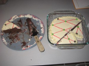
.  I wanted to transport it in a pan with a lid, and I have such a 8″ square  pan with surface area 8^2 = 64 \text{ in}^2. What’s the best way to fit it in, with the fewest cuts and least wasted scraps? (Well, not really wasted, I’ll eat them gladly 🙂 )

Localized Comparisons: Idiopleth Maps?

In which we propose a unifying theme, name, and some new prototypes for visualizations that allow “localization of comparisons,” aka “How do I relate to others?”

When Nathan Yau visited the Bureau a few months ago, he compared two world maps of gasoline prices by country. The first one was your typical choropleth: various color shades correspond to different gas prices. Fair enough, but (say) an American viewing the map is most likely interested in how US gas prices compare to the rest of the world. So instead, present a map with America in a neutral color (grey) and recolor the other countries relative to the US, to show whether their prices are higher or lower than here (for instance, red for pricier and green for cheaper gas).

I liked this idea but wanted to take it further: Instead of a one-off map just for Americans, why not make an interactive map that recolors automatically when you select a new country?
As a statistician, I’m also interested in how to communicate uncertainty: is your local area’s estimate statistically significantly different from your neighbors’ estimates? Continue reading “Localized Comparisons: Idiopleth Maps?”

Stats 101 resources

A few friends have asked for self-study resources on learning (or brushing up on) basic statistics. I plan to keep updating this post as I find more good suggestions.

Of course the ideal case is to have a good teacher in a nice classroom environment:

The best classroom setting

For self-study, however, you might try an open course online. MIT has some OpenCourseWare for mathematics (including course 18.433, “Statistics for Applications”), and Carnegie Mellon offers free online courses in statistics. I have not tried them myself yet but hear good things so far.

As for textbooks: Freedman, Pisani, and Purves’ Statistics is a classic intro to the key concepts and seems a great way to get up to speed.
Two other good “gentle” conceptual intros are The Cartoon Guide to
Statistics
and How to Lie with Statistics. Also useful is Statistics Done Wrong [see my review], an overview of common mistakes in designing studies or applying statistics.
But I believe they all try to avoid equations, so you might need another source to show you how to actually crunch the numbers.
My undergrad statistics class used Devore and Farnum’s Applied Statistics for Engineers and Scientists. I haven’t touched it in years, so I ought to browse it again, but I remember it demonstrated the steps of each analysis quite clearly.
If you end up using the Devore and Farnum book, Jonathan Godfrey has converted the 2nd edtion’s examples into R.
[Edit: John Cook’s blog and his commenters have some good advice about textbooks. They also cite a great article by George Cobb about how to choose a stats textbook.]

Speaking of R, I would suggest it if you don’t already have a particular statistical software package in mind. It is open source and a free download, and I find that working in R is similar to the way I think about math while working it out on paper (unlike SPSS or SAS or Stata, all of which are expensive and require a very different mindset).
I list plenty of R resources in my R101 post. In particular, John Verzani’s simpleR seems to be a good introduction to using R, and reviews on a lot of basic statistics along the way (though not in detail).
People have also recommended some books on intro stats with R, especially Dalgaard’s Introductory Statistics with R or Maindonald & Braun’s Data Analysis and Graphics Using R.

For a very different approach to introductory stats, my former professor Allen Downey wrote a book called Think Stats aimed at programmers and using Python. I’ve only just read it, and I have a few minor quibbles that I want to discuss with him, but it’s a great alternative to the classic approach. As Allen points out, “standard statistical techniques are really computational shortcuts, which is less important when computation is cheap.” Both mindsets are good to have under your belt, but Allen’s is one of the few intro books so far for the computational route. It’s published by O’Reilly but Allen also makes a free version available online, as well as a related blog full of good resources.
Speaking of O’Reilly, apparently their book Statistics Hacks contains major conceptual errors, so I would have to advise against it unless they fix them in a future edition.

DC Datadive

This weekend I had an absolute blast taking part in the DC Datadive hosted by the NYC-based Data Without Borders (DWB). It was somewhat like a hackathon, but rather than competing to develop an app with commercial potential, we were tasked with exploring data to produce insights for social good. (Perhaps it’s more like the appropriate-technology flash conferences for engineers that my classmates organized back at Olin.) In any case, we mingled on Friday night, chose one of three projects to focus on for Saturday (10am to 5am, in our case!), and presented Sunday morning.

The author, eager to point out a dotplot

There were three organizations acting as project sponsors (presentations here):

  • The National Environmental Education Foundation wondered how to evaluate their own efforts to increase environmental literacy among the US public. Their volunteers came up with great advice and even found some data NEEF didn’t realize they already had.
  • GuideStar, a major database of financial information on nonprofit organizations, wanted early-warning prediction of nonprofits that are at risk of failing, as well as ways to highlight high-performing organizations that are currently under the radar. This group of datadivers essentially ran their own Netflix prize contest, assembling an amazing range of machine learning approaches that each gave a new insight into the data.
  • DC Action for Children tasked us with creating a visualization to clearly express how children’s well-being, health, school performance, etc. are related to the neighborhood where they live. I chose to work on this project and am really pleased with the map we produced: screenshot and details below.

Click above and try it out. Mousing over each area gives its neighborhood-level information; hovering over a school gives school details.
In short, our map situates school performance (percent of children with Proficient or Advanced scores on reading and math tests) in the context of their DC neighborhood. Forgive me if I’m leaving out important nuances, but as I understood it the idea was to change the conversation from “The schools on this list are failing so they must have poor adminstration, bad teachers, etc.” towards “The children attending the schools in this neighborhood have it rough: socioeconomic conditions, few resources like libraries and swimming pools, no dentists or grocery stores, etc. Maybe there are other factors that public policy should address before putting full responsibility on the school.” I think our map is a good start on conveying this more effectively than a bunch of separated tables.

It was so exciting to have a tangible “product” to show off. There may be a few minor technical glitches, and we did not have time to show all of the data that the other subteams collected, but it’s a good first draft.
Planning and coordinating our giant group was a bit tough at first but our DWB coordinator, Zac, gamely kept us moving and communicating across the several sub-teams that we formed. The data sub-team found, organized, and cleaned a bunch more variables than we could put in, so that whoever continues this work will have lots of great data to use. And the GIS sub-team aggregated it all to several levels (Census tract, neighborhood, and ward); again we only had time to implement one level on map, but all is ready to add the other levels when time allows.
As for myself, I worked mostly with the visualization sub-team: Nick who set up the core map in TileMill; Jason who kept pushing it forward until 5am; Sisi who styled it and cobbled together the info boxes out of HTML and the Google Charts API and who knows what else; and a ton of other fantastic people whose handles I can’t place at the moment. I learned A TON from everybody and was just happy that my R skills let me contribute to this great effort.
[Edit: It was amiss not to mention Nick’s coworkers Troy and Andy who provided massive help with the GIS prep and the TileMill hosting. Andy has a great writeup of the tools, which they also use for their maps of the week.]
I absolutely loved the collaborative spirit: people brought so many different skills and backgrounds to the team, and we made new connections that I hope will continue with future work on this or similar projects. Perhaps some more of us will join the Data Science DC Meetup group, for example.
I do wish I had spent more time talking to people on the other projects — I was so engrossed in my own team’s work that I didn’t get to see what other groups were doing until the Sunday presentations. Thank goodness for catching up later via Twitter and #dcdatadive.

A huge thanks to New America Foundation for hosting us (physically as well as with a temporary TileMill account), to the Independent Sector NGEN Fellows for facilitating, to whoever brought all the delicious food, and of course to DWB for putting it all together. I hope this is just the start of much more such awesomeness!

PS — my one and only concern: The wifi clogged up early on Saturday, when everyone was trying to get data from the shared Dropboxes at once. If you plan to attend a future datadive, I’d suggest bringing a USB stick to ease sharing of big files if the wifi collapses.

[Edit: I also recommend DC Action for Children’s blog posts on their hopes before the datadive and their reactions afterwards. They have also shared a good article with more open questions about how kids are impacted by inequality in and among DC neighborhoods.]

R101

I’m preparing “R101,” an introductory workshop on the statistical software R. Perhaps other beginners might find some use in the following summary and resources. (See also the post on resources for teaching yourself introductory statistics.)

Do you have obligatory screenshots of nifty graphics that R can produce? Yes, we do.

Nice. So what exactly is R? It is an open-source software tool for statistics, data processing, data visualization, etc. (Technically there’s a programming language called S, and R is just one open-source software tool that implements the S language. But you’ll often hear people just say “the R language.” Beginners can worry about the nuances later.)
Open source means it is free to download and use; this is great for academics and others with low budgets. It also means you can inspect the code of any algorithm if you want to double-check it or just to see how it’s done; this is great for validating and building on each others’ ideas. And it is easy to share code in user-defined “packages,” of which there are thousands, all helping people use cutting-edge statistical tools as soon as they are invented.

How do I get started? Download and install R from CRAN, the Comprehensive R Archive Network. There are Windows, Mac, and Linux versions.
In Windows at least, when you open the program there is a big window containing a smaller window, the R Console. You can type and submit commands in the Console window at the prompts (the “>” signs). Try typing 3+5 and hit Enter, and you should see the output [1] 8 which is good. The output of 3+5 is a 1-item vector (hence the [1]) with the value 8 as it should be.
Great, now you know how to use R as a desktop calculator!
Or you can type your commands in a script, so that you can save your code easily. Go to “File -> New script” and it will open the R Editor window. Type 3+5 in there, highlight it, and then either click the “Run line or selection” icon on the top menu bar or just hit Ctrl+R on the keyboard. It should copy the command into the Console window and run it, with the same result as before.
Sweet, now you can save the code you used to do your calculations.
Quick-R has more details on using the R interface.
Next, try A Sample Session from the R manual to see examples of other things R can do.

What are the key concepts? Basically, everything is a function or an object. Objects are where your data and results are stored: data frames, matrices, vectors, lists, etc. Functions take objects in, think about them, and spit new objects out. Functions sometimes also have side effects (like displaying a table of output or a graph, or changing a display setting).
If you want to save the results or output of a function, use <- which is the assignment operator (think of an arrow pointing left). For example, to save the natural log of 10 into a variable called x, type the command x <- log(10). Then you can use x as the input to another function.
Note that functions create new output rather than affecting the input variable. If you have a vector called y that you need sorted, sort(y) will print out a sorted copy of y but will not changed y itself. If you actually want y to be sorted, you have to reassign it: y <- sort(y).
Functions always take their input in parentheses: (). So if you see a word followed by parentheses, you know it’s a function in R. You will also see square brackets: []. These are used for locating or extracting data in objects. For example, if you have a vector called y, then y[3] gives you the 3rd element of that vector. If y is a matrix, then y[4,7] is the element in the 4th row, 7th column.

How do I get help? If you know you want to use a function named foo, you can learn more about it by typing ?foo which will bring up the help file for that function. The “Usage” section tells you the arguments, their default order, and their default values. (If no default value is given, it is a required argument.) “Arguments” gives more details about each argument. “Value” gives the structure of the output. “Examples” shows an example of the function in use.
If you know what you want to do but don’t know what the function is called, I suggest looking through the R Reference Card. If that does not answer your question, you can try searching using RSeek.org or search.r-project.org, search engine tuned to the R sites and mailing lists… since just typing the letter R into Google is not always helpful 🙂

Where do I read more?
Online resources for general beginners:
R for Beginners
Simple R
Official Introduction to R
R Fundamentals
Kickstarting R
Let’s Use R Now
UCLA R Class Notes
A Quick and (Very) Dirty Intro to Doing Your Statistics in R
Hints for the R Beginner
R Tutorials from Universities Around the World (88 as of last count)

For statisticians used to other packages:
Quick-R
R for SAS and SPSS Users

For programmers:
R’s unconventional features
Google’s R code style guide

Good books (as suggested by Cosma Shalizi):
Paul Teetor, The R Cookbook: “explains how to use R to do many, many common tasks”
Norman Matloff, The Art of R Programming: “Good introduction to programming for complete novices using R.”


I won’t believe where you are unless I know how you got there

The process of doing science, math, engineering, etc. is usually way messier than how those results are reported. Abstruse Goose explains it well:

In pure math, that’s usually fine. As long as your final proof can be verified by others, it doesn’t necessarily matter how you got there yourself.
Now, verifying it might be hard, for example with computer-assisted proofs like that of the Four Color Theorem. And teaching math via the final proof might not be the best way, pedagogically, to develop problem-solving intuition.
But still, a theorem is either true or it isn’t.

However, in the experimental sciences, where real-world data is inherently variable, it’s very rare that you can really say, “I’ve proven that Theory X is true.” Usually the best you can do is to say, “I have strong evidence for Theory X,” or, “Given these results it is reasonable to believe in Theory X.”
(There’s also decision theory: “Do we have enough evidence to think that Theory X is true?” is a separate question from “Do we have enough evidence to act as if Theory X is true?”)
In these situations, the way you reached your conclusions really does affect how trustworthy they are.

Andrew Gelman reports that Cornell psychologists have written a nice paper on this topic, focusing on the statistical testing side of this issue. It’s a quick and worthwhile read.

Some of their recommendations only make sense for limited types of analysis, but for those cases, it is sensible advice. I thought that the contrast between their two descriptions of Study 2 (“standard” on p. 2, versus “compliant” on p. 6) was very effective.

I’m not sure what to think of their idea of limiting “researcher degrees of freedom.”
For example, they discourage a Bayesian approach because “Bayesian statistics require making additional judgments (e.g., the prior distribution) on a case-by-case basis, providing yet more researcher degrees of freedom.”
I’m a bit hesitant to say that researchers should be pigeonholed into the standard frequentist toolkit and not allowed to use their best judgment!
If canned frequentist methods are unsuitable for the problem at hand, or underestimate uncertainty relative to a carefully-thought-out, problem-appropriate Bayesian method, you may not be doing better after all…
However, like the authors of this paper, I do support better reporting of why a certain analysis was judged to be the right tool for the job.
Ideally, more of us would know Bayesian methods and could justify the choice between frequentist and Bayes approaches for the given problem at hand, not by always saying “the frequentist approach is standard” and stopping our thinking there.

Synaesthesia (or, This is Your Brain on Physics)

John Cook posted a fascinating Richard Feynman quote that made me wonder whether the physicist may have had synaesthesia:

I see some kind of vague showy, wiggling lines  — here and there an E and a B written on them somehow, and perhaps some of the lines have arrows on them — an arrow here or there which disappears when I look too closely at it. When I talk about the fields swishing through space, I have a terrible confusion between the symbols I use to describe the objects and the objects themselves. I cannot really make a picture that is even nearly like the true waves.

As it turns out, he probably did:

As I’m talking, I see vague pictures of Bessel functions from Jahnke and Emde’s book, with light-tan j’s, slightly violet-bluish n’s, and dark brown x’s flying around. And I wonder what the hell it must look like to the students.

The letter-color associations in this second quote are a fairly common type of synaesthesia. However, the first quote above sounds quite different, but still plausibly like synaesthesia: “I have a terrible confusion between the symbols I use to describe the objects and the objects themselves”…

I wonder whether many of the semi-mystical genius-heroes of math & physics lore (also, for example, Ramanujan) have had such neurological conditions underpinning their unusually intuitive views of their fields of study.

I love the idea of synaesthesia and am a bit jealous of people who have it. I’m not interested in drug-induced versions but I would love to experiment with other ways of experiencing synthetic synaesthesia myself. Wired Magazine has an article on such attempts, and I think I remember another approach discussed in Oliver Sacks’ book Musicophilia.

I have a friend who sees colors in letters, which helps her to remember names — I’ve heard her think out loud along these lines: “Hmm, so-and-so’s name is kind of reddish-orange, so it must start with P.” I wonder what would happen if she learned a new alphabet, say the Cyrillic alphabet (used in Russian etc.): would she associate the same colors with similar-sounding letters, even if they look different? Or similar-looking ones, even if they sound different? Or, since her current associations were formed long ago, would she never have any color associations at all with the new alphabet?

Also, my sister sees colors when she hears music; next time I see her I ought to ask for more details. (Is the color related to the mood of the song? The key? The instrument? The time she first heard it? etc. Does she see colors when practicing scales too, or just “real” songs?)

Finally, this isn’t quite synaesthesia but another natural superpower in a similar vein, suggesting that language can influence thought:

…unlike English, many languages do not use words like “left” and “right” and instead put everything in terms of cardinal directions, requiring their speakers to say things like “there’s an ant on your south-west leg”.  As a result, speakers of such languages are remarkably good at staying oriented (even in unfamiliar places or inside buildings) and perform feats of navigation that seem superhuman to English speakers. In this case, just a few words in a language make a big difference in what cognitive abilities their speakers develop. Certainly next time you plan to get lost in the woods, I recommend bringing along a speaker of Kuuk Thaayorre or Guugu Yimithirr rather than, say, Dutch or English.

The human brain, ladies and gentlemen!

Separation of degrees

Scientific American has a short article on trends in undergraduate degrees over the past 20 years, illustrated with a great infographic by Nathan Yau. As a big fan of STEM (science, tech, engineering and math) education, I was pleased to see data on changing patterns among STEM degree earners.

However, there seemed to be a missed opportunity. The article mentioned that “More women are entering college, which in turn is changing the relative popularity of disciplines.” If the data were broken down by gender, readers could better see this fact for themselves.

I thought I could exploit the current graphic’s slight redundancy: the bar heights below and above the gray horizontal lines are exactly the same. Why not repurpose this format to show data on degrees earned by men vs. by women (below vs. above the horizontal line), in the same amount of space?

I could not find the gender breakdown for the exact same set of degrees, but a similar dataset is in the Digest of Education Statistics, tables 308 to 330. Here are my revised plots, made using R with the ggplot2 package.

Click this thumbnail to see all the data in one plot (it’s too big for the WordPress column width):

Or see the STEM and non-STEM plots separately below.

So, what’s the verdict? These new graphs do support SciAm’s conclusions: women are largely driving the increases in psychology and biology degrees (as well as “health professions and related sciences”), and to a lesser degree in the arts and communications. On the other hand, increases in business and social science degrees appear to be driven equally by males and females. The mid-’00s spike in computer science was mostly guys, it seems.

I’d also like to think that my alma mater, Olin College, contributed to the tiny increase in female engineers in the early ’00s 🙂

Technical notes:
Some of these degree categories are hard to classify as STEM vs. non-STEM. In particular, Architecture and SocialScience include some sub-fields of each type… Really, I lumped them under non-STEM only because it balanced the number of items in each group.
Many thanks to a helpful Learning R tutorial on back-to-back bar charts.