I won’t believe where you are unless I know how you got there

The process of doing science, math, engineering, etc. is usually way messier than how those results are reported. Abstruse Goose explains it well:

In pure math, that’s usually fine. As long as your final proof can be verified by others, it doesn’t necessarily matter how you got there yourself.
Now, verifying it might be hard, for example with computer-assisted proofs like that of the Four Color Theorem. And teaching math via the final proof might not be the best way, pedagogically, to develop problem-solving intuition.
But still, a theorem is either true or it isn’t.

However, in the experimental sciences, where real-world data is inherently variable, it’s very rare that you can really say, “I’ve proven that Theory X is true.” Usually the best you can do is to say, “I have strong evidence for Theory X,” or, “Given these results it is reasonable to believe in Theory X.”
(There’s also decision theory: “Do we have enough evidence to think that Theory X is true?” is a separate question from “Do we have enough evidence to act as if Theory X is true?”)
In these situations, the way you reached your conclusions really does affect how trustworthy they are.

Andrew Gelman reports that Cornell psychologists have written a nice paper on this topic, focusing on the statistical testing side of this issue. It’s a quick and worthwhile read.

Some of their recommendations only make sense for limited types of analysis, but for those cases, it is sensible advice. I thought that the contrast between their two descriptions of Study 2 (“standard” on p. 2, versus “compliant” on p. 6) was very effective.

I’m not sure what to think of their idea of limiting “researcher degrees of freedom.”
For example, they discourage a Bayesian approach because “Bayesian statistics require making additional judgments (e.g., the prior distribution) on a case-by-case basis, providing yet more researcher degrees of freedom.”
I’m a bit hesitant to say that researchers should be pigeonholed into the standard frequentist toolkit and not allowed to use their best judgment!
If canned frequentist methods are unsuitable for the problem at hand, or underestimate uncertainty relative to a carefully-thought-out, problem-appropriate Bayesian method, you may not be doing better after all…
However, like the authors of this paper, I do support better reporting of why a certain analysis was judged to be the right tool for the job.
Ideally, more of us would know Bayesian methods and could justify the choice between frequentist and Bayes approaches for the given problem at hand, not by always saying “the frequentist approach is standard” and stopping our thinking there.

Separation of degrees

Scientific American has a short article on trends in undergraduate degrees over the past 20 years, illustrated with a great infographic by Nathan Yau. As a big fan of STEM (science, tech, engineering and math) education, I was pleased to see data on changing patterns among STEM degree earners.

However, there seemed to be a missed opportunity. The article mentioned that “More women are entering college, which in turn is changing the relative popularity of disciplines.” If the data were broken down by gender, readers could better see this fact for themselves.

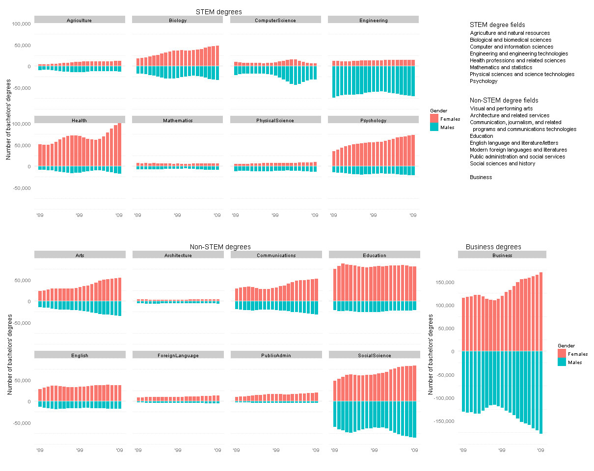
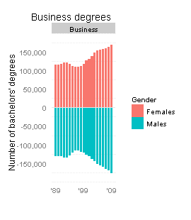
I thought I could exploit the current graphic’s slight redundancy: the bar heights below and above the gray horizontal lines are exactly the same. Why not repurpose this format to show data on degrees earned by men vs. by women (below vs. above the horizontal line), in the same amount of space?

I could not find the gender breakdown for the exact same set of degrees, but a similar dataset is in the Digest of Education Statistics, tables 308 to 330. Here are my revised plots, made using R with the ggplot2 package.

Click this thumbnail to see all the data in one plot (it’s too big for the WordPress column width):

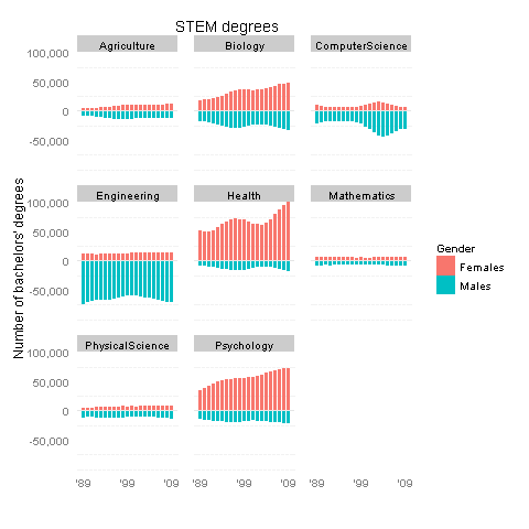
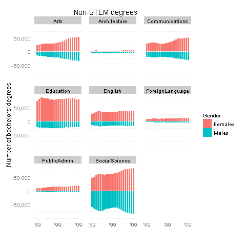
Or see the STEM and non-STEM plots separately below.

So, what’s the verdict? These new graphs do support SciAm’s conclusions: women are largely driving the increases in psychology and biology degrees (as well as “health professions and related sciences”), and to a lesser degree in the arts and communications. On the other hand, increases in business and social science degrees appear to be driven equally by males and females. The mid-’00s spike in computer science was mostly guys, it seems.

I’d also like to think that my alma mater, Olin College, contributed to the tiny increase in female engineers in the early ’00s 🙂

Technical notes:
Some of these degree categories are hard to classify as STEM vs. non-STEM. In particular, Architecture and SocialScience include some sub-fields of each type… Really, I lumped them under non-STEM only because it balanced the number of items in each group.
Many thanks to a helpful Learning R tutorial on back-to-back bar charts.

Flipping Out

While we’re on the subject of statistics-related classroom activities with a “wow factor,” let me bring up my favorite: guessing whether a sequence of coin flips is real or fake.

BS detector

For me, it really brought home the idea that math is an amazing BS detector. Sure, we tell kids to learn math so you can balance your checkbook, figure out the tip at a restaurant, blah blah blah. But consider these very reasonable counterarguments: (1) Yawn, and (2) Calculators/computers do all that for us anyway.

So you have to fire back: you wanna get screwed over? When you sign up for student loans at a terrible rate because the loan officer was friendly and you couldn’t even guesstimate the math in your head, you’ll be stuck with awful payments for the next 10 years. When your phone company advertises “.002 cents per kilobyte” but charges you .002 dollars per kilobyte instead, a hundred times as much, you should call them out on it.

You may never have the luck to acquire a superhero spider sense, but we mortals can certainly hone our number sense. People will try to con you over the years, but if you keep this tool called “math” in your utility belt I guarantee it’ll save your butt a few times down the line.

Coin trick

Anyway, the coin flip thing itself may be more of a cute demo than directly practical — but it’s really really cute. Watch:
You split the class into two groups. One is going to flip a coin 100 times in a row and write down the resulting sequence of heads and tails. The other is going to pretend they did this and write down a made-up “random” sequence of heads and tails. The teacher leaves the room until both groups are done, then comes back in and has to guess which sequence came from real coin flips and which is the fake. And BAM, like magic, no calculation required, the teacher’s finely-honed number-sense makes it clear which is which.
Can you tell from the pair below?
(example copied from Gelman and Nolan, 2002, Teaching Statistics)

Enterprising statisticians have noticed that, in a sequence of 100 truly random coin flips, there’s a high probability of at least one “long” streak of six or more heads in a row (and same for tails). Meanwhile, people faking the data usually think that long streaks don’t look “random” enough. So the fake sequence will usually switch back and forth from heads to tails and back after only 2 or 3 of each, while the real sequence will have a few long streaks of 5 or 6 or more heads (or tails) in a row.

So is your number sense tingling yet? In the example above, the sequence on the left is real while the right-hand data was faked.
(I’m not sure where this demo originates. I first heard of it in Natalie Angier’s 2007 book The Canon, but it’s also described in Gelman and Nolan’s 2002 book Teaching Statistics mentioned above, and in Ted Hill’s 1999 Chance magazine article “The Difficulty of Faking Data”. Hill’s article is worth a read and goes into more detail on another useful statistical BS detector, Benford’s Law, that can detect patterns of fraudulent tax data!)

So what?

Lesson learned: randomness may look non-random, and vice versa, to the untrained eye. Sure, this is a toy example, but let’s generalize a bit. First, here we have random data generated in one dimension, time. This shows that long winning or losing streaks can happen by pure chance, far more often than most people expect. Say the sports team you manage has been on a winning (or losing) streak — does that mean the new star player is a real catch (or dud)? Maybe not; it might be a coincidence, unless the streak keeps running much longer than you’d expect due to chance… and statisticians can help you calibrate that sense of just how long to expect it.

Or imagine random data generated in two dimensions, spatial data, like mapping disease incidence on a grid of city blocks. Whereas before we had winning/losing streaks over time, now we’ll have clusters in space. We don’t know where they’ll be but we are sure there’s going to be some clustering somewhere. So if neighborhood A seems to have a higher cancer rate than neighborhood B, is there a local environmental factor in ‘hood A that might be causing it? Or is it just a fluke, to be expected, since some part of town will have the highest rates even if everyone is equally at risk? This is a seriously hard problem and can make a big difference in the way you tackle public health issues. If we cordon off area A, will we be saving lives or just wasting time and effort? Statisticians can tell, better than the untrained eye, whether the cluster is too intense to be a fluke.

It’s hard to make good decisions without knowing what’s a meaningful pattern and what’s just a coincidence. Statistics is a crazy powerful tool for figuring this out — almost magical, as the coin flip demo shows.

Spinner Prescription

In the last post I described a problem with Dan Meyer’s otherwise excellent expected-values teaching tool: you’d like to wow the kids by correctly predicting the answer a month in advance, but the given setup is actually too variable to let you make a safe prediction.

Essentially, if you’re saying “Let’s do a magic trick to get kids engaged in this topic,” but the trick takes a month to run AND only has a 30% chance of working… then why not tweak the trick to be more reliable?

spin it many more times?

Part of this unreliability comes from the low number of spins — about 20 spins total, if you do it once every weekday for a month. The “easy” fix is to spin Dan’s spinner many more times … but it turns out you’d have to spin it about 4000 times to be 90% confident your prediction will be right. Even if you have the patience, that’s a lot of individual spins to track in your spreadsheet or wherever.

use a MORE reliable spinner?

Another fix might be to change the spinner so that it works reliably given only 20 spins. First, we don’t want any of the sectors too small, else we might not hit them at all during our 20 spins, and then it becomes unpredictable. It turns out the smallest sector has to be at least about 1/9th of the spinner if you want to be 90% confident of hitting that sector at least once in those 20 spins.
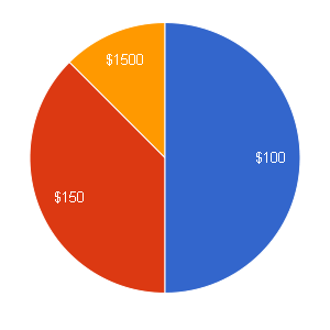
(Let y \sim \mathrm{Binomial}(p=1/9, n=20) . Then $latex p(y<0) = 1-p(y=0) = 0.905$.) If we round that up to 1/8th instead, we can easily use a Twister spinner (which has 16 equal sectors). After playing with some different options, using the same simulation approach as the previous post, I found that the following spinner seems to work decently: 1/2 chance of $100, 3/8 chance of $150, and 1/8 chance of $1500. After 20 spins of this spinner, there's about a 87% chance that the "$1500" will have been the winning bet, so you can be pretty confident about making the right bet a month in advance.

Unfortunately, predicting that spinner correctly is kind of unimpressive. The “$1500” is a fairly big slice, so it doesn’t look too risky.

spin just a few more times and use a safer spinner!

What if we spin it just a few more than 20 times — say 60 times, so two or three times each day? That’s not too much data to keep track of. Will that let us shrink the smallest slice, while keeping predictability high, and thus making this all more impressive?

Turns out that if we know we’ll have about 60 spins, we can make the smallest slice 1/25th of the spinner and still be confident we’ll hit it at least once. Cool. If we want to keep the Twister board, and have the smallest slice be 1/16th of the circle, we actually have a 90% chance of hitting it at least twice. So that makes things even more predictable (for the teacher), while still making it less predictable (to the kids) than the previous spinner.

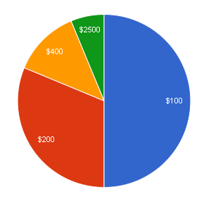
More messing around led to this suggested spinner: 1/2 chance of $100, 5/16 chance of $200, 1/8 chance of $400, and 1/16 chance of $2500. The chance that “$2500” is the right bet after 60 spins of this spinner is about 88%, so again you can make your bet confidently — but this time, the “right” answer doesn’t look as obvious.

In short, I’d recommend using this spinner for around 60 spins, rather than Dan’s spinner for 20 spins. It’s not guaranteed to be “optimal” but it’s far more reliable than the original suggestion.
If anyone tries it, I’d be curious to hear how it went!

Spinner Doctor

The setup

Dan Meyer, a (former?) math teacher with some extraordinary ideas, has a nifty concept for teaching expected values:

“So one month before our formal discussion of expected value, I’d print out this image, tack a spinner to it, and ask every student to fix a bet on one region for the entire month. I’d seal my own bet in an envelope.

I’d ask a new student to spin it every day for a month. We’d tally up the cash at the end of the month as the introduction to our discussion of expected value.
So let them have their superstition. Let them take a wild bet on $12,000. How on Earth did the math teacher know the best bet in advance?”

I absolutely love the idea of warming up their brains to this idea a month before you actually teach it, and getting them “hooked” by placing a bet and watching it play out over time.

The Challenge

But there’s a problem: at least as presented, the intended lesson isn’t quite true. I’m taking it as a challenge to see if we can fix it without killing the wow-factor. Let’s try.

As I read it, the intended lesson here is: “if you’re playing the same betting game repeatedly, it’s good to bet on the option with the highest expected value.”
And the intended wow-factor comes from: “none of the options looked like an obvious winner to me, but my teacher knew which one would win!”

But the lesson just isn’t true with this spinner and time-frame: here, the highest-expected-value choice is actually NOT the one most likely to have earned the most money after only 20 or 30 spins.
And the wow-factor is not guaranteed: none of the choices is much more likely to win than the others in only 20-30 spins, so the teacher can’t know the winning bet in advance. It’s like you’re a magician doing a card trick that only works a third of the time. You can still have a good discussion about the math, but it’s just not as cool.

I’d like to re-design the spinner so that the lesson is true, and the wow-factor still happens, after only a month of spins.

WAit, is there really a problem?

First, what’s wrong with the spinner? By my eyeball, the expected values per spin are $100/2 = $50; $300/3 = $100; $600/9 = $67ish; $5000/27 = $185ish; and $12000/54 = $222ish. So in the LONG run, if you spin this spinner a million times, the “$12000” has the highest expected value and is almost surely the best bet. No question.

But in Dan’s suspense-building setup, you only spin once a day for a month, for a total of 20ish spins (since weekends are out). With only 20 spins, the results are too unpredictable with the given spinner — none of the five choices is especially likely to be the winner.

How do we know? Instead of thinking “the action is spinning the spinner once, and we’re going to do this action twenty times,” let’s look at it another way: “the action is spinning the spinner twenty times in a row, and we’re going to do this action once.” That’s what really matters to the classroom teacher running this exercise: you get one shot to confidently place my bet at the start of the month; after a single month of daily spins, will the kids be wowed by seeing that you placed the right bet?

I ran a simulation in R (though sometime I’d like to tackle this analytically too):
Take 20 random draws from a multinomial distribution with the same probabilities as Dan’s spinner.
Multiply the results by the values of each bet.

> nr.spins <- 20
> spins=rmultinom(1,size=nr.spins,prob=c(1/2,1/3,1/9,1/27,1/54))
> spins
     [,1]
[1,]   11
[2,]    7
[3,]    2
[4,]    0
[5,]    0
> winnings=spins*c(100,300,600,5000,12000)
> winnings
     [,1]
[1,] 1100
[2,] 2100
[3,] 1200
[4,]    0
[5,]    0

For example, in this case we happened not to hit the “$5000” or the “$12000” at all. But we hit “$100” 11 times, “$300” 7 times, and “$600” twice, so someone who bet on “$300” would have won the most money that month.
Now, this was just for one month. Try it again for another month:

> spins
     [,1]
[1,]    8
[2,]    9
[3,]    1
[4,]    2
[5,]    0
> winnings
      [,1]
[1,]   800
[2,]  2700
[3,]   600
[4,] 10000
[5,]     0

This time we got “$5000” twice and whoever bet on that would have been the winner.
Okay, there’s clearly some variability as to who wins when you draw a new set of 20 spins. We want to know how variable this is.
So let’s do this many times — like a million times — and each time you do it, see which bet won that month. Keep track of how often each bet wins (and ties too, why not).

nr.sims=1000000
bestpick <- rep(0,5)
tiedpick <- rep(0,5)
nr.spins <- 20
for(i in 1:nr.sims){
    spins=rmultinom(1,size=nr.spins,prob=c(1/2,1/3,1/9,1/27,1/54))
    winnings=spins*c(100,300,600,5000,12000)
    best <- which(winnings==max(winnings))
    if(length(best)==1){
        bestpick[best] <- bestpick[best]+1
    } else{
        tiedpick[best] <- tiedpick[best]+1
    }
}

Results are as follows. The first number under bestpick is the rough proportion of times that “$100” would win; the last number is the rough proportion of times that “$12000” would win. Similarly for proportion of ties under tiedpick, except that I haven’t corrected for double-counting (since ties are rare enough not to affect our conclusions).

> bestpick/nr.sims
[1] 0.0145 0.2124 0.0712 0.3780 0.3029
> tiedpick/nr.sims
[1] 0.00199 0.02093 0.01893 0.00000 0.0000

(Ties, and the fact it’s just a simulation, mean these probabilities aren’t exactly right… but they’re within a few percentage points of their long-run value.)
It turns out that the fourth choice, “$5000”, wins a little under 40% of the time. The highest-expected-value choice, “$12000”, only wins about 30% of the time. And “$300” turns out to be the winning bet about 20% of the time.
Unless I’ve made a mistake somewhere, this shows that using Dan’s spinner for one spin a day, 20 days in a row, (1) the most likely winner is not the choice with the highest expected value, and (2) the teacher can’t know which choice will be the winner — it’s too uncertain. So the lesson is wrong, and you can’t guarantee the wow-factor. That’s a shame.

dang. What to do, then?

Well, you can try spinning it more than once a day. What if you spin it 10 times a day, for a total of 200 spins? If we re-run the simulation above using nr.spins <- 200 here’s what we get:

> bestpick/nr.sims
[1] 0.000000 0.012258 0.000287 0.393095 0.589246
> tiedpick/nr.sims
[1] 0.000000 0.000332 0.000037 0.004780 0.005079

So it’s better, in that “$12000” really is the best choice… but it still has only about a 60% chance of winning. I’d prefer something closer to 90% for the sake of the wow-factor.
What if you have each kid spin it 10 times each day? Say 20 kids in the class, times 10 spins per kid, times 20 days, so 4000 spins by the month’s end:

> bestpick/nr.sims
[1] 0.000 0.000 0.000 0.106 0.892
> tiedpick/nr.sims
[1] 0.00000 0.00000 0.00000 0.00157 0.00157

That’s much better. But that’s a lot of spins to do by hand, and to keep track of…
Of course you could run a simulation on your computer, but I assume that’s nowhere near as convincing to the students.

What I’d really like to see is a spinner that gives more consistent results, so that you can be pretty sure after only 20 or 30 spins it’ll usually give the same winner. A simple example would be a spinner with only these 3 options: 1/2 chance of $100, 1/3 chance of $300, and 1/6 chance of $400.

> bestpick/nr.sims
[1] 0.0574 0.6977 0.2371
> tiedpick/nr.sims
[1] 0.00200 0.00783 0.00596

That’s okay, but there’s still only about a 70% chance of the highest-expected-value (“$300” here) being the winner after 20 spins… and anyway it’s much easier to guess “correctly” here, no math required, so it’s not as impressive if the teacher does guess right.

Hmmm. Gotta think a bit harder about whether it’s possible to construct a spinner that’s both (1) predictable and (2) non-obvious, given only 20 or so spins. Let me know if you have any thoughts.

Edit: I propose a better solution in the next post.

Just when you thought it was safe to go back in the cubicle…

Yesterday’s earthquake in Virginia was a new experience for me. I am glad that there was no major damage and there seem to have been no serious injuries.

Most of us left the building quickly — this was not guidance, just instinct, but apparently it was the wrong thing to do: FEMA suggests that you take cover under a table until the shaking stops, as “most injuries occur when people inside buildings attempt to move to a different location inside the building or try to leave.”

After we evacuated the building, and once it was clear that nobody had been hurt, I began to wonder: how do you know when it’s safe to go back inside?
Assuming your building’s structural integrity is sound, what are the chances of experiencing major aftershocks, and how soon after the original quake should you expect them? Are you “safe” if there were no big aftershocks within, say, 15 minutes of the quake? Or should you wait several hours? Or do they continue for days afterwards?

Maybe a friendly geologist could tell me this is a pointless or unanswerable question, or that there’s a handy web app for that already. But googling does not present an immediate direct answer, so I dig into the details a bit…

FEMA does not help much in this regard: “secondary shockwaves are usually less violent than the main quake but can be strong enough to do additional damage to weakened structures and can occur in the first hours, days, weeks, or even months after the quake.”

I check the Wikipedia article on aftershocks and am surprised to learn that events in the New Madrid seismic zone (around where Kentucky, Tennessee, and Missouri meet) are still considered aftershocks to the 1811-1812 earthquake! So maybe I should wait 200 years before going back indoors…

All right, but if I don’t want to wait that long, Wikipedia gives me some good leads:
First of all, Båth’s Law tells us that the largest aftershock tends to be of magnitude about 1.1-1.2 points lower than the main shock. So in our case, the aftershocks for the 5.9 magnitude earthquake are unlikely to be of magnitude higher than 4.8. That suggests we are safe regardless of wait time, since earthquakes of magnitude below 5.0 are unlikely to cause much damage.
Actually, there are several magnitude scales; and there are other important variables too (such as intensity and depth of the earthquake)… but just for the sake of argument, we can use 5.0 (which is about the same on the Richter and the Moment Magnitude scales) as our cutoff for safety to go back inside. Except that, in that case, Båth’s Law suggests any aftershocks to the 5.9 quake are not likely to be dangerous — but now I’m itching to do some more detailed analysis… and anyhow, quakes above magnitude 4.0 can still be felt, and are probably still quite scary coming right after a bigger one. So let us say we are interested in the chance of an aftershock of magnitude 4.0 or greater, and keep pressing on through Wikipedia.

We can use the Gutenberg-Richter law to estimate the relative frequency of quakes above a certain size in a given time period.
The example given states that “The constant b is typically equal to 1.0 in seismically active regions.” So if we round up our recent quake to magnitude around 6.0, we should expect about 10 quakes of magnitude 5.0 or more, about 100 quakes of magnitude 4.0 or more, etc. for every 6.0 quake in this region.

But here is our first major stumper: is b=1.0 appropriate for the USA’s east coast? It’s not much of a “seismically active region”… I am not sure where to find the data to answer this question.

Also, this only says that we should expect an average of ten 5.0 quakes for every 6.0 quake. In other words, we’ll expect to see around ten 5.0 quakes some time before the next 6.0 quake, but that doesn’t mean that all (or even any) of them will be aftershocks to this 6.0 quake.

That’s where Omori’s Law comes in. Omori looked at earthquake data empirically (without any specific physical mechanism implied) and found that the aftershock frequency decreases more or less proportionally with 1/t, where t is time after the main shock. He tweaked this a bit and later Utsu made some more modifications, leading to an equation involving the main quake amplitude, a “time offset parameter”, and another parameter to modify the decay rate.

Our second major stumper: what are typical Omori parameter values for USA east coast quakes? Or where can I find data to fit them myself?

Omori’s Law gives the relationship for the total number of aftershocks, regardless of size. So if we knew the parameters for Omori’s Law, we could guess how many aftershocks total to expect in the next hour, day, week, etc. after the main quake. And if we knew the parameters for the Gutenberg-Richter law, we could guess what proportion of quakes (within each of those time periods) would be above a certain magnitude.
Combining this information (and assuming that the distribution of aftershock magnitudes is typical of the overall quake magnitude distribution for the region), we could guess the probability of a magnitude 4.0 or greater quake within the next day, week, etc. The Southern California Earthquake Center provides details on putting this all together.

What this does not answer directly is my first question: Given a quake of magnitude X, in a region with Omori and Gutenberg-Richter parameters Y, what is the time T such that, if any aftershocks of magnitude 4.0 or greater have not occurred yet, they probably won’t happen?
If I can find typical local parameter values for the laws given above, or good data for estimating them; and if I can figure out how to put it together; then I’d like to try to find the approximate value of T.

Stumper number three: think some more about whether (and how) this question can be answered, even if only approximately, using the laws given above.

I know this is a rough idea, and my lack of background in the underlying geology might give entirely the wrong answers. Still, it’s a fun exercise to think about. Please leave any advice, critiques, etc. in the comments!

Grafixing what ain’t broken

Yesterday I had the pleasure of eating lunch with Nathan Yau of FlowingData.com, who is visiting the Census Bureau this week to talk about data visualization.
He told us a little about his PhD thesis topic (monitoring, collecting, and sharing personal data). The work sounds interesting, although until recently it had been held up by work on his new book, Visualize This.

We also talked about some recent online discussions of “information visualization vs. statistical graphics.” These conversations were sparked by the latest Statistical Computing & Graphics newsletter. I highly recommend the pair of articles on this topic: Robert Kosara made some great points about the potential of info visualization, and Andrew Gelman with Antony Unwin responded with their view from the statistics side.

In Yau’s opinion, there is not much point in making a difference between the two. However, as I understand it, Gelman then continued blogging on this topic but in a way that may seem critical towards the info visualization community:
Lots of work to convey a very simple piece of information,” “There’s nothing special about the top graph above except how it looks,” “sacrificing some information for an appealing look” …
Kaiser Fung
, of the Junk Charts blog, pitched in on the statistics side as well. Kosara and Yau responded from the visualization point of view.
To all statisticians, I recommend Kosara’s article in the newsletter and Yau’s post which covers the state of infovis research.

My view is this: Gelman seems intent on pointing out the differences between graphs made by statisticians with no design expertise vs. by designers with no statistical expertise, but I don’t think this latter group represents what Kosara is talking about. Kosara wants to highlight the potential benefits for a person (or team) who can combine both sets of expertise. These are two rather different discussions, though both can contribute to the question of how to train people to be fluent in both skill-sets.

Personally, I can think of examples labeled “information visualization” that nobody would call “statistical graphics” (such as the Rock Paper Scissors poster), but not vice versa. Any statistical graphic could be considered a visualization, and essentially all statisticians will make graphs at some point in their careers, so there is no harm in statisticians learning from the best of the visualization community. On the other side, a “pure” graphics designer may be focused on how to communicate rather than how to analyze the data, but can still benefit from learning some statistical concepts. And a proper information visualization expert should know both fields deeply.

I agree there is some junk out there calling itself “information visualization”… but only because there is a lot of junk, period, and the people who make it (with no expertise in design or in statistics) are more likely to call it “information visualization” than “statistical graphics.” But that shouldn’t reflect poorly on people like Kosara and Yau who have expertise in both fields. Anyone working with numerical data and wanting to take the time to:
* thoughtfully examine the data, and
* thoughtfully communicate conclusions
might as well draw on insights both from statisticians and from designers.

What are some of these insights?
Some discussion about graphics, such as the Junk Charts blog and Edward Tufte’s books, reminds me of prescriptive grammar guides in the high school English class sense, along the lines of Strunk and White: “what should you do?” They warn the reader about the equivalent of “typos” (mislabeled axes) and “poor style” (thick gridlines that obscure the data points) that can hinder communication.
Then there is the descriptive linguist’s view of grammar: the building blocks of “what can you do?” A graphics-related example is Leland Wilkinson’s book Grammar of Graphics, applied to great success in Hadley Wickham’s R package ggplot2, allowing analysts to think about graphics more flexibly than the traditional grab-bag of plots.
Neither of these approaches to graphics is traditionally taught in many statistics curricula, although both are useful. Also missing are technical graphic design skills: not just using Illustrator and Photoshop, but even basic knowledge about pixels and graphics file types that can make the difference between clear and illegible graphs in a paper or presentation.

What other info visualization insights can statisticians take away? What statistical concepts should graphic designers learn? What topics are in need of solid information visualization research? As Yau said, each viewpoint has the same sentiments at heart: make graphics thoughtfully.

PS — some of the most heated discussion (particularly about Kosara’s spiral graph) seems due to blurred distinctions between the best way to (1) answer a specific question about the data (or present a conclusion that the analyst has already reached), vs. (2) explore a dataset with few preconceptions in mind. For example, Gelman talks about redoing Kosara’s spiral graph in a more traditional way that cleanly presents a particular conclusion. But Kosara points out that his spiral graph is meant for use as an interactive tool for exploring the data, rather than a static image for conveying a single summary. So Gelman’s comments about “that puzzle solving feeling” may be misdirected: there is use for graphs that let the analyst “solve a puzzle,” even when it only confirms something you already knew. (The things you think you know are often wrong, so there’s a benefit to such confirmation.) Once you’ve used this exploratory graphical tool, you might summarize the conclusion in a very different graph that you show to your boss or publish in the newspaper.

PPS — Here is some history and “greatest hits” of data visualization.

The Testimator: Significance Day

A few more thoughts on JSM, from the Wednesday sessions:

I enjoyed the discussion on the US Supreme Court’s ruling regarding statistical significance. Some more details of the case are here.
In short, the company Matrixx claimed they did not need to tell investors about certain safety reports, since those results did not reach statistical significance. Matrixx essentially suggested that there should be a “bright line rule” that only statistically-significant results need to be reported.
However, the Supreme Court ruled against this view: All of the discussants seemed to agree that the Supreme Court made the right call in saying that statistical significance is not irrelevant, but we have to consider “the totality of the evidence.” That’s good advice for us all, in any context!

In particular, Jay Kadane and Don Rubin did not prepare slides and simply spoke well, which was a nice change of presentation style from most other sessions. Rubin brought up the fact that the p-value is not a property solely of the data, but also of the null hypothesis, test statistics, covariate selection, etc. So even if the court wanted a bright-line rule of this sort, how could they specify one in sufficient detail?
For that matter, while wider confidence intervals are more conservative
when trying to showing superiority of one drug over another, there are safety situations where narrower confidence intervals are actually the more conservative ones but “everyone still screws it up.” And “nobody really knows how to do multiple comparisons right” for subgroup analysis to check if the drug is safe on all subgroups. So p-values are not a good substitute for human judgment on the “totality of the evidence”.

I also enjoyed Rubin’s quote from Jerzy Neyman: “You’re getting misled by thinking that the mathematics is the statistics. It’s not.” This reminded me of David Cox’s earlier comments that statistics is about the concepts, not about the math. In the next session, Paul Velleman and Dick DeVeaux continued this theme by arguing that “statistics is science more than math.”
(I also love DeVeaux and Velleman’s 2008 Amstat News article on how “math is music; statistics is literature.” Of course Andrew Gelman presented his own views about stats vs. math on Sunday; and Perci Diaconis talked about the need for conceptually-unifying theory, rather than math-ier theory, at JSM 2010. See also recent discussion at The Statistics Forum. Clearly, defining “statistics” is a common theme lately!)

In any case, Velleman presented a common popular telling of the history behind Student’s t test, and then proceeded to bust myths behind every major point in the story. Most of all, he argued that we commonly take the wrong lessons from the story. Perhaps it was not his result (the t-test) that should be taught so much as the computationally-intensive method he first used, which is an approach that’s easier to do nowadays and may be more pedagogically valuable.
I’m also jealous of Gosset’s title at Guinness: “Head Experimental Brewer” would look great on a resume 🙂

After their talks, I went to the session honoring Joe Sedransk in order to hear Rod Little and Don Malec talk about topics closer to my work projects. Little made a point about “inferential schizophrenia”: if you use direct survey estimates for large areas, and model-based estimates for small areas, your entire estimation philosophy jumps drastically at the arbitrary dividing line between “large” and “small.” Wouldn’t it be better to use a Bayesian approach that transitions smoothly, closely approaching the direct estimates for large areas and the model estimates in small areas?
Pfeffermann and Rao commented afterwards that they don’t feel things are as “schizophrenic” as Little claims, but are glad that Bayesians are now okay with measuring the frequentist properties of their procedures (and Little claimed that Bayesian models can often end up with better frequentist properties than classical models).

In the afternoon, I sat in on Hadley Wickham’s talk about starting off statistics courses with graphical analysis.This less-intimidating approach lets beginners describe patterns right from the start.
He also commented that each new tool you introduce should be motivated by an actual problem where it’s needed: find an interesting question that is answered well by the new tool. In particular, when you combine a good dataset with an interesting question that’s well-answered by graphics, this gives students a good quick payoff for learning to program. Once they’re hooked, *then* you can move to the more abstract stuff.

Wickham grades students on their curiosity (what can we discover in this data?), skepticism (are we sure we’ve found a real pattern?), and organization (can we replicate and communicate this work well?). He provides practice drills to teach “muscle memory,” as well as many opportunities for mini-analyses to teach a good “disposition.”
This teaching philosophy reminds me a lot of Dan Meyer and Shawn Cornally’s approaches to teaching math (which I will post about separately sometime) (edit: which I have posted about elsewhere).
Wickham also collects interesting datasets, cleans them up, and posts them on Github along with his various R packages and tools including the excellent ggplot2.

The last talks I attended (by Eric Slud and Ansu Chatterjee, on variance estimation) were also related to my work on small area modeling.
I was amused by the mixed metaphors in Chatterjee’s warning to “not use the bootstrap as a sledgehammer,” and Bob Fay’s discussion featured the excellent term “Testimator” 🙂
This reminds me that last year Fay presented on the National Crime Victimization Survey, and got a laugh from the audience for pointing out that, “From a sampling point of view, it’s a problem that crime has gone down.”

Overall, I enjoyed JSM (as always). I did miss a few things from past JSM years:
This year I did not visit the ASA Student Stat Bowl competition, and I’m a bit sad that as a non-student I can no longer compete and defend my 2nd place title… although that ranking may not have held up across repeated sampling anyway 😛
I was also sad that last year’s wonderful StatAid / Statistics Without Borders mixer could not be repeated this year due to lack of funding.
But JSM was still a great chance to meet distant friends and respected colleagues, get feedback on my research and new ideas on many topics, see what’s going on in the wider world of stats (there are textbooks on Music Data Mining now?!?), and explore another city.
(Okay, I didn’t see too much of Miami beyond Lincoln Rd,
but I loved that the bookstore was creatively named Books & Books …
and the empanadas at Charlotte Bakery were outstanding!)
I also appreciate that it was an impetus to start this blog — knock on wood that it keeps going.

I look forward to JSM 2012 in San Diego!

Failure to reject anole hypothesis

-Is that a gecko?
-No, I think it’s an anole.
-You sure?
-I’m 95% percent confident…

Evidence in favor of anole hypothesis

I am writing this first blog post while at the 2011 Joint Statistical Meetings conference, in Miami, FL. When several thousand statisticians converge on Miami, dizzy from the heat and observing the tiny lizards that make up the local wildlife, you may overhear some remarks like the title of this post 🙂

Several statistics blogs are already covering JSM events day by day, including posts on The Statistics Forum by Julien Cornebise and Christian Robert:
http://statisticsforum.wordpress.com/2011/08/01/jsm-first-sessions-day/
http://statisticsforum.wordpress.com/2011/08/02/jsm-impressions-day-1/
as well as the Twitter feed of the American Statistical Association:
http://twitter.com/#!/AmstatNews

I have attended presentations by many respected statisticians. For instance Andrew Gelman, author of several popular textbooks and blogs, gave a talk pitting mathematical models against statistical models, claiming that mathematicians are more qualitative than us quantitative statisticians. In his view, it’s better to predict a quantitative, continuous value (share of the popular vote won by the incumbent) than a qualitative, binary outcome (who won the election). Pop scientists should stop trying to provide “the” reason for an outcome and instead explore how all of the relevant factors play together. I particularly liked Dr Gelman’s view that statistics is to math as engineering is to physics.

In another talk, Sir David Cox (of the Cox proportional hazards model) encouraged us to provide a unified view of statistics in terms of common objectives, rather than fragmenting into over-specialized tribes. He noted that a physicist whose experiment disagrees with F=ma will immediately say they must have missed something in the data; a statistician would just shrug that the model is an approximation… but in some cases,  we really should look to see if there are additional variables we have missed. Sir Cox’s wide-ranging talk also covered a great example on badger-culling; the fact that many traditional hypothesis testing problems are better framed as estimation (we already know the effect is not 0, so what is it?); and a summary of 2 faces of frequentism and 7 faces of Bayesianism, all of which “work” but some of which are philosophically inconsistent with one another. He believes the basic division should not be between Bayesians and frequentists, but between letting the data speak for itself (leaving interpretation for later) vs. more ambitiously integrating interpretation into the estimation itself. (An audience member thanked him for giving Bayesians faces, but noted that many are more interested in their posteriors.) Finally, he emphasized that the core of statistical theory is about concepts, and that the mathematics is just part of the implementation.

ASA president Nancy Geller gave an inspiring address calling on statisticians to participate more and “make our contributions clear and widely known.” She asked us to stand against the “assumption that statistics are merely a tool to be used by the consultant to get a result, rather than an intrinsic part of the creative process.” The following awards ceremony was mishandled by an overzealous audio engineer who played booming dramatic music over the presentation… I suspect this would be perfect for sales awards at a business conference but was off the mark for recognizing statisticians, who seem less comfortable with self-promotion — though I suppose it was fitting that this followed Dr Geller’s recommendations 😛

I’ve appreciated seeing other people whose names I recognized, including Leland Wilkinson, Dianne Cook, and Jim Berger. These annual meetings are also a great opportunity to meet firsthand with respected experts in your subfield. In my case, in the subject of Small Area Estimation, this has included meeting JNK Rao, author of the field’s standard textbook; saying hello to Bob Fay, of the pervasive Fay-Herriot model; and being heckled by Avi Singh and Danny Pfeffermann during my own presentation 🙂

Lastly, I also enjoyed meeting with the board of Statistics Without Borders, whose website I help to co-chair:
http://community.amstat.org/statisticswithoutborders/home/
SWB is always looking for volunteers and I will discuss our work further in another post. However, I will point out that former co-chair Jim Cochran was honored as an ASA Fellow tonight, partly in recognition for his work with SWB.

Next up is the JSM Dance Party. Statisticians are, shall we politely say, remarkable dancers… I have seen some truly unforgettable dance skills at past JSM dance parties and I hope to see some more tonight!

Edit: See comments for Cox’s “faces” of frequentism and Bayesianism.