Census-related links from June

A few links to share since I’ve been away:

Article on “An American Tradition: The U.S. Census Bureau Continues to Innovate in Data Visualization” (free access after watching an ad): A colleague summarizes some of the many mapping and datavis resources provided by the Census Bureau.

Two interactive web apps by data users (these use Census Bureau data but the datavises are someone else’s products):

  • Web app “Point Context”: a data user calls the Census Bureau’s API to find the distributions of age, race, income, and education for residents of the “average” neighborhood containing an arbitrary set of latitude-longitude coordinates.
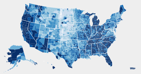
  • Interactive map of “Is the United States spending less on public education?”: A Census data user practices with D3 and tries out the lessons from datavis classes — show comparisons, allow color-blind-safe color palettes, “catchy” headlines and informative annotations help guide readers, etc. I particularly like the arrow indicating where the selected state falls on the colorbar.

Several tools for making maps from Excel or spreadsheet-like tools:

  • Esri, the makers of ArcGIS software, have created a Microsoft Office add-on that lets you create maps of your data in Excel. A live demo looked promising, especially if your organization is already an Esri client… but otherwise ArcGIS is not cheap!
  • If you do have ArcGIS Online access, you can try using Esri’s “Story Maps” templates. Their published examples include this simple one based on Census Bureau data.
  • JMP, a SAS product, also has mapping tools that should be fairly simple for people used to spreadsheets. But again, SAS’s products tend to be expensive too.

Visual Revelations, Howard Wainer

I’m starting to recognize several clusters of data visualization books. These include:

(Of course this list calls out for a flowchart or something to visualize it!)

Howard Wainer’s Visual Revelations falls in this last category. And it’s no surprise Wainer’s book emulates Tufte’s, given how often the author refers back to Tufte’s work (including comments like “As Edward Tufte told me once…”). And The Visual Display of Quantitative Information is still probably the best introduction to the genre. But Visual Revelations is different enough to be a worthwhile read too if you enjoy such books, as I do.

Most of all, I appreciated that Wainer presents many bad graph examples found “in the wild” and follows them with improvements of his own. Not all are successful, but even so I find this approach very helpful for learning to critique and improve my own graphics. (Tufte’s classic book critiques plenty, but spends less time on before-and-after redesigns. On the other hand, Kosslyn’s book is full of redesigns, but his “before” graphs are largely made up by him to illustrate a specific point, rather than real graphics created by someone else.)

Of course, Wainer covers the classics like John Snow’s cholera map and Minard’s plot of Napoleon’s march on Russia (well-trodden by now, but perhaps less so in 1997?). But I was pleased to find some fascinating new-to-me graphics. In particular, the Mann Gulch Fire section (p. 65-68) gave me shivers: it’s not a flashy graphic, but it tells a terrifying story and tells it well.
[Edit: I should point out that Snow’s and Minard’s plots are so well-known today largely thanks to Wainer’s own efforts. I also meant to mention that Wainer is the man who helped bring into print an English translation of Jacques Bertin’s seminal Semiology of Graphics and a replica volume of William Playfair’s Commercial and Political Atlas and Statistical Breviary. He has done amazing work at unearthing and popularizing many lost gems of historical data visualization!
See also Alberto Cairo’s review of a more recent Wainer book.]

Finally, Wainer’s tone overall is also much lighter and more humorous than Tufte’s. His first section gives detailed advice on how to make a bad graph, for example. I enjoyed Wainer’s jokes, though some might prefer more gravitas.

Continue reading Visual Revelations, Howard Wainer”

audiolyzR: Data sonification with R

Update (5/15/2014): I just realized audiolyzR is publicly available on CRAN. See also co-creator Jesse Garrison’s audiolyzR page.

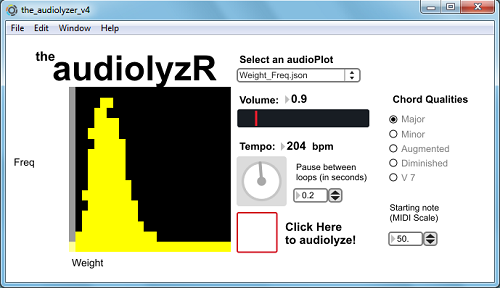
In his talk “Give Your Data A Listen” at last summer’s useR! 2012 conference, Eric Stone presented joint work with Jesse Garrison on audiolyzR, an R package for “data sonification.” I thought this was a nifty and well-executed idea. Since I haven’t seen Eric and Jesse post any demos online yet, I’d like to share a summary and video clip here, so that I can point to them whenever I describe audiolyzR to other folks.

audiolyzR

In August I invited Eric to my workplace to speak, and he gave us a great talk including demos of features added since the useR session. Here’s the post-event summary:

Eric Stone, a PhD student at Temple University, presented his co-authored work with Jesse Garisson on “data sonification”: using sound (other than speech) to visualize a dataset.
Eric demonstrated audiolizations of scatterplots and histograms using the statistical software R and the audio toolkit Max/MSP, as well as his ongoing research on time-series line plots. The software shows a visual display of the data and then plays an audio version, with the x-axis mapped to time and the y-axis to pitch. For instance, a positively-correlated scatterplot sounds like rising scales or arpeggios. Other variables are represented by timbre, volume, etc. to distinguish them. The analyst can also tweak the tempo and other settings while listening to the data repeatedly to help outliers stand out more clearly. A few training examples helped the audience to learn how to listen to these audiolizations and identify these outliers.
Eric believes that, even if the audiolization itself is no clearer than a visual plot, activating multiple cortices in the brain makes the analyst more attuned to the data. As a musician since childhood, he succeeded in making the results sound pleasant so that they do not wear out the listener.
The software will soon be released as an R package and linked to RExcel to expand its reach to Excel users. Future work includes: 1) supporting more data structures and more layers of data in the same audiolization; 2) testing the software with visually impaired users as a tool for accessibility; and 3) developing ways to embed the audiolizations into a website.

Eric suggested that he can imagine someone using this as part of an information dashboard or for reviewing a zillion different data views in a row, while multi-tasking: Just set it to loop through each slice of the data while you work on something else. Your ears will alert you when you hit a data slice that’s unusual and worth investigating further.

Eric has kindly sent me a version of the package, and below I demonstrate a few examples using NHANES data:

I’ve asked Eric if there’s a public release coming anytime soon, but it may be a while:

I am nearly ready to release it, but it’s one of those situations where my advisor will come up with “just one more thing” to add, so, you know, it might be a while.. Anyway, if people are interested I can provide them with the software and everything. Just let me know if anyone is.

If you want to get in touch with Eric, his contact info is in the useR talk abstract linked at the top.

On a very-loosely-related note, consider also John Cook’s post on measuring evidence in decibels. Someday I’d like to re-read this after I’ve had my morning coffee and think about if there’s any useful way to turn this metaphor into literal sonic hypothesis testing.

The tuba effect

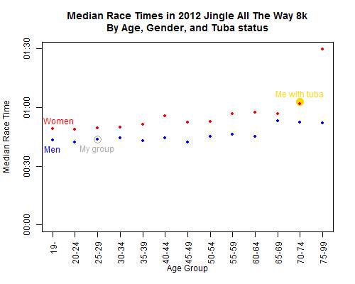
The Jingle All The Way 8k results are up, and naturally I was curious how I stacked against the other runners. I know I’m no sprinter, so I’ve just plotted the median times within each age-by-gender category. Apparently carrying a tuba gave me a race time comparable to the median among 70-74 year old women.

Of course I already knew I’d lose a race against my grandmother, a strong Polish woman who taught PE for many years. But when I’m carrying a tuba, your grandmother could likely beat me too.

Most-cited books on list of lists of data visualization readings

As part of the resources for his online data visualization course, Alberto Cairo has posted several lists of recommended readings:

Some of these links lead to other excellent recommended-readings lists:

I figured I should focus on reading the book suggestions that came up more than once across these lists. Below is the ranking; it’s by author rather than book, since some authors were suggested with multiple books. So many good books!


The list, by number of citations per author: Continue reading “Most-cited books on list of lists of data visualization readings”

Graph Design for the Eye and Mind, Stephen Kosslyn

When I reviewed The Grammar of Graphics, Harlan Harris pointed me to Kosslyn’s book Graph Design for the Eye and Mind. I’ve since read it and can recommend it highly, although the two books have quite different goals. Unlike Wilkinson’s book, which provides a framework encompassing all the graphics that are possible, Kosslyn’s book summarizes perceptual research on what makes graphics actually readable.

In other words, this is something of the graphics equivalent to Strunk and White’s The Elements of Style, except that Kosslyn’s grounded in actual psychology research rather than personal preferences. This is a good book to keep at your desk for quickly checking whether your most recent graphic follows his advice.

Kosslyn is targeting the communicator-of-results, not the pure statistician (churning out graphs for experts’ data exploration) or the data artist (playing with data-inspired, more-pretty-than-meaningful visual effects). In contrast to Tukey’s remark that a good statistical graphic “forces us to notice what we never expected to see,” Kosslyn’s focus is clear communication of what the analyst has already notices.

For present purposes I would say that a good graph forces the reader to see the information the designer wanted to convey. This is the difference between graphics for data analysis and graphics for communication.

Kosslyn also respects aesthetics but does not focus on them:

Making a display attractive is the task of the designer […] But these properties should not obscure the message of the graph, and that’s where this book comes in.

So Kosslyn presents his 8 “psychological principles of effective graphics” (for details, see Chopeta Lyons’ review or pages 4-12 of Kosslyn’s Clear and to the Point). Then he illustrates the principles with clear examples and back them up with research citations, for each of several common graph types as well as for labels, axes, etc. in general. I particularly like all the paired “Don’t” and “Do” examples, showing both what to avoid and how to fix it. Most of the book is fairly easy reading and solid advice. Although much of it is common sense, it’s useful as a quick checkup of the graphs you’re creating, especially as it’s so well laid-out.

Bonus: Unlike many other recent data visualization books, Kosslyn does not completely disavow pie charts. Rather, he gives solid advice on the situations where they are appropriate, and on how to use them well in those cases.

If you want to dig even deeper, Colin Ware’s Information Visualization is a very detailed but readable reference on the psychological and neural research that underpins Kosslyn’s advice.

The rest of this post is a list of notes-to-self about details I want to remember or references to keep handy… Bolded notes are things I plan to read about further. Continue reading Graph Design for the Eye and Mind, Stephen Kosslyn”

Animated map of 2012 US election campaigning, with R and ffmpeg

[vimeo 52312754]

(Video link here, in case the embedded player doesn’t work for you.)

Idea: see if I can mimic the idea behind Ben Schmidt’s lovely video of ocean shipping routes, and apply it to another dataset. But which?
“Hmm… what’s another interesting dataset about some competitors traveling around a mostly-fixed area at the same time?… Hey friends, stop  giving me election news, I need to think of an idea… Oh.” Continue reading “Animated map of 2012 US election campaigning, with R and ffmpeg”

Javascript and D3 for R users, part 2: running off the R server instead of Python

Thank you all for the positive responses to Basics of JavaScript and D3 for R Users! Quick update: last time we had to dabble in a tiny bit of Python to start a local server, in order to actually run JavaScript and D3 examples on our home computer… However, commenter Shankar had the great idea of using the R server instead. He provided some example code, but reported that it didn’t work with all the examples.

Here’s my alternative code, which works with all the D3 examples I’ve tried so far. Unlike Shankar’s approach with lower-level functions, I found it simpler to use Jeffrey Horner’s excellent Rook package.

# Load the Rook library
library(Rook)

# Where is your d3 directory located?
myD3dir <- 'C:/Downloads'

# Start the server
s <- Rhttpd$new()
s$start(quiet=TRUE)

# To view a different D3 example,
# change the directory and .html file names below
# and rerun s$add() and s$browse()
s$add(
app=Builder$new(
Static$new(
# List all the subdirectories that contain
# any files it will need to access (.js, .css, .html, etc)
urls = c('/d3','/d3/examples','/d3/examples/choropleth'),
root = myD3dir
),
Redirect$new('/d3/examples/choropleth/choropleth.html')
),
name='d3'
)
s$browse(2)
# browse(1) would load the default RookTest app instead

# When you're done,
# clean up by stopping and removing the server
s$stop()
s$remove(all=TRUE)
rm(s)

If I understand the Rook documentation correctly, you just can’t browse directories using R’s local server. So you’ll have to type in the exact directory and HTML file for each example separately. But otherwise, this should be a simple way to play with D3 for anyone who’d rather stick within R instead of installing Python.

Basics of JavaScript and D3 for R Users

Hadley Wickham, creator of the ggplot2 R package, has been learning JavaScript and its D3 library for the next iteration of ggplot2 (tentatively titled r2d3?)… so I suspect it’s only a matter of time before he pulls the rest of the R community along.

Below are a few things that weren’t obvious when I first tried reading JavaScript code and the D3 library in particular. (Please comment if you notice any errors.) Then there’s also a quick walkthrough for getting D3 examples running locally on your computer, and finally a list of other tutorials & resources. In a future post, we’ll explore one of the D3 examples and practice tweaking it.

Perhaps these short notes will help other R users get started more quickly than I did. Even if you’re a ways away from writing complex JavaScript from scratch, it can still be useful to take one of the plentiful D3 examples and modify it for your own purposes. Continue reading “Basics of JavaScript and D3 for R Users”