Hanukkah of Data 2022

The fall semester is over. Time to kick back and relax with… data analysis puzzles? Yes, of course!

The creators of the VisiData software have put together a “Hanukkah of Data,” 8 short puzzles released one day at a time. Four have been released already, but there’s still time for you to join in. From their announcement:

If you like the concept of Advent of Code, but wish there was set of data puzzles for data nerds, well, this year you’re in luck!

We’ve been hard at work the past couple of months creating Hanukkah of Data, a holiday puzzle hunt, with 8 days of bite-sized data puzzles. Starting December 18th, we’ll be releasing one puzzle a day, over the 8 days of Hanukkah.

This is your chance to explore a fictional dataset with SQL or VisiData or Datasette or your favorite data analysis tool, to help Aunt Sarah find the family holiday tapestry before her father notices it’s missing!

Register here to receive notifications when puzzles become available.

I can’t remember where I heard about this, but I’m very glad I did. I wasn’t familiar with VisiData before this, but I look forward to giving it a try too. For now, I’m just using R and enjoying myself tremendously. The puzzles are just the right length for my end-of-semester brain, the story is sweet, and the ASCII artwork is gorgeous. Many thanks to Saul Pwanson and colleagues for putting this together.

Partially lit ASCII art menorah from the Hanukkah of Data puzzle website

Are there other efforts like this in the Statistics and/or R communities? Hanukkah of Data is the kind of thing I would love to assign my students to help them practice their data science skills in R. Here are closest other things I’ve seen, though none are quite the same:

surveyCV: K-fold cross validation for complex sample survey designs

I’m fortunate to be able to report the publication of a paper and associated R package co-authored with two of my undergraduate students (now alums), Cole Guerin and Thomas McMahon: “K-Fold Cross-Validation for Complex Sample Surveys” (2022), Stat, doi:10.1002/sta4.454 and the surveyCV R package (CRAN, GitHub).

The paper’s abstract:

Although K-fold cross-validation (CV) is widely used for model evaluation and selection, there has been limited understanding of how to perform CV for non-iid data, including from sampling designs with unequal selection probabilities. We introduce CV methodology that is appropriate for design-based inference from complex survey sampling designs. For such data, we claim that we will tend to make better inferences when we choose the folds and compute the test errors in ways that account for the survey design features such as stratification and clustering. Our mathematical arguments are supported with simulations and our methods are illustrated on real survey data.

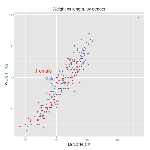
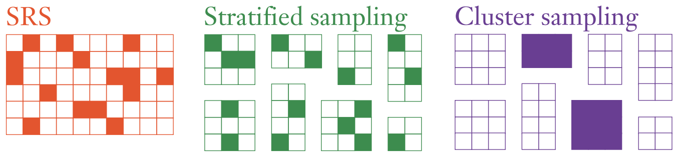
Long story short, traditional K-fold CV assumes that your rows of data are exchangeable, such as iid draws or simple random samples (SRS). But in survey sampling, we often use non-exchangeable sampling designs such as stratified sampling and/or cluster sampling.1

Illustration of simple random sampling, stratified sampling, and cluster sampling

Our paper explains why in such situations it can be important to carry out CV that mimics the sampling design.2 First, if you create CV folds that follow the same sampling process, then you’ll be more honest with yourself about how much precision there is in the data. Next, if on these folds you train fitted models and calculate test errors in ways that account for the sampling design (including sampling weights3), then you’ll generalize from the sample to the population more appropriately.

If you’d like to try this yourself, please consider using our R package surveyCV. For linear or logistic regression models, our function cv.svy() will carry out the whole K-fold Survey CV process:

  • generate folds that respect the sampling design,
  • train models that account for the sampling design, and
  • calculate test error estimates and their SE estimates that also account for the sampling design.

For more general models, our function folds.svy() will partition your dataset into K folds that respect any stratification and clustering in the sampling design. Then you can use these folds in your own custom CV loop. In our package README and the intro vignette, we illustrate how to use such folds to choose a tuning parameter for a design-consistent random forest from the rpms R package.

Finally, if you are already working with the survey R package and have created a svydesign object or a svyglm object, we have convenient wrapper functions folds.svydesign(), cv.svydesign(), and cv.svyglm() which can extract the relevant sampling design info out of these objects for you.

It was very rewarding to work with Cole and Thomas on this project. They did a lot of the heavy lifting on setting up the initial package, developing the functions, and carrying out simulations to check whether our proposed methods work the way we expect. My hat is off to them for making the paper and R package possible.

Some next steps in this work:

  • Find additional example datasets and give more detailed guidance around when there’s likely to be a substantial difference between usual CV and Survey CV.
  • Build in support for automated CV on other GLMs from the survey package beyond the linear and logistic models. Also, write more examples of how to use our R package with existing ML modeling packages that work with survey data, like those mentioned in Section 5 of Dagdoug, Goga, and Haziza (2021).
  • Try to integrate our R package better with existing general-purpose R packages for survey data like srvyr and for modeling like tidymodels, as suggested in this GitHub issue thread.
  • Work on better standard error estimates for the mean CV loss with Survey CV. For now we are taking the loss for each test case (e.g., the squared difference between prediction and true test-set value, in the case of linear regression) and using the survey package to get design-consistent estimates of the mean and SE of this across all the test cases together. This is a reasonable survey analogue to the standard practice for regular CV—but alas, that standard practice isn’t very good. Bengio and Grandvalet (2004) showed how hard it is to estimate SE well even for iid CV. Bates, Hastie, and Tibshirani (2021) have recently proposed another way to approach it for iid CV, but this has not been done for Survey CV yet.

PSA: R’s rnorm() and mvrnorm() use different spreads

Quick public service announcement for my fellow R nerds:

R has two commonly-used random-Normal generators: rnorm and MASS::mvrnorm. I was foolish and assumed that their parameterizations were equivalent when you’re generating univariate data. But nope:

  • Base R can generate univariate draws with rnorm(n, mean, sd), which uses the standard deviation for the spread.
  • The MASS package has a multivariate equivalent, mvrnorm(n, mu, Sigma), which uses the variance-covariance matrix for the spread. In the univariate case, Sigma is the variance.

I was using mvrnorm to generate a univariate random variable, but giving it the standard deviation instead of the variance. It took me two weeks of debugging to find this problem.

Dear reader, I hope this cautionary tale reminds you to check R function arguments carefully!

Data sanity checks: Data Proofer (and R analogues?)

I just heard about Data Proofer (h/t Nathan Yau), a test suite of sanity-checks for your CSV dataset.

It checks a few basic things you’d really want to know but might forget to check yourself, like whether any rows are exact duplicates, or whether any columns are totally empty.
There are things I always forget to check until they cause a bug, like whether geographic coordinates are within -180 to 180 degrees latitude or longitude.
And there are things I never think to check, though I should, like whether there are exactly 65k rows (probably an error exporting from Excel) or whether integers are exactly at certain common cutoff/overflow values.
I like the idea of automating this. It certainly wouldn’t absolved me of the need to think critically about a new dataset—but it might flag some things I wouldn’t have caught otherwise.

(They also do some statistical checks for outliers; but being a statistician, this is one thing I do remember to do myself. (I’d like to think) I do it more carefully than any simple automated check.)

Does an R package like this exist already? The closest thing in spirit that I’ve seen is testdat, though I haven’t played with that yet. If not, maybe testdat could add some more of Data Proofer’s checks. It’d become an even more valuable tool to run whenever you load or import any tabular dataset for the first time.

Why bother with magrittr

I’ve seen R users swooning over the magrittr package for a while now, but I couldn’t make heads or tails of all these scary %>% symbols. Finally I had time for a closer look, and it seems potentially handy indeed. Here’s the idea and a simple toy example.

So, it can be confusing and messy to write (and read) functions from the inside out. This is especially true when functions take multiple arguments. Instead, magrittr lets you write (and read) functions from left to right.

Say you need to compute the LogSumExp function \log\left(\sum_{i=1}^n\exp(x_i)\right), and you’d like your code to specify the logarithm base explicitly.

In base R, you might write
log(sum(exp(MyData)), exp(1))
But this is a bit of a mess to read. It takes a lot of parentheses-matching to see that the exp(1) is an argument to log and not to one of the other functions.

Instead, with magrittr, you program from left to right:
MyData %>% exp %>% sum %>% log(exp(1))
The pipe operator %>% takes output from the left and uses it as the first argument of input on the right. Now it’s very clear that the exp(1) is an argument to log.

There’s a lot more you can do with magrittr, but code with fewer nested parentheses is already a good selling point for me.

Apart from cleaning up your nested functions, this approach to programming might be helpful if you write a lot of JavaScript code, for example if you make D3.js visualizations. R’s magrittr pipe is similar in spirit to JavaScript’s method chaining, so it might make context-switching a little easier.

Statistical Graphics and Visualization course materials

I’ve just finished teaching the Fall 2015 session of 36-721, Statistical Graphics and Visualization. Again, it is a half-semester course designed primarily for students in the MSP program (Masters of Statistical Practice) in the CMU statistics department. I’m pleased that we also had a large number of students from other departments taking this as an elective.

For software we used mostly R (base graphics, ggplot2, and Shiny). But we also spent some time on Tableau, Inkscape, D3, and GGobi.

We covered a LOT of ground. At each point I tried to hammer home the importance of legible, comprehensible graphics that respect human visual perception.

Pie chart with remake
Remaking pie charts is a rite of passage for statistical graphics students

My course materials are below. Not all the slides are designed to stand alone, but I have no time to remake them right now. I’ll post some reflections separately.

Download all materials as a ZIP file (38 MB), or browse individual files:
Continue reading “Statistical Graphics and Visualization course materials”

About to teach Statistical Graphics and Visualization course at CMU

I’m pretty excited for tomorrow: I’ll begin teaching the Fall 2015 offering of 36-721, Statistical Graphics and Visualization. This is a half-semester course designed primarily for students in our MSP program (Masters in Statistical Practice).

A large part of the focus will be on useful principles and frameworks: human visual perception, the Grammar of Graphics, graphic design and interaction design, and more current dataviz research. As for tools, besides base R and ggplot2, I’ll introduce a bit of Tableau, D3.js, and Inkscape/Illustrator. For assessments, I’m trying a variant of “specs grading”, with a heavy use of rubrics, hoping to make my expectations clear and my TA’s grading easier.

Di Cook, LDA and CART classification boundaries on Flea Beetles dataset
Classifier diagnostics from Cook & Swayne’s book

My initial course materials are up on my department webpage.
Here are the

  • syllabus (pdf),
  • first lecture (pdf created with Rmd), and
  • first homework (pdf) with dataset (csv).

(I’ll probably just use Blackboard during the semester, but I may post the final materials here again.)

It’s been a pleasant challenge to plan a course that can satisfy statisticians (slice and dice data quickly to support detailed analyses! examine residuals and other model diagnostics! work with data formats from rectangular CSVs through shapefiles to social networks!) … while also passing on lessons from the data journalism and design communities (take design and the user experience seriously! use layout, typography, and interaction sensibly!). I’m also trying to put into practice all the advice from teaching seminars I’ve taken at CMU’s Eberly Center.

Also, in preparation, this summer I finally enjoyed reading more of the classic visualization books on my list.

  • Cleveland’s The Elements of Graphing Data and Robbins’ Creating More Effective Graphs are chock full of advice on making clear graphics that harness human visual perception correctly.
  • Ware’s Information Visualization adds to this the latest research findings and a ton of useful detail.
  • Cleveland’s Visualizing Data and Cook & Swayne’s Interactive and Dynamic Graphics for Data Analysis are a treasure trove of practical data analysis advice. Cleveland’s many case studies show how graphics are a critical part of exploratory data analysis (EDA) and model-checking. In several cases, his analysis demonstrates that previously-published findings used an inappropriate model and reached poor conclusions due to what he calls rote data analysis (RDA). Cook & Swayne do similar work with more modern statistical methods, including the first time I’ve seen graphical diagnostics for many machine learning tools. There’s also a great section on visualizing missing data. The title is misleading: you don’t need R and GGobi to learn a lot from their book.
  • Monmonier’s How to Lie with Maps refers to dated technology, but the concepts are great. It’s still useful to know just how maps are made, and how different projections work and why it matters. Much of cartographic work sounds analogous to statistical work: making simplifications in order to convey a point more clearly, worrying about data quality and provenance (different areas on the map might have been updated by different folks at different times), setting national standards that are imperfect but necessary… The section on “data maps” is critical for any statistician working with spatial data, and the chapter on bureaucratic mapping agencies will sound familiar to my Census Bureau colleagues.

I hope to post longer notes on each book sometime later.

“Don’t invert that matrix” – why and how

The first time I read John Cook’s advice “Don’t invert that matrix,” I wasn’t sure how to follow it. I was familiar with manipulating matrices analytically (with pencil and paper) for statistical derivations, but not with implementation details in software. For reference, here are some simple examples in MATLAB and R, showing what to avoid and what to do instead.

[Edit: R code examples and results have been revised based on Nicholas Nagle’s comment below and advice from Ryan Tibshirani. See also a related post by Gregory Gundersen.]

If possible, John says, you should just ask your scientific computing software to directly solve the linear system Ax = b. This is often faster and more numerically accurate than computing the matrix inverse of A and then computing x = A^{-1}b.

We’ll chug through a computation example below, to illustrate the difference between these two methods. But first, let’s start with some context: a common statistical situation where you may think you need matrix inversion, even though you really don’t.

[One more edit: I’ve been guilty of inverting matrices directly, and it’s never caused a problem in my one-off data analyses. As Ben Klemens comments below, this may be overkill for most statisticians. But if you’re writing a package, which many people will use on datasets of varying sizes and structures, it may well be worth the extra effort to use solve or QR instead of inverting a matrix if you can help it.]

Continue reading ““Don’t invert that matrix” – why and how”

Two principled approaches to data visualization

Yesterday I spoke at Stat Bytes, our student-run statistical computing seminar.

My goal was to introduce two principled frameworks for thinking about data visualization: human visual perception and the Grammar of Graphics.
(We also covered some relevant R packages: RColorBrewer, directlabels, and a gentle intro to ggplot2.)

These are not the only “right” approaches, nor do they guarantee your graphics will be good. They are just useful tools to have in your arsenal.

Example plot with direct labels and ColorBrewer colors, made in ggplot2.

The talk was also a teaser for my upcoming fall course, 36-721: Statistical Graphics and Visualization [draft syllabus pdf].

Here are my

The talk was quite interactive, so the slides aren’t designed to stand alone. Open the slides and follow along using my notes below.
(Answers are intentionally in white text, so you have a chance to think for yourself before you highlight the text to read them.)

If you want a deeper introduction to dataviz, including human visual perception, Alberto Cairo’s The Functional Art [website, amazon] is a great place to start.
For a more thorough intro to ggplot2, see creator Hadley Wickham’s own presentations at the bottom of this page.

Continue reading “Two principled approaches to data visualization”

DotCity: a game written in R? and other statistical computer games?

A while back I recommended Nathan Uyttendaele’s beginner’s guide to speeding up R code.

I’ve just heard about Nathan’s computer game project, DotCity. It sounds like a statistician’s minimalist take on SimCity, with a special focus on demographic shifts in your population of dots (baby booms, aging, etc.). Furthermore, he’s planning to program the internals using R.

This is where scatterplot points go to live and play when they're not on duty.
This is where scatterplot points go to live and play when they’re not on duty.

Consider backing the game on Kickstarter (through July 8th). I’m supporting it not just to play the game itself, but to see what Nathan learns from the development process. How do you even begin to write a game in R? Will gamers need to have R installed locally to play it, or will it be running online on something like an RStudio server?

Meanwhile, do you know of any other statistics-themed computer games?

  • I missed the boat on backing Timmy’s Journey, but happily it seems that development is going ahead.
  • SpaceChem is a puzzle game about factory line optimization (and not, actually, about chemistry). Perhaps someone can imagine how to take it a step further and gamify statistical process control à la Shewhart and Deming.
  • It’s not exactly stats, but working with data in textfiles is an important related skill. The Command Line Murders is a detective noir game for teaching this skill to journalists.
  • The command line approach reminds me of Zork and other old text adventure / interactive fiction games. Perhaps, using a similar approach to the step-by-step interaction of swirl (“Learn R, in R”), someone could make an I.F. game about data analysis. Instead of OPEN DOOR, ASK TROLL ABOUT SWORD, TAKE AMULET, you would type commands like READ TABLE, ASK SCIENTIST ABOUT DATA DICTIONARY, PLOT RESIDUALS… all in the service of some broader story/puzzle context, not just an analysis by itself.
  • Kim Asendorf wrote a fictional “short story” told through a series of data visualizations. (See also FlowingData’s overview.) The same medium could be used for a puzzle/mystery/adventure game.