
OK, back to statistics and datavis.
As I’ve said before, I’m curious about finding better ways to draw maps which simultaneously show numerical estimates and their precision or uncertainty.
The April 2015 issue of Significance magazine includes a nice example of this [subscription link; PDF], thanks to Michael Wininger. Here is his Figure 2a (I think the labels for the red and blue areas are mistakenly swapped, but you get the idea):
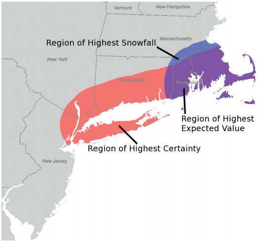
Basically, Wininger is mapping the weather continuously over space, and he overlays two contours: one for where the predicted snowfall amount is highest, and another for where the probability of snowfall is highest.
I can imagine people would also enjoy an interactive version of this map, where you have sliders for the two cutoffs (how many inches of snow? what level of certainty?). You could also just show more levels of the contours on one static map, by adding extra lines, though that would get messy fast.
I think Wininger’s approach looks great and is easy to read, but it works largely because he’s mapping spatially-continuous data. The snowfall levels and their certainties are estimated at a very fine spatial resolution, unlike say a choropleth map of the average snowfall by county or by state. The other thing that helps here is that certainty is expressed as a probability (which most people can interpret)… not as a measure of spread or precision (standard deviation, margin of error, coefficient of variation, or what have you).
Could this also work on a choropleth map? If you only have data at the level of discrete areas, such as counties… Well, this is not a problem with weather data, but it does come up with administrative or survey data. Say you have survey estimates for the poverty rate in each county (along with MOEs or some other measure of precision). You could still use one color to fill all the counties with high estimated poverty rates. Then use another color to fill all the counties with highly precise estimates. Their overlap would show the areas where poverty is estimated to be high and that estimate is very precise. Sliders would let the readers set their own definition of “high poverty” and “highly precise.”
I might be wrong, but I don’t think I’ve seen this approach before. Could be worth a try.