Overview
Encouraged by Robert Kosara’s call for applications, I attended the Tapestry 2016 conference two weeks ago. As advertised, it was a great chance to meet others from all over the data visualization world. I was one of relatively few academics there, so it was refreshing to chat with journalists, industry analysts, consultants, and so on. (Journalists were especially plentiful since Tapestry is the day before NICAR, the Computer-Assisted Reporting Conference.) Thanks to the presentations, posters & demos, and informal chats throughout the day, I came away with new ideas for improving my dataviz course and my own visualization projects.
I also presented a poster and handout on the course design for my Fall 2015 dataviz class. It was good to get feedback from other people who’ve taught similar courses, especially on the rubrics and assessment side of things.
The conference is organized and sponsored by the folks at Tableau Software. Although I’m an entrenched R user myself, I do appreciate Tableau’s usefulness in bringing the analytic approach of the grammar of graphics to people who aren’t dedicated programmers. To help my students and collaborators, I’ve been meaning to learn to use Tableau better myself. Folks there told me I should join the Pittsburgh Tableau User Group and read Dan Murray’s Tableau Your Data!.
Below are my notes on the three keynote speakers: Scott Klein on the history of data journalism, Jessica Hullman on research into story patterns, and Nick Sousanis on comics and visual thinking vs. traditional text-based scholarship.
My next post will continue with notes on the “short stories” presentations and some miscellaneous thoughts.
Keynote speakers
Scott Klein
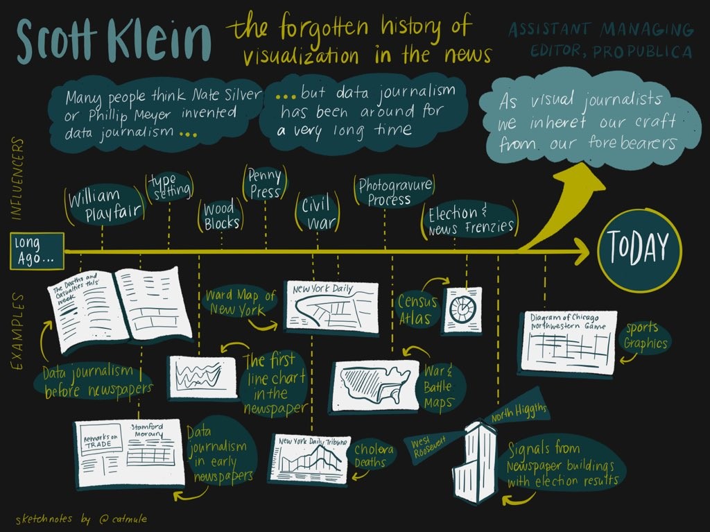
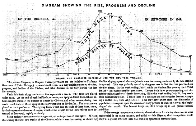
Scott Klein, one of the editors at ProPublica, spoke on the history of visualization in data journalism—going all the way back to the “bills of mortality” in the 1600s. Parts of his talk overlap with his article for Malofiej 24, which is well worth a read.
(See also his new TinyLetter, Above Chart, starting with the manifesto.)
I was surprised to learn that William Playfair—known to dataviz nerds today as the inventor/popularizer of line graphs and many other charts—was not at all popular in his time. Colleagues in the early 1800s dismissed his charts as mere playthings. Admittedly, statistical societies at the time did discuss them and argue about the “best” way to present graphics. (They kept arguing through the 1900s—see Brinton’s Graphic methods for presenting facts (1914)—and we still argue about it today!) But Playfair’s ideas didn’t really catch on in practice for a long time.
Today we’re taught about the graphics “titans” like Playfair or Minard… But it’s important to appreciate how the craft of dataviz was actually inherited in practice, passed on by anonymous news teams on tight deadlines working with imperfect data.
Newspapers didn’t use abstract line charts etc. at first, partly out of technical issues getting them printed, and partly out of lack of familiarity among the readership. As Klein pointed out, the earliest newspaper line chart he’s found came with paragraphs of text on how to read it. But today we think it’s familiar and clear. Surely there are other graphs out there now that look “too complex” today but will become commonplace and familiar in the future.
But US papers were printing maps already by the early 1800s. Maps became a lot more common during the Civil War, when people wanted to visualize the dramatic battles of the day. Statisticians will recognize the name of Francis Galton, a pioneer in regression and other core statistical tools—it turns out he also created the first isoline weather map.
Election news graphics like those at FiveThirtyEight are nothing new either. The New York Times published a choropleth map of election results in 1896 the day after the election. Klein showed this to a colleague who marveled that they could do it so quickly—even today, it takes us longer than that just to get the correct data! Well… as it turns out, in 1896 they published incorrect (quick-and-dirty estimates of) election results by state 😛 and it just so happened that the national result was correct despite those errors.
(Nifty history note: Before everyone had radios at home, election news was broadcast by slide projectors onto a wall next to the newspaper office (or simply written in chalk). People would gather to watch the results come in live. For those who couldn’t come into town, there were searchlights at the top of the building, pointing north to indicate one candidate was winning, south for the other. We don’t usually think of searchlights as “information visualization,” but they sure could be.)
Finally, Klein reminded us about the beautiful old US Census Atlases of 1870, 1880, and 1890. These are the places “where you’ll find the weird stuff”—some of the most innovative data graphics of the time (if not always successful). I’d love to know more about the creators: who were they? Why and how were they interested in developing novel graphical forms? Why was the Census their dataset of choice?
Jessica Hullman
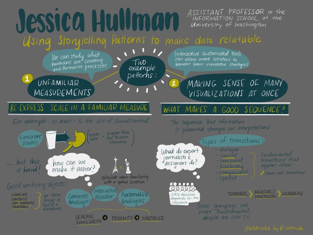
Jessica Hullman, at the University of Washington, described her research into story patterns that make data more relatable, as well as tools that suggest or automate such story patterns. She covered two broad examples: analogies for unfamiliar units or magnitudes, and the ordering of multiple visualizations.
First, it’s nice when reports can put numbers in context. That might be a simple metric-vs-imperial translation for readers across the pond, or it might be a useful comparison for numbers that might be unintuitive (“The site is X acres, or roughly Y football fields”). A fun example is that the “Trenta” sized coffee at Starbucks is a bit larger than the average human stomach.
Hullman wanted to automatically generate such analogies for a wide range of units and measurements. You need to choose objects that are familiar, concrete, and countable, such that different instances of the objects have quite uniform dimensions. And you want your database of objects to span many orders of magnitude: research shows that people find it easy to reason about between 1 and 10 items. So it doesn’t help to say something is the weight of 0.04 pens or 400 pens.
Hullman went through quite a process to build up her database: scrape WordNet for object names at the right category level to be concrete; scrape Amazon to get dimensions of each object; crowdsource the objects’ “familiarity” with Mechanical Turk… Finally, build a formula using various criteria to choose the top several “re-unitizations” and auto-suggest them whenever you read numbers in an article. In Hullman’s app, you can also choose two same-unit numbers to compare: say the volume of A to B is like comparing a water bottle to a hot tub. You can try it out yourself.
[Now, some of this process seems like overkill to me. The Dictionary of Numbers seems to be a similar app, but with manually curated comparisons. I would go even simpler and make a manually-curated index-card cheatsheet, to keep on your desk, with the most common units (e.g. pounds or feet) and a few orders of magnitude (1, 10, 100, …) for each. Then you can easily translate any reasonable number of these common units. Rather than choose the “optimal” object by her formula, seeing that it happens to weigh 37.8 pounds, and saying 80 pounds is about two of those… why not find an acceptable object weighing 10 pounds, and say 80 pounds is 8 of those?]
But if you ignore my curmudgeonly comments about the object database, I admit her process makes particular sense for spatial comparisons. It’s easiest for humans to compare areas or distances with local landmarks. Nowadays, you can ask for the reader’s IP address, check their approximate location, and then look up your database of landmarks local to them. Hullman makes her database by looking at Wikipedia(?) for possible major landmarks near the user, then at the number of Flickr photos of each landmark to rate it by likely familiarity. Especially for surface areas, it’s helpful to superpose them on a map of your home area—e.g. for a US news story about Nepal, show Nepal’s outline overlaid on your home state.
Hullman’s second topic was her study of the sequence of visualizations, like in a series of ordered tabs. (For example, the New York Times’ “Copenhagen: Emissions, Treaties and Impacts” has a sequence of topic tabs at the top, then another numbered sequence within each tab.) In what order should individual components be presented to engage the user, retain interest, and make things clear? Obviously chronology is a good heuristic, when it applies, but it’s not always relevant. The data analyst’s order of discovery isn’t always good for presentation either.
Ordering can make a big difference: studies have shown that mock juries can come to different verdicts when they see the same evidence presented in a different order. Since we’re best at comparing adjacent pieces of information, the story we tell in our heads will change as the presentation order changes.
She looked at hundreds of sequenced visualization examples in data journalism and tried to taxonomize the transition types she found. Some of those transition types: from question to answer; causal relationship; temporal; spatial; hierarchical (zoom from general to specific or vice versa); and changing the variables shown (e.g. on a time series plot, change the y-axis variable while the x-axis times stay the same).
The most commonly used ones seem to minimize cognitive cost: almost everything remains constant, with a change to only one variable (or the level of a variable, i.e. which time or which place is shown). That also means keeping visual consistency—e.g. same color scales throughout the sequence.
Besides such micro-transitions, stories also have bigger episodes, often repeating the same structure (of several individual transitions) within each episode. This allows the story to be more complex while maintaining familiarity as you go across.
Hullman’s still working on understanding how authors balance these micro and macro transition structures. She also mentioned using such “story patterns” in exploratory data analysis, perhaps having your software auto-suggest understandable transitions that lead you, incrementally and sensibly, towards an “interesting” view of the data. (This sounds related to my “human in the loop” analysis ideas from Bertini’s talk—see next post.)
An audience member asked about story structures that can help readers find their own conclusion, rather than convincing them of yours. Hullman suggested the “martini glass” structure from Segel and Heer’s paper on “Narrative Visualization”: you can begin with a linear, author-driven exposition to give the readers context, but finish with a wide-open exploratory view of the data for readers to play with.
There’s also the open question of when & whether “high cost” transitions might actually be useful. In films, you often see shocking, jarring transitions used to surprise the viewer or shift the mood. But it’s unclear how that would apply in data analysis and journalism.
Edit: Dinosaur Comics has some great examples of making comparisons with just analogies, leaving out the numbers entirely.
Nick Sousanis
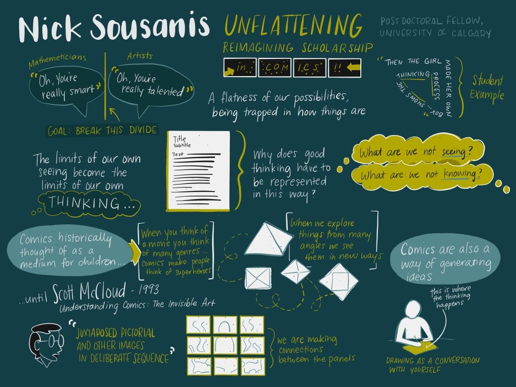
Nick Sousanis is a comics artist, postdoc at the University of Calgary, and the author of Unflattening, a PhD thesis written in the form of a comic book (or graphic novel). Particularly in academia but in other fields as well, says Sousanis, we are often stuck like Abbott’s Flatlanders. There are directions worth exploring that we can’t even imagine, because of precedent, expectations from the past, existing structures, etc.
In particular, Sousanis wants us to push back on the supremacy of text over images (especially in traditional text-heavy education and scholarship). Like binocular vision, we see things more deeply when we can approach them from multiple vantage points. He spoke a bit about the history and value of comics as their own form of media, then about the value of drawing as part of your work process (much like Madden’s talk—see next post).
[Historical notes: “Cartoon” apparently comes from the Italian “cartone”, a material that painters used for sketches. Standalone comics were popular in newspapers for a while before comic books were invented—basically creating a market from scratch—as a way for printing presses to have more things to print (and sell) at the time of day when newspapers weren’t being printed.]
So, why treat comics as a distinct thing? Having all the panels on a page, visible at once, helps crystallize them together & opens new possibilities. Unlike the forced linearity of, say, film (or baby board books), you can see “past” and “future” panels at the same time, play jokes by reaching across panels, create a new image by joining the backgrounds of different panels over a page, etc.
Sousanis mentioned we have two kinds of attention always working: one for linear tasks (what’s in the next moment?), another for making broader connections (cycling back to more distant times or places or concepts). The form of a comic allows for these back-references and interconnections to be more explicit than in rows of text.
In this way, comics are quite different from storyboards. Even though both tell a story in a series of panels, there’s only one assumed layout of the storyboard panels—you move linearly through identically-shaped panels over time, even if you happen to draw several on a page for space-saving. In a comic, the sizes and shapes of panels, as well as their adjacencies, are part of what you get to play with.
Audience members working on mobile development asked: What about when you’re on such a platform and you need to show one small thing at a time—you can’t show many panels (or, in dataviz, small multiples) at once? Sousanis admitted it’s a tough situation, and he didn’t publish his book in a mobile-ready format for exactly this reason. I wondered if there’s a reverse, too: are there upper limits on the size for a comic? Would it be too overwhelming to make one that’s a giant poster, or is the usual page size just out of tradition and convenience?
Next, Sousanis encouraged us to use drawing in our own working lives, even if we’re not used to creating visual media. He cited psychologist Barbara Tversky, to the effect that drawing is a conversation with yourself. As soon as you put marks down on paper, your eyes give feedback and imagine other things you might not have intended—helping you see both the existing ideas in your head and new ideas too.
He mentioned an assignment he gives students: Tell the same story (e.g. How did you get here?) twice: in 3 panels and in 2 pages. These very different settings lead to very different tellings of that story.
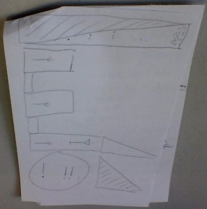
Finally, he led us all in another exercise: Carve up a page into a grid or other layout to represent the shape of your day. Think about the form, the panel sizes, the adjacencies, etc. Then, fill it in with some kind of marks that represent your activities or feelings—but “don’t draw things.” Use the whole page; negative space counts.
Here’s mine: I left a big blank space for all the learning still swirling in my head that hadn’t crystallized yet, but I could frame it with meals and travel and sleep.
This was a great way to end the day. (You can find other attendees’ responses on Twitter if you search @Nsousanis #tapestryconf.) I only wish we’d had more time to discuss with neighbors—and that the other speakers had been able to include more audience participation too.
Finally, Sousanis recommended a few other recent(ish) comic books / graphic novels for those who want to branch out beyond superhero pulp comics:
- Matt Madden’s 99 Ways to Tell a Story
- Richard McGuire’s Here
- David Mazzucchelli’s Asterios Polyp and City of Glass
This is in addition to classics like Art Spiegelman’s Maus and Scott McCloud’s Understanding Comics.

