useR 2012: main conference braindump

I knew R was versatile, but DANG, people do a lot with it:

> > … I don’t think anyone actually believes that R is designed to make *everyone* happy. For me, R does about 99% of the things I need to do, but sadly, when I need to order a pizza, I still have to pick up the telephone. —Roger Peng

> There are several chains of pizzerias in the U.S. that provide for Internet-based ordering (e.g. www.papajohnsonline.com) so, with the Internet modules in R, it’s only a matter of time before you will have a pizza-ordering function available. —Doug Bates

Indeed, the GraphApp toolkit … provides one (for use in Sydney, Australia, we presume as that is where the GraphApp author hails from). —Brian Ripley

So, heads up: the following post is super long, given how much R was covered at the conference. Much of this is a “notes-to-self” braindump of topics I’d like to follow up with further. I’m writing up the invited talks, the presentation and poster sessions, and a few other notes. The conference program has links to all the abstracts, and the main website should collect most of the slides eventually.

Continue reading “useR 2012: main conference braindump”

useR 2012: impressions, tutorials

First of all, useR 2012 (the 8th International R User Conference) was, hands down, the best-organized conference I’ve had the luck to attend. The session chairs kept everything moving on time, tactfully but sternly; the catering was delicious and varied; and Vanderbilt University’s leafy green campus and comfortable facilities were an excellent setting. Many thanks to Frank Harrell and the rest of Vanderbilt’s biostatistics department for hosting!

Plus there's a giant statue of bacon. What's not to love?

Continue reading “useR 2012: impressions, tutorials”

JSM: accessible for first-year grad students?

A friend of mine has just finished his first year of a biostatistics program. I’m encouraging him to attend the Joint Statistical Meetings (JSM) conference in San Diego this July/August. He asked:

Some of the talks look really interesting, though as a someone who’s only been through the first year of a master’s program, I wonder if I’d be able to understand much.  When you went as a student, did you find the presentations to be accessible?

I admit a lot of the talks went over my head the first year — and many still do. Some talks are too specialized even for an experienced statistician who just has a different focus… But there are always plenty of accessible talks as well:

  • Talks on teaching statistical literacy or Stats 101 might be useful if you’re ever a TA or consultant
  • Talks on data visualization may focus on communicating results rather than on technical details
  • Overview lectures can introduce you to a new field
  • Some folks are known for generally being accessible speakers (a few off the top of my head: Hadley Wickham, Persi Diaconis, Andrew Gelman, Don Rubin, Dick DeVeaux, David Cox, Hal Varian… and plenty of others)

And it’s worthwhile for a grad student to start getting to know other statisticians and becoming immersed in your field.

  • There’s a nice opening night event for first-time attendees, and the Stat Bowl contest for grad students; in both of those, I made some friends I keep seeing again at later JSMs
  • Even when the talk is too advanced, it’s still fun to see a lecture by the authors of your textbooks, meet the folks who invented a famous estimator, etc.
  • You can get involved in longer-term projects: after attending the Statistics Without Borders sessions, I’ve become co-chair of the SWB website and co-authored a paper that’s now under review
  • It’s fun to browse the books in the general exhibit hall, get free swag, and see if any exhibitors are hiring; there is also a career placement center although I haven’t used it myself

Even if you’re a grad student or young statistician just learning the ropes, I definitely think it’s worth the trip!

Great work in math education (through blogs and Star Wars)

I keep emailing these links to friends, so I might as well put them in an update-able post instead.

I got hooked by this line:

You say “looks like somebody has too much time on their hands” but all I hear is “I’m sad because I don’t know what creativity feels like.”

I love this mentality and followed it down the path to an excellent community of high school math/physics teachers, all blogging about how they try to keep students engaged, motivate the topics they teach, make grades meaningful, etc. Two of my favorites are Shawn Cornally and Dan Meyer:

Shawn Cornally‘s all about formative assessment, standards-based grading, learning through inquiry, etc. Definitely watch his TEDx talk (with Star Wars references, as promised; I love the part about “Tayh D Be”) and check out the formative assessment / feedback / grading tool he’s built.

Dan Meyer takes a love of storytelling (compare the narrative of Star Wars to a typical math problem) and sets up some badass perplexing math questions, using good hooks to get students engaged AND using the real world as an answer key (vs. just “Oh that’s what the back of the book says”).

Also recommended is another TEDx talk by physics teacher / skateboarder Dr Tae.

Here is an overview of some other discussions in this math-teacher blogosphere. That includes some back-and-forth on Khan Academy, which I think is doing great work but I agree with the criticism that his videos can come across as “This is a required class, so let me help you pass the quiz,” instead of “This is an awesome subject, so let me get you hooked on it.” It’s much better than nothing, but there’s room for even more goodness…

Plenty of other great great blogs to share, but that’s a start for now.

Stats 101 resources

A few friends have asked for self-study resources on learning (or brushing up on) basic statistics. I plan to keep updating this post as I find more good suggestions.

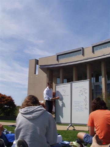
Of course the ideal case is to have a good teacher in a nice classroom environment:

The best classroom setting

For self-study, however, you might try an open course online. MIT has some OpenCourseWare for mathematics (including course 18.433, “Statistics for Applications”), and Carnegie Mellon offers free online courses in statistics. I have not tried them myself yet but hear good things so far.

As for textbooks: Freedman, Pisani, and Purves’ Statistics is a classic intro to the key concepts and seems a great way to get up to speed.
Two other good “gentle” conceptual intros are The Cartoon Guide to
Statistics
and How to Lie with Statistics. Also useful is Statistics Done Wrong [see my review], an overview of common mistakes in designing studies or applying statistics.
But I believe they all try to avoid equations, so you might need another source to show you how to actually crunch the numbers.
My undergrad statistics class used Devore and Farnum’s Applied Statistics for Engineers and Scientists. I haven’t touched it in years, so I ought to browse it again, but I remember it demonstrated the steps of each analysis quite clearly.
If you end up using the Devore and Farnum book, Jonathan Godfrey has converted the 2nd edtion’s examples into R.
[Edit: John Cook’s blog and his commenters have some good advice about textbooks. They also cite a great article by George Cobb about how to choose a stats textbook.]

Speaking of R, I would suggest it if you don’t already have a particular statistical software package in mind. It is open source and a free download, and I find that working in R is similar to the way I think about math while working it out on paper (unlike SPSS or SAS or Stata, all of which are expensive and require a very different mindset).
I list plenty of R resources in my R101 post. In particular, John Verzani’s simpleR seems to be a good introduction to using R, and reviews on a lot of basic statistics along the way (though not in detail).
People have also recommended some books on intro stats with R, especially Dalgaard’s Introductory Statistics with R or Maindonald & Braun’s Data Analysis and Graphics Using R.

For a very different approach to introductory stats, my former professor Allen Downey wrote a book called Think Stats aimed at programmers and using Python. I’ve only just read it, and I have a few minor quibbles that I want to discuss with him, but it’s a great alternative to the classic approach. As Allen points out, “standard statistical techniques are really computational shortcuts, which is less important when computation is cheap.” Both mindsets are good to have under your belt, but Allen’s is one of the few intro books so far for the computational route. It’s published by O’Reilly but Allen also makes a free version available online, as well as a related blog full of good resources.
Speaking of O’Reilly, apparently their book Statistics Hacks contains major conceptual errors, so I would have to advise against it unless they fix them in a future edition.

DC Datadive

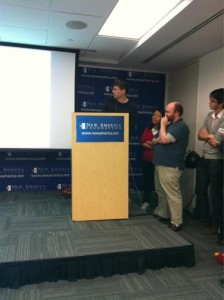
This weekend I had an absolute blast taking part in the DC Datadive hosted by the NYC-based Data Without Borders (DWB). It was somewhat like a hackathon, but rather than competing to develop an app with commercial potential, we were tasked with exploring data to produce insights for social good. (Perhaps it’s more like the appropriate-technology flash conferences for engineers that my classmates organized back at Olin.) In any case, we mingled on Friday night, chose one of three projects to focus on for Saturday (10am to 5am, in our case!), and presented Sunday morning.

The author, eager to point out a dotplot

There were three organizations acting as project sponsors (presentations here):

  • The National Environmental Education Foundation wondered how to evaluate their own efforts to increase environmental literacy among the US public. Their volunteers came up with great advice and even found some data NEEF didn’t realize they already had.
  • GuideStar, a major database of financial information on nonprofit organizations, wanted early-warning prediction of nonprofits that are at risk of failing, as well as ways to highlight high-performing organizations that are currently under the radar. This group of datadivers essentially ran their own Netflix prize contest, assembling an amazing range of machine learning approaches that each gave a new insight into the data.
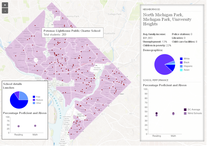
  • DC Action for Children tasked us with creating a visualization to clearly express how children’s well-being, health, school performance, etc. are related to the neighborhood where they live. I chose to work on this project and am really pleased with the map we produced: screenshot and details below.

Click above and try it out. Mousing over each area gives its neighborhood-level information; hovering over a school gives school details.
In short, our map situates school performance (percent of children with Proficient or Advanced scores on reading and math tests) in the context of their DC neighborhood. Forgive me if I’m leaving out important nuances, but as I understood it the idea was to change the conversation from “The schools on this list are failing so they must have poor adminstration, bad teachers, etc.” towards “The children attending the schools in this neighborhood have it rough: socioeconomic conditions, few resources like libraries and swimming pools, no dentists or grocery stores, etc. Maybe there are other factors that public policy should address before putting full responsibility on the school.” I think our map is a good start on conveying this more effectively than a bunch of separated tables.

It was so exciting to have a tangible “product” to show off. There may be a few minor technical glitches, and we did not have time to show all of the data that the other subteams collected, but it’s a good first draft.
Planning and coordinating our giant group was a bit tough at first but our DWB coordinator, Zac, gamely kept us moving and communicating across the several sub-teams that we formed. The data sub-team found, organized, and cleaned a bunch more variables than we could put in, so that whoever continues this work will have lots of great data to use. And the GIS sub-team aggregated it all to several levels (Census tract, neighborhood, and ward); again we only had time to implement one level on map, but all is ready to add the other levels when time allows.
As for myself, I worked mostly with the visualization sub-team: Nick who set up the core map in TileMill; Jason who kept pushing it forward until 5am; Sisi who styled it and cobbled together the info boxes out of HTML and the Google Charts API and who knows what else; and a ton of other fantastic people whose handles I can’t place at the moment. I learned A TON from everybody and was just happy that my R skills let me contribute to this great effort.
[Edit: It was amiss not to mention Nick’s coworkers Troy and Andy who provided massive help with the GIS prep and the TileMill hosting. Andy has a great writeup of the tools, which they also use for their maps of the week.]
I absolutely loved the collaborative spirit: people brought so many different skills and backgrounds to the team, and we made new connections that I hope will continue with future work on this or similar projects. Perhaps some more of us will join the Data Science DC Meetup group, for example.
I do wish I had spent more time talking to people on the other projects — I was so engrossed in my own team’s work that I didn’t get to see what other groups were doing until the Sunday presentations. Thank goodness for catching up later via Twitter and #dcdatadive.

A huge thanks to New America Foundation for hosting us (physically as well as with a temporary TileMill account), to the Independent Sector NGEN Fellows for facilitating, to whoever brought all the delicious food, and of course to DWB for putting it all together. I hope this is just the start of much more such awesomeness!

PS — my one and only concern: The wifi clogged up early on Saturday, when everyone was trying to get data from the shared Dropboxes at once. If you plan to attend a future datadive, I’d suggest bringing a USB stick to ease sharing of big files if the wifi collapses.

[Edit: I also recommend DC Action for Children’s blog posts on their hopes before the datadive and their reactions afterwards. They have also shared a good article with more open questions about how kids are impacted by inequality in and among DC neighborhoods.]

Separation of degrees

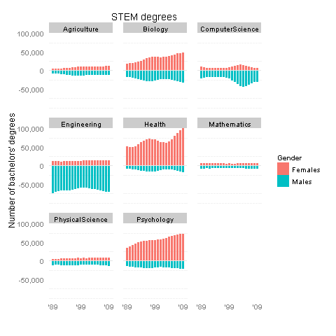
Scientific American has a short article on trends in undergraduate degrees over the past 20 years, illustrated with a great infographic by Nathan Yau. As a big fan of STEM (science, tech, engineering and math) education, I was pleased to see data on changing patterns among STEM degree earners.

However, there seemed to be a missed opportunity. The article mentioned that “More women are entering college, which in turn is changing the relative popularity of disciplines.” If the data were broken down by gender, readers could better see this fact for themselves.

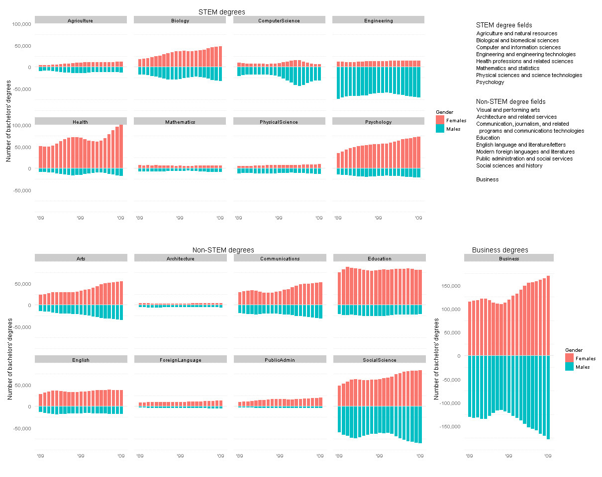
I thought I could exploit the current graphic’s slight redundancy: the bar heights below and above the gray horizontal lines are exactly the same. Why not repurpose this format to show data on degrees earned by men vs. by women (below vs. above the horizontal line), in the same amount of space?

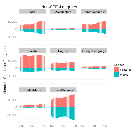
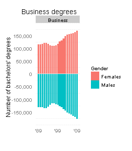
I could not find the gender breakdown for the exact same set of degrees, but a similar dataset is in the Digest of Education Statistics, tables 308 to 330. Here are my revised plots, made using R with the ggplot2 package.

Click this thumbnail to see all the data in one plot (it’s too big for the WordPress column width):

Or see the STEM and non-STEM plots separately below.

So, what’s the verdict? These new graphs do support SciAm’s conclusions: women are largely driving the increases in psychology and biology degrees (as well as “health professions and related sciences”), and to a lesser degree in the arts and communications. On the other hand, increases in business and social science degrees appear to be driven equally by males and females. The mid-’00s spike in computer science was mostly guys, it seems.

I’d also like to think that my alma mater, Olin College, contributed to the tiny increase in female engineers in the early ’00s 🙂

Technical notes:
Some of these degree categories are hard to classify as STEM vs. non-STEM. In particular, Architecture and SocialScience include some sub-fields of each type… Really, I lumped them under non-STEM only because it balanced the number of items in each group.
Many thanks to a helpful Learning R tutorial on back-to-back bar charts.

Share what you learn

Shawn Cornally always has good ideas about how to keep high school useful:
“I want my student to be able to produce something from this study that lingers instead of just rots on a hard drive, because, like church, school shouldn’t be about the building.”

That also reminds me: I should make a list of my favorite simple-but-useful cooking science tips. For example, after I learned just a bit about the science of gluten in flour, it made so much more sense why you knead bread so thoroughly but you only mix muffin batter “just until combined” (lumps okay).

Harold McGee’s On Food And Cooking is an awesome resource for such things. I also just got Jeff Potter’s Cooking For Geeks this week so I’ll be checking that out too.

Flipping Out

While we’re on the subject of statistics-related classroom activities with a “wow factor,” let me bring up my favorite: guessing whether a sequence of coin flips is real or fake.

BS detector

For me, it really brought home the idea that math is an amazing BS detector. Sure, we tell kids to learn math so you can balance your checkbook, figure out the tip at a restaurant, blah blah blah. But consider these very reasonable counterarguments: (1) Yawn, and (2) Calculators/computers do all that for us anyway.

So you have to fire back: you wanna get screwed over? When you sign up for student loans at a terrible rate because the loan officer was friendly and you couldn’t even guesstimate the math in your head, you’ll be stuck with awful payments for the next 10 years. When your phone company advertises “.002 cents per kilobyte” but charges you .002 dollars per kilobyte instead, a hundred times as much, you should call them out on it.

You may never have the luck to acquire a superhero spider sense, but we mortals can certainly hone our number sense. People will try to con you over the years, but if you keep this tool called “math” in your utility belt I guarantee it’ll save your butt a few times down the line.

Coin trick

Anyway, the coin flip thing itself may be more of a cute demo than directly practical — but it’s really really cute. Watch:
You split the class into two groups. One is going to flip a coin 100 times in a row and write down the resulting sequence of heads and tails. The other is going to pretend they did this and write down a made-up “random” sequence of heads and tails. The teacher leaves the room until both groups are done, then comes back in and has to guess which sequence came from real coin flips and which is the fake. And BAM, like magic, no calculation required, the teacher’s finely-honed number-sense makes it clear which is which.
Can you tell from the pair below?
(example copied from Gelman and Nolan, 2002, Teaching Statistics)

Enterprising statisticians have noticed that, in a sequence of 100 truly random coin flips, there’s a high probability of at least one “long” streak of six or more heads in a row (and same for tails). Meanwhile, people faking the data usually think that long streaks don’t look “random” enough. So the fake sequence will usually switch back and forth from heads to tails and back after only 2 or 3 of each, while the real sequence will have a few long streaks of 5 or 6 or more heads (or tails) in a row.

So is your number sense tingling yet? In the example above, the sequence on the left is real while the right-hand data was faked.
(I’m not sure where this demo originates. I first heard of it in Natalie Angier’s 2007 book The Canon, but it’s also described in Gelman and Nolan’s 2002 book Teaching Statistics mentioned above, and in Ted Hill’s 1999 Chance magazine article “The Difficulty of Faking Data”. Hill’s article is worth a read and goes into more detail on another useful statistical BS detector, Benford’s Law, that can detect patterns of fraudulent tax data!)

So what?

Lesson learned: randomness may look non-random, and vice versa, to the untrained eye. Sure, this is a toy example, but let’s generalize a bit. First, here we have random data generated in one dimension, time. This shows that long winning or losing streaks can happen by pure chance, far more often than most people expect. Say the sports team you manage has been on a winning (or losing) streak — does that mean the new star player is a real catch (or dud)? Maybe not; it might be a coincidence, unless the streak keeps running much longer than you’d expect due to chance… and statisticians can help you calibrate that sense of just how long to expect it.

Or imagine random data generated in two dimensions, spatial data, like mapping disease incidence on a grid of city blocks. Whereas before we had winning/losing streaks over time, now we’ll have clusters in space. We don’t know where they’ll be but we are sure there’s going to be some clustering somewhere. So if neighborhood A seems to have a higher cancer rate than neighborhood B, is there a local environmental factor in ‘hood A that might be causing it? Or is it just a fluke, to be expected, since some part of town will have the highest rates even if everyone is equally at risk? This is a seriously hard problem and can make a big difference in the way you tackle public health issues. If we cordon off area A, will we be saving lives or just wasting time and effort? Statisticians can tell, better than the untrained eye, whether the cluster is too intense to be a fluke.

It’s hard to make good decisions without knowing what’s a meaningful pattern and what’s just a coincidence. Statistics is a crazy powerful tool for figuring this out — almost magical, as the coin flip demo shows.

Spinner Prescription

In the last post I described a problem with Dan Meyer’s otherwise excellent expected-values teaching tool: you’d like to wow the kids by correctly predicting the answer a month in advance, but the given setup is actually too variable to let you make a safe prediction.

Essentially, if you’re saying “Let’s do a magic trick to get kids engaged in this topic,” but the trick takes a month to run AND only has a 30% chance of working… then why not tweak the trick to be more reliable?

spin it many more times?

Part of this unreliability comes from the low number of spins — about 20 spins total, if you do it once every weekday for a month. The “easy” fix is to spin Dan’s spinner many more times … but it turns out you’d have to spin it about 4000 times to be 90% confident your prediction will be right. Even if you have the patience, that’s a lot of individual spins to track in your spreadsheet or wherever.

use a MORE reliable spinner?

Another fix might be to change the spinner so that it works reliably given only 20 spins. First, we don’t want any of the sectors too small, else we might not hit them at all during our 20 spins, and then it becomes unpredictable. It turns out the smallest sector has to be at least about 1/9th of the spinner if you want to be 90% confident of hitting that sector at least once in those 20 spins.
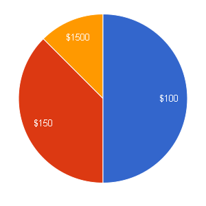
(Let y \sim \mathrm{Binomial}(p=1/9, n=20) . Then $latex p(y<0) = 1-p(y=0) = 0.905$.) If we round that up to 1/8th instead, we can easily use a Twister spinner (which has 16 equal sectors). After playing with some different options, using the same simulation approach as the previous post, I found that the following spinner seems to work decently: 1/2 chance of $100, 3/8 chance of $150, and 1/8 chance of $1500. After 20 spins of this spinner, there's about a 87% chance that the "$1500" will have been the winning bet, so you can be pretty confident about making the right bet a month in advance.

Unfortunately, predicting that spinner correctly is kind of unimpressive. The “$1500” is a fairly big slice, so it doesn’t look too risky.

spin just a few more times and use a safer spinner!

What if we spin it just a few more than 20 times — say 60 times, so two or three times each day? That’s not too much data to keep track of. Will that let us shrink the smallest slice, while keeping predictability high, and thus making this all more impressive?

Turns out that if we know we’ll have about 60 spins, we can make the smallest slice 1/25th of the spinner and still be confident we’ll hit it at least once. Cool. If we want to keep the Twister board, and have the smallest slice be 1/16th of the circle, we actually have a 90% chance of hitting it at least twice. So that makes things even more predictable (for the teacher), while still making it less predictable (to the kids) than the previous spinner.

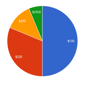
More messing around led to this suggested spinner: 1/2 chance of $100, 5/16 chance of $200, 1/8 chance of $400, and 1/16 chance of $2500. The chance that “$2500” is the right bet after 60 spins of this spinner is about 88%, so again you can make your bet confidently — but this time, the “right” answer doesn’t look as obvious.

In short, I’d recommend using this spinner for around 60 spins, rather than Dan’s spinner for 20 spins. It’s not guaranteed to be “optimal” but it’s far more reliable than the original suggestion.
If anyone tries it, I’d be curious to hear how it went!