I am sorry to hear that Rob Santos has resigned from being director of the US Census Bureau.
Robert Santos decides to resign as US Census Bureau director midway through a 5-year term … [Santos] said in a letter Thursday evening that he made the decision “after deep reflection.” … The Texas native said in his letter that he planned to spend time with his family in retirement. [AP]
Dr Santos was also a past President of the ASA (American Statistical Association) and, from what I’ve heard, well-respected as the director at the Census Bureau.
I am wondering whether this letter is publicly available. I have not seen it on news sources or the Census Bureau website. Dr Santos’ LinkedIn post about the resignation merely says “It’s been such an honor to serve our nation.”
I had hoped Dr Santos would stay on through his full 5-year term, as long as possible, to minimize politicization (or appearance thereof) of the Census Bureau’s work.
Beyond the Census Bureau, there is plenty of other statistical turmoil at the moment:
At the direction of the Trump administration, the federal Department of Health and Human Services and its agencies are purging its websites of information and data on a broad array of topics — from adolescent health to LGBTQ+ rights to HIV. [NPR]
I would love for the current ASA leadership to rally its members, helping us to work together to support our federal statistical agencies and statistical civil servants.
It’s been a while. Years ago in 2017, I posted with concern but cautious optimism about the integrity of federal statistical data. Now in 2025, as that presidential administration returns to power, these concerns (and many others) are much sharper than ever before.
First of all, an atmosphere of “you’d better tattle on your colleagues or else you’ll get in trouble too” pervaded Communist-era 1980s Poland where I was born. That was a major reason why my parents fled to the USA with me, to raise me in a country where you could speak freely and trust your neighbors, because such snitching obviously had no place here. Now it is chilling to see that same kind of message coming directly from the top of the US executive branch:
In a new message distributed on Wednesday, government employees were warned they would face “adverse consequences” if they failed to promptly report any hidden DEI programs. […] “There will be no adverse consequences for timely reporting this information. However, failure to report this information within 10 days may result in adverse consequences,” the memo said. [Reuters]
Next, there are heavy-handed, unsubtle attempts to discourage hiring and retention of top talent across the government, likely leading to worse outcomes, leading to a feedback loop that “justifies” even more whittling down of talent and institutional knowledge in the name of “efficiency.”
Elon Musk and Vivek Ramaswamy, whom Trump appointed to lead his Department of Government Efficiency, or DOGE, suggested that requiring federal employees to return to the office five days a week “would result in a wave of voluntary terminations that we welcome.” [NPR]
Finally, focusing back on statistical data: There are also heavy-handed, unsubtle attempts to discourage participation in the decennial Census, likely leading to poorer data quality, leading to further erosion of trust in shared facts. We can’t even collect good data to begin with if we lose the public’s trust; so even if the Census changes are ultimately blocked, the fact that this has come up at all means that harm is already underway. (And if the administration’s changes do go through, they may reap further partisan advantages from changes to apportionment for the House of Representatives as well as future redistricting.)
Among the dozens of Biden-era executive orders that President Trump revoked on Monday was one that had reversed the first Trump administration’s unprecedented policy of altering a key set of census results. […] Biden’s now-revoked 2021 order affirmed the longstanding practice of including the total number of persons residing in each state in those census results. It was issued in response to Trump’s attempt during the national tally in 2020 to exclude millions of U.S. residents without legal status. [NPR]
Including a citizenship question, Passel adds, “introduces another source of potential error into the census, and it undermines public confidence in the data as well.” [NPR]
I admit the US federal statistical system wasn’t perfect by any means before this…
In recent months, budget shortfalls and the restrictions of short-term funding have led to the end of some datasets by the Bureau of Economic Analysis, known for its tracking of the gross domestic product, and to proposals by the Bureau of Labor Statistics to reduce the number of participants surveyed to produce the monthly jobs report. […] Potok says she’s currently working on an update to an American Statistical Association report released last year [in July of 2024] to sound the alarm on the risks facing the country’s data. That report concluded that the main threats to the statistical agencies include declining public participation in surveys, not enough laws to help protect the data’s integrity from political interference and neglect from congressional appropriators. [NPR]
PS — Nowadays Poland is doing leagues better today than when we left in the 1980s. But even there, we still have concerns about the independence of statistical agencies from political manipulation:
The International Statistical Institute (ISI) and the American Statistical Association (ASA) have raised concerns regarding the recent dismissal of Dominik Rozkrut as President of Statistics Poland (Główny Urząd Statystyczny – GUS). In a joint letter addressed to Prime Minister Donald Tusk, the organisations emphasised the vital role of professional independence in maintaining the credibility and trustworthiness of official statistics. The letter, dated 26 December 2024, highlights the importance of statistical institutions as cornerstones of evidence-based decision-making in democratic societies. The ISI and ASA warned that any threats to the independence of statistical leaders could erode public trust and undermine the integrity of official data. [ISI]
Meng is one of the coauthors of this new Nature paper, which discusses the Big Data Paradox in context of concerns about two very large but statistically-biased US surveys related to the COVID-19 pandemic: the Delphi-Facebook survey and the Census Household Pulse survey. As someone who has worked with both the Delphi group at CMU and with the Census Bureau, I can’t help feeling a little defensive 🙂 but I do agree that both surveys show considerable statistical bias (at least nonresponse bias for the Census survey; and biases in the frame and sampling as well as nonresponse for the Delphi survey). More work is needed on how best to carry out & analyze such surveys. I don’t think I can put it any better myself than Frauke Kreuter’s brief “What surveys really say”, which describes the context for all of this and points to some of the research challenges needed in order to move ahead.
I hope my 2018 post is still a useful glimpse at the Big Data Paradox idea. That said, I also encourage you to read the Delphi team’s response to (an earlier draft of) Bradley et al.’s Nature paper. In their response, Reinhart and Tibshirani agree that the Delphi-Facebook survey does show sampling bias and that massive sample sizes don’t always drive mean squared errors to zero. But they also argue that Delphi’s survey is still appropriate for its intended uses: quickly detecting possible trends of rapid increase (say, in infections) over time, or finding possible hotspots across nearby geographies. If the bias is relatively stable over short spans of time or space, these estimated differences are still reliable. They also point out how Meng’s data defect correlation is not easily interpreted in the face of survey errors other than sampling bias (such as measurement error). Both Kreuter’s and Reinhart & Tibshirani’s overviews are well worth reading.
Eighty years ago this week, my grandmother and grandfather were each enthusiastic seven-year-olds, excited for September 1st — their first day of school! At the time, they lived hundreds of kilometers apart and had yet to meet. She had spent her childhood in France but was thrilled to be back in ancestral Poland, in the north-eastern city of Wilejka, where she would finally be able to study in Polish. He was a voracious reader in Poznań, the westernmost large city in Poland at the time. Still, both had laid out their best clothes and filled a satchel with notebooks and pens.
Of course, it was not to be. My grandfather’s mother woke him in the middle of the night and brought him quietly down to the cellar, in the dark, past windows blacked out with curtains and blankets, as German forces began shelling the city. In the morning his apartment still stood, but he saw the broken walls and ruined rooms of the building next door. Meanwhile, my grandmother’s long-awaited Polish school was cancelled as well, eventually replaced by a Russian school as Soviet forces occupied her city.
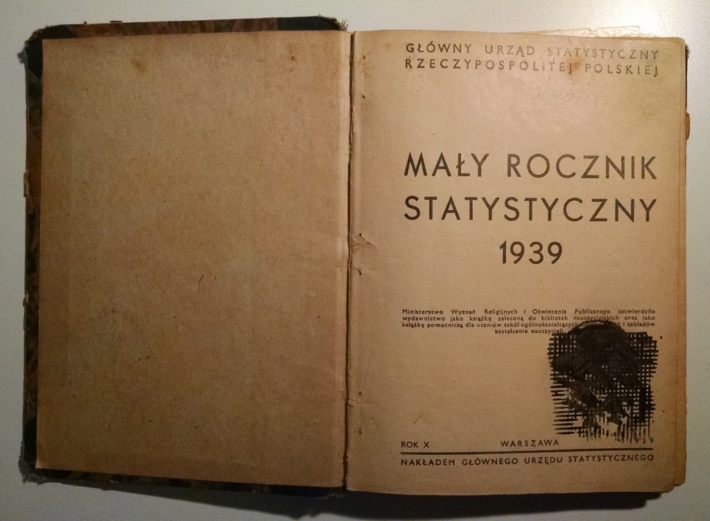
Somehow, they survived World War II and eventually met as teachers, committed to the critical importance of education in rebuilding their broken country. My grandfather went on to become a professor of history and a leading figure at the University of Zielona Góra, in the city where they finally settled (and where I was born). A few years ago, when he passed away, I found some of the old statistical yearbooks he must have used as research resources.
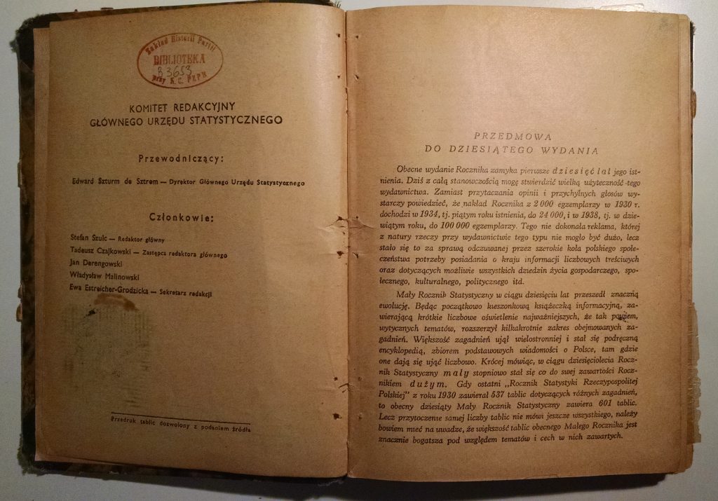
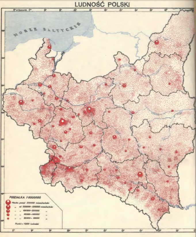
The yearbook from 1939 is particularly touching. As a physical artifact, it has clearly been through a lot: worn from use, spine broken, pages torn, stamped and underlined and scribbled all over.
But it’s the “Foreword to the 10th Edition,” written in April 1939, that really moves me with its premature optimism:
The current edition of the Year-Book closes the first ten years of its existence. Today I can emphatically assert the great utility of this publication … It remains only necessary to express a hope that the Concise Year-Book, completing currently the first decade of its existence and beginning in the near future its second decade… will continually and increasingly fulfill its mission as set out in 1930…
Once again, it was not to be. The statistical service could not continue its planned work, once the war began in September. The Polish government-in-exile in London did manage to publish a Concise Statistical Year-Book for 1939-1941, summarizing what was known about conditions in the German- and Soviet-occupied territories. But the regular annual compilation and publication of Polish statistical yearbooks did not resume until after the war, in 1947 — and even then it was interrupted again during 1951-1955 as the Soviets in charge did not want to risk revealing any state secrets.
Now, on this 80th anniversary of the war, my own son is eager to start school, while I am preparing to bring the 1939 yearbook to my fall course on surveys and censuses. I am grateful that our life today is so much better than my grandparents’ was, even if it’s hard to be optimistic about the state of the world when you hear the news lately. All we can do is roll up our sleeves and get back to work, trying to leave the place better than we found it.
Another Pole, the poet Wisława Szymborska, said it well:
The End and the Beginning
After every war
someone has to clean up.
Things won’t
straighten themselves up, after all.
Someone has to push the rubble
to the side of the road,
so the corpse-filled wagons
can pass.
Someone has to get mired
in scum and ashes,
sofa springs,
splintered glass,
and bloody rags.
Someone has to drag in a girder
to prop up a wall,
Someone has to glaze a window,
rehang a door.
Photogenic it’s not,
and takes years.
All the cameras have left
for another war.
We’ll need the bridges back,
and new railway stations.
Sleeves will go ragged
from rolling them up.
Someone, broom in hand,
still recalls the way it was.
Someone else listens
and nods with unsevered head.
But already there are those nearby
starting to mill about
who will find it dull.
From out of the bushes
sometimes someone still unearths
rusted-out arguments
and carries them to the garbage pile.
Those who knew
what was going on here
must make way for
those who know little.
And less than little.
And finally as little as nothing.
In the grass that has overgrown
causes and effects,
someone must be stretched out
blade of grass in his mouth
gazing at the clouds.
In short, there are concerns that the new administration may defund or eliminate valuable statistical programs. They may also insist on asking for citizenship / immigration status on the next decennial Census, despite the detrimental effect this would have on response rates and data quality. The ASA’s post has further details and links to relevant news stories.
Whatever your political views, it’s difficult to manage a country effectively and efficiently without high-quality statistical information. Public data is an important good for members of the public as well, as I argued a few years back during worries about eliminating a federal statistical survey. I’m grateful those concerns did not come to pass then. I hope for the best this time too.
One of the things I’ve been able to do is teach a freshman seminar every once in a while. In 1990, I did it as a class in a very ad hoc way and then again in 2000, and again in 2010, I taught small freshman seminars on the census. Those were the census years, so I would bring real data into the classroom which we would discuss. One of the nice things about working on those seminars is that, because I personally knew many of the Census Directors, I was able to bring many of them to class as my guests. It was great fun and it really changes how students think about what they do. In 1990, we signed all students up as census enumerators and they did a shelter and homeless night and had to come back and describe their experiences and share them. That doesn’t sound like it should belong in a stat class but I can take you around here at JSM and introduce you to people who were in those classes and they’ve become statisticians!
What a great teaching idea 🙂 It reminds me of discussions in an anthropology class I took, where we learned about participant observation and communities of practice. Instead of just standing in a lecture hall talking about statistics, we’d do well to expose students to real-life statistical work “in the field”—not just analysis, but data collection too. I still feel strongly that data collection/generation is the heart of statistics (while data analysis is just icing on the cake), and Steve’s seminar is a great way to hammer that home.
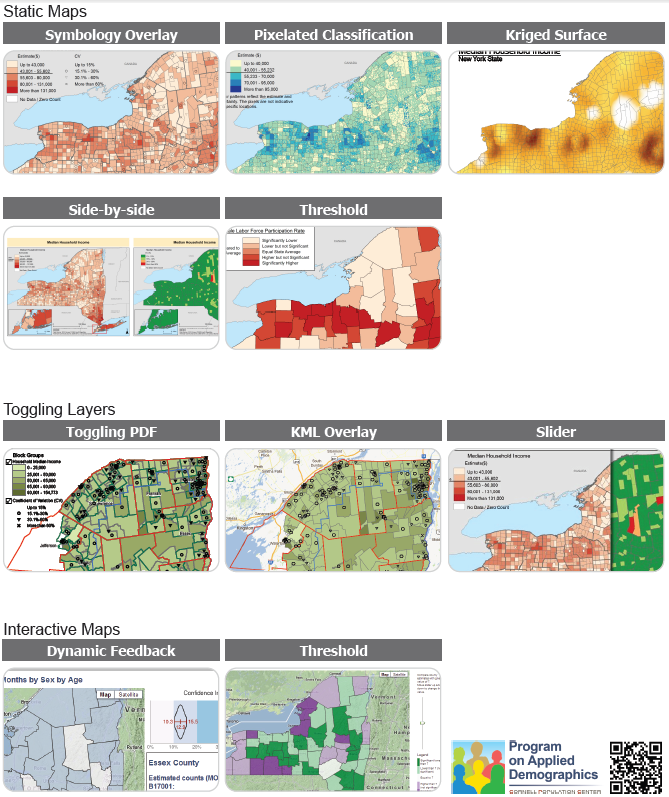
Screenshot of index page from PAD mapping examples
Each of these maps shows a dataset with statistical estimates and their precision/uncertainty for various areas in New York state. If we use color or shading to show the estimates, like in a traditional choropleth map, how can we also show the uncertainty at the same time? The PAD examples include several variations of static maps, interaction by toggling overlays, and interaction with mouseover and sliders. Interactive map screenshots are linked to live demos on the PAD website.
I’m still fascinated by this problem. Each of these approaches has its strengths and weaknesses: Symbology Overlay uses separable dimensions, but there’s no natural order to the symbols. Pixelated Classification seems intuitively clear, but may be misleading if people (incorrectly) try to find meaning in the locations of pixels within an area. Side-by-side maps are each clear on their own, but it’s hard to see both variables at once. Dynamic Feedback gives detailed info about precision, but only for one area at a time, not all at once. And so forth. It’s an interesting challenge, and I find it really helpful to see so many potential solutions collected in one document.
For more about mapping uncertainty, see their paper:
Francis, J., Tontisirin, N., Anantsuksomsri, S., Vink, J., & Zhong, V. (2015). Alternative strategies for mapping ACS estimates and error of estimation. In Hoque, N. and Potter, L. B. (Eds.), Emerging Techniques in Applied Demography (pp. 247–273). Dordrecht: Springer Netherlands, DOI: 10.1007/978-94-017-8990-5_16 [preprint]
and my related posts:
Localized Comparisons: my own attempts at showing uncertainty in an interactive map and in a cartogram, plus links to work by Gabriel Florit, David Sparks, Nicholas Nagle, and Nancy Torrieri & David Wong
I love having the chance to promote nifty data visualizations; good work from my former employer, the Census Bureau; and student projects from my alma mater, Olin College. So it’s a particular pleasure to highlight all three at once:
Elizabeth Duncan and Marena Richardson, students in Olin’s Data Science course, teamed up with Census staff and BusinessUSA to develop an app that helps make Census data accessible to small business owners.
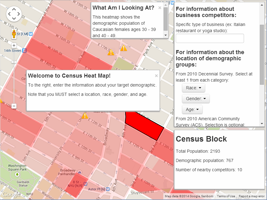
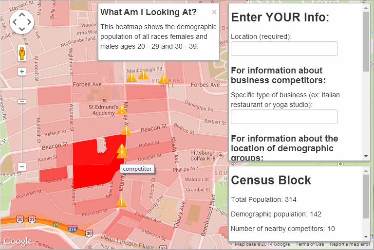
The result, Census Marketing, is a nifty and simple interface to overlay Decennial Census and American Community Survey data on Google Maps.
Imagine you’re planning to start or expand a small business, and you know the demographic you’d like to target (age, income, etc.) Where in your town is there a high concentration of your target market? And, are there already competing businesses nearby?
Load up Duncan and Richardson’s website, enter your location, select demographic categories from a few drop-down menus, and give your business type. The app will go find the relevant data (through the Census API) and display it for you as a block-level heatmap on Google Maps. It’ll also highlight the locations of existing businesses that might be competitors.
For example, say you want to open a pizzeria in my Pittsburgh neighborhood of Squirrel Hill. You might want to target the undergrad and grad student populations, since they tend to order pizza pretty often. Punch in the zip code 15217, choose all races and both sexes, select age groups 20-29 and 30-39, and specify that you’re looking for other competing pizzerias:
Well! The student-age population is clearly concentrated around Hobart and Murray… but so are the competing pizzerias. Good to know. Maybe you need to brainstorm a new business plan, seek out a different part of town, or try marketing to a different demographic.
Besides learning about data science and creating a website, Duncan and Richardson also interviewed several actual small business owners to refine the user experience. It’s a nice example of Olin’s design-centered approach to engineering education. I can imagine a couple of further improvements to this app… But it’s already a nice use case for the Census API, and a good example of the work Olin students can do in a short time.
PS—the course instructor, Allen Downey, has a free book ThinkStats on introductory statistics from a computer scientist’s point of view. I hear that a revised second edition is on its way.
Two interactive web apps by data users (these use Census Bureau data but the datavises are someone else’s products):
Web app “Point Context”: a data user calls the Census Bureau’s API to find the distributions of age, race, income, and education for residents of the “average” neighborhood containing an arbitrary set of latitude-longitude coordinates.
Interactive map of “Is the United States spending less on public education?”: A Census data user practices with D3 and tries out the lessons from datavis classes — show comparisons, allow color-blind-safe color palettes, “catchy” headlines and informative annotations help guide readers, etc. I particularly like the arrow indicating where the selected state falls on the colorbar.
Several tools for making maps from Excel or spreadsheet-like tools:
Esri, the makers of ArcGIS software, have created a Microsoft Office add-on that lets you create maps of your data in Excel. A live demo looked promising, especially if your organization is already an Esri client… but otherwise ArcGIS is not cheap!
JMP, a SAS product, also has mapping tools that should be fairly simple for people used to spreadsheets. But again, SAS’s products tend to be expensive too.
I really enjoyed tonight’sDC R Meetup, presented by the prolific Anthony Damico. [Edit: adding link to the full video of Anthony’s talk; review is below.]
I’ve met Anthony before to discuss whether the Census Bureau could either…
publish R-readable input statements for flat file public datasets (instead of only the SAS input statements we publish now); or…
cite his R package sascii, which automatically processes a SAS input file and reads data directly into R (no actual SAS installation required!). Folks agree sascii is an excellent tool and we’re working on the approvals to mention it on the relevant download pages.
Meanwhile, Anthony’s not just waiting around. He’s put together an awesome blog, asdfree.com (“Analyze Survey Data for Free”), where he posts complete R instructions for finding, downloading, importing, and analyzing each of several publicly-available US government survey datasets. These include, in his words, “obsessively commented” R scripts that make it easy to follow his logic and understand the analysis examples. Of course, “My syntax does not excuse you from reading the technical documentation,” but the blog posts point you to the key features of the tech docs. For each dataset on the blog, he also makes sure to replicate a set of official estimates from that survey, so you can be confident that R is producing the same results that it should. Continue reading “DC R Meetup: “Analyze US Government Survey Data with R””→