
Yesterday’s CMU stats department seminar was given by Stefan Wager, who spoke on statistical estimation with random forests (RFs).
Random forests are very popular models in machine learning and data science for prediction tasks. They often have great empirical performance when all you need is a black-box algorithm, as in many Kaggle competitions. On the other hand, RFs are less commonly used for estimation tasks, because historically we could not do well at computing confidence intervals or hypothesis tests: there was no good understanding of RFs’ statistical properties, nor good estimators of variance (needed for confidence intervals). Until now.
Wager has written several papers on the statistical properties of random forests. He also has made code available for computing pointwise confidence intervals. (Confidence bands, for the whole RF-estimated regression function at once, have not been developed yet.)
Wager gave concrete examples of when this can be useful, for instance in personalized medicine. You don’t always want just point-estimate predictions for how a patient will respond to a certain treatment. Often you want some margin of error too, so you can decide on the treatment that’s most likely to help. That is, you’d like to avoid a treatment with a positive estimate but a margin of error so big that we’re not sure it helps (it might actually be harmful).
It’s great to see such work on statistical properties of (traditionally) black-box models. In general, it’s an exciting (if challenging) problem to figure out properties and estimate MOEs for such ML-flavored algorithms. Some data science or applied ML folks like to deride high-falutin’ theoretical statisticians, as did Breiman himself (the originator of random forests)… But work like Wager’s is very practical, not merely theoretically interesting. We need more of this, not less.
PS—One other nifty idea from his talk, something I hadn’t seen before: In the usual k-nearest-neighbor algorithm, you pick a target point where you want to make a prediction, then use Euclidean distance to find the k closest neighbors in the training data. Wager showed examples where it works better to train a random forest first, then use “number of trees where this data point is in the same leaf as the target point” as your distance. That is, choose as “neighbors” any points that tend to land in the same leaf as your target, regardless of their Euclidean distance. The results seem more stable than usual kNN. New predictions may be faster to compute too.
Followup for myself:
- Ryan Tibshirani asked about using shrinkage together with random forests. I can imagine small area estimators that shrink towards a CART or random forest prediction instead of a usual regression, but Ryan sounded more like he had lasso or ridge penalties in mind. Does anyone do either of these?
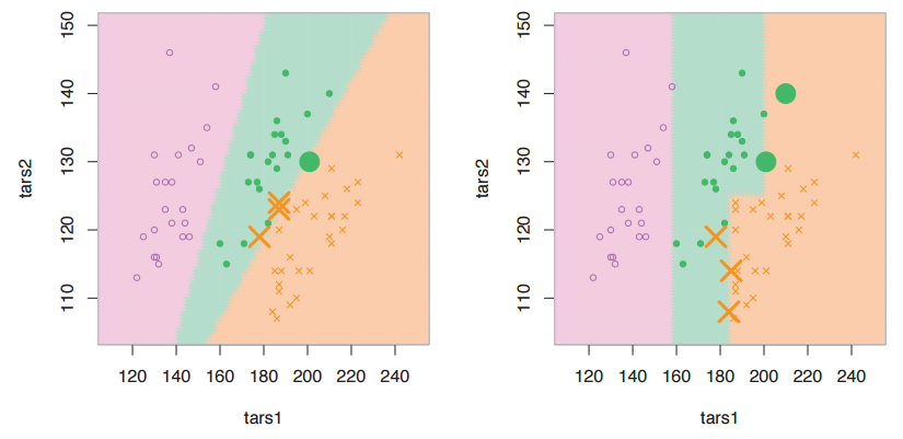
- Trees and forests can only split perpendicular to the variables, but sometimes you might have “rotated” structure (i.e. interesting clustering splits are diagonal in the predictor space). So, do people ever find it useful to do PCA first, and *then* CART or RFs? Maybe even using all the PCs, so that you’re not doing it for dimension reduction, just for the sake of rotation? Or maybe some kind of sparse PCA variant where you only rotate certain variables that need it, but leave the others alone (unrotated) when you run CART or RFs?
- The “infinitesimal jackknife” sounded like a nifty proof technique, but I didn’t catch all the details. Read up more on this.
 , and you’d like your code to specify the logarithm base explicitly.
 . This is often faster and more numerically accurate than computing the matrix inverse of A and then computing
  .
.