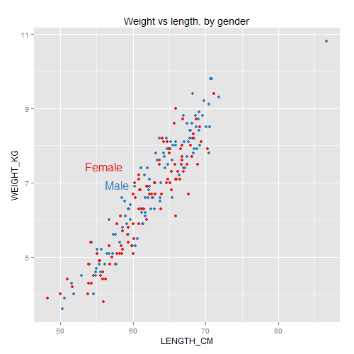
Yesterday I spoke at Stat Bytes, our student-run statistical computing seminar.
My goal was to introduce two principled frameworks for thinking about data visualization: human visual perception and the Grammar of Graphics.
(We also covered some relevant R packages: RColorBrewer, directlabels, and a gentle intro to ggplot2.)
These are not the only “right” approaches, nor do they guarantee your graphics will be good. They are just useful tools to have in your arsenal.

The talk was also a teaser for my upcoming fall course, 36-721: Statistical Graphics and Visualization [draft syllabus pdf].
Here are my
The talk was quite interactive, so the slides aren’t designed to stand alone. Open the slides and follow along using my notes below.
(Answers are intentionally in white text, so you have a chance to think for yourself before you highlight the text to read them.)
If you want a deeper introduction to dataviz, including human visual perception, Alberto Cairo’s The Functional Art [website, amazon] is a great place to start.
For a more thorough intro to ggplot2, see creator Hadley Wickham’s own presentations at the bottom of this page.
Continue reading “Two principled approaches to data visualization”


